Thursday, 21 March 2013

The Themed Patterns (developed and finished)!

 I have now made my two patterns. I first made two more illustrations into my sketchbook that form a segment of the repeated pattern. Here is the 'wartime' theme:

Wartime Theme
 As you can see I have applied shading into the design. Due to the context being about the blitz, I immediately made the connotation of soot and ash. The grainy texture made by a pencil on its side represents this perfectly. I applied this method and then used a wet brush to create a smudge effect. I deliberately made the shading around the destroyed area darker to emphasise that a bomb caused this destruction; so a burnt effect basically. I originally drew the outline in pencil just in case I made a mistake and then went over it in fine liner. Then to put it into the pattern I began duplicating the image, attaching them at each side. I repeated this a couple of times and gradually it built up within the A4 horizontal page. Here is the outcome:


 As I described before, I wanted it to appear as though the houses were ascending up a hill from the perspective of the viewer. The monochrome and the endless amount of roof tops and windows makes this piece look very dense. The destroyed areas of the terrace houses reveal a living room window on the street behind. This makes the pattern almost hypnotic and abstract. It forces the viewer to peer in closer.
 This pattern further represents the context due to the catastrophic nature of WWII. It serves almost like a memorial to the victims taken by the blitz because the image appears so vast and infinite; symbolizing the almost countless deaths. It also could symbolize society and what human nature is capable of; even worse in mainland Europe where innocents were murdered by gas according to their race. War is a terrible thing, and the events that happened during WWII must definitely never happen again.


 Now for the 'historic buildings' theme. As I had been working closely with the theme of Pear Mill, I thought it appropriate to incorporate it into this cover somehow. Due to the term given to work upon, 'buildings', I realised that the cover had to be something universal; something that applied with most standard buildings. When I think of a building, I imagine a giant rectangular block with windows. The windows I then thought were a great idea. When I found this idea, I immediately remembered the album cover Physical Graffiti, by Led Zeppelin:

Physical Graffiti, Led Zeppelin
 This influenced my idea of having the pattern just as windows. In accordance to Pear Mill, I decided to draw a segment of the windows into my sketchbook:

Buildings Theme
 I drew and kept the windows in the same style as my entire illustration of Pear Mill, with the pen and ink and watercolours. I then applied the same technique as I did with the 'wartime' theme and kept on duplicating them until they filled the A4 space. Here is my outcome:


 Yet again, compared with my 'wartime' pattern, it appears rather densely populated with the amount of windows there are. It appears almost like a 'super factory'! I believe it appears abstract as well as representational because of the same reason (the size). Its difference with the 'wartime' cover is that it has colour. Colour is more so necessary in this one because of the burgundy/redness that is associated with industrial architecture. The weathered red bricks that crafted these working spaces symbolize how huge the buildings were.
 I believe this relates to the context of the brief well because the buildings that were made during the industrial revolution still stand today and so keep the memory of what was. Their dominance in the landscape pushes across the message that everything has a history, and that these histories will never be altered or forgotten. Even if Joyce cannot remember, the building physically remains present.

Wednesday, 20 March 2013

Pear Mill Revealed!

 I have made my illustration of Pear Mill. I cleaned it up a little in Photoshop and increased the contrast to enhance the colours of the paint:


 Looking back on the previous designs, I decided to redraw my strongest one and add extra detail. It's essentially the same shape and perspective as that one, and the colours too are similar. Again, they were painted in watercolours and they helped let the ink run unpredictably. Also the windows have received a touch up with the extra lines going through them, which represent the panes. The most important aspect obviously is that it illustrates Pear Mill. It acquires a Quentin Blake style where the paint is running over the lines and the lines are hastily drawn. This gives it character and it displays a great example of how effective hand-rendered work can be.

Monday, 18 March 2013

Development of the Booklet Covers

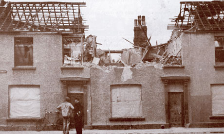
 As well as the Pear Mill illustration and the sweet shop animation, we ALSO have to design two pattern-based booklet covers! It seems to be a very busy project. The two covers are themed 'historic wartime' and historic buildings'. For the 'wartime' cover, I came across a photograph of a residential street in Manchester during World War II that had been blitzed:

Blitzed Street in Manchester

 The pattern appeared in my head and I knew what I wanted. The pattern will be a drawn version of this photograph and will be repeated as though a house has exploded every few yards down the endless street. The streets will overlap one another as though they are gradually going up a hill for example. I have started drawing this idea within my sketchbook:


 These are deliberately first drafts, so I'll make sure to put in adequate detail. I will keep the image monochrome to keep with the theme of the war period. Photography during WWII was predominately black and white, so I want it to bear that connotation. The pattern idea for this is well suited as well because terrace houses from above appear as rows and rows and rows of almost infinite (exaggerating) stretches of streets. It emphasises also the fact that the Germans could have dropped a bomb anywhere over the city without knowing where, and it will have destroyed at least something. It must have been such a scary time, especially for young Joyce who had to hide under the staircases in her sweet shop whilst the sirens blazed. I find WWII so fascinating. The fact it occurred during the Twentieth Century still astounds me.

Drawings of Pear Mill

 After visiting Pear Mill, I now began drawing the building into my sketchbook. The best development work I'd made so far had come from my sketchbooks, like in the Penguin book cover project, so I just started being playful with the use of media and what style I'd prefer it. Here they are:


 The lines I've drawn were made with the pen and ink technique. It seems this has become my favourite use of line. I enjoy how unpredictable it is, such as when it runs a little or flicks ink to the other side of the page. It works effectively with watercolours too because the water encourages the flow of the ink to spread. The second-to-last image is different to the rest because I applied brusho dye for the first time. I was unsure as how to use it, but I guess I learn from experience. It was more difficult to use than I'd previously thought because the grains sometimes don't run and you have to be careful of putting too much water on the surface, otherwise it'll run off the page! I enjoyed all these styles of drawing and I believe the last one to be the strongest, simply because slightly more detail has gone into it, i.e. the different shades appearing on each side of the building and the line textures. My final outcome will probably end up being similar to this one.

Sunday, 17 March 2013

The Stage is Set

 After almost a week's dedication to this image, I have finally completed it. It seemed simple to start with, but the layers from the original image were all locked together so I had to manoeuvre around them which took quite some time. There were so many layers by the end of it! Anyway, it is done and all I have to do now is put it into After Effects. Here it is:

Richard

 For the jars, I duplicated them adjusting their size depending how far down they were. I even added different types of reflection on each jar simply using the brush tool. For the shelf lines I extended them keeping in mind with the point-of-perspective, so they'd become narrower as they verge to the right-hand side of the image. For the sweets in the jars I again duplicated them and scattered them as randomly as possible. I adjusted their colours too to add variation in the types of sweets available.
 What also is required for the animation are the liquorice sticks. For this I photographed a small bunch of them and applied the same method of contrast levelling as I did with the other sweets. Here they are within the shop replacing Richard's figure:

Liquorice

 I find this a fun concept, but at the same time feel sad due to its context. Joyce's loss of memory is the crucial factor behind this brief.

Thursday, 7 March 2013

My Animation Environment

 For this animation I am going to create, I am simply going to expand the scene of the sweet jars from my original outcome of the last Age UK project. This will mean more sweet jars and more sweets! Luckily with the help of Photoshop, all I'll have to do is duplicate everything. Here is a rough sketch of my initial idea including lines and arrows directing the flow of the animation:

Sketch of Animation

 My idea is to pan across this expanse of sweet jars as though a child is looking at them all eagerly. Then the child's eyes will pass over the figure of Joyce's husband within the sweet jar. There would then be a double-take back towards the figure, but he would not be there. Instead he'd be replaced with a stack of liquorice sticks. This concept is playing with the quote Joyce used to describe the memory of her husband, "A figure in the background."

Photographs of Pear Mill

 Yesterday I went to go visit Pear Mill to acquire some photographs of the building. I may use them as reference when I make my illustration of the building. Here they are:


 The building appears how it probably would have looked back in its cotton spinning days. Stockport, Manchester and most of the North-West of England remains very industrial looking. The buildings almost emit an echo from the past during the great days of the Industrial Revolution.