Tuesday 29 April 2014

My GIFs are Moving!

 After making some research into illustrated GIFs, I then decided to create my own; keeping within the ongoing themes of the project. I based them upon what work I had already produced to maintain a familiar series of imagery.

Here they are:


 I wanted to see what method came out most successful, so I worked using photography, line drawings, and Photoshop tools. The first one utilises the element of photography, with a series of shots taken of a piece of paper being scrunched up. I deliberately left in the surrounding graph lines from the stand I was using because I wanted the process to be as much a part of the image as the rest of the elements. I imported the shots into AfterEffects and reversed the animation, to enable the theme further.

 The second and third GIFs seen above are images previously made to be still images. I increased the hue of the colours, saving a new file each time. This enabled a gradual change in colours within the GIFs, creating an almost hallucinogenic sensation. This encourages the project themes further, in terms of psychology and individualism.

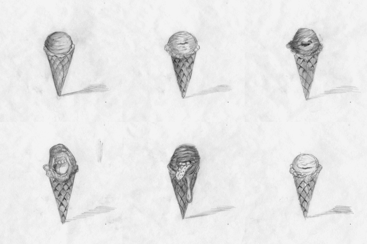
 The last few were made using my traditional method of animation, which is the combination of a series of simple line drawings. I used my nib and ink again for this and based the drawings upon previous pieces. Each is figurative and displays themes of originality and consumption - both psychological and physical. The raw haste within each as well encourages these themes, displaying a sense of maddening frustration.

Monday 21 April 2014

Portfolio Visits Part 2

Fig Taylor

 The first visit I had with the new contents of my portfolio was from Fig Taylor, a portfolio consultant who previously gave the class a presentation with advice about how to be successful in self-promotion. We sat round as a group and she looked through each of our portfolios to give us feedback and to tell us where our territory of work would lie in the industry. She got to mine and had a glance through. She mentioned that my work acquired minimalistic elements and that she wasn't too sure where to categorize it in illustration. I found this both disheartening and positive, because my work clearly has potential in other fields of the industry. It was critical feedback, so I'll use it to my advantage.

Day Job

 When we had our London trip, we visited an illustrator collective called Day Job. They're 10 postgraduates who make work in a empty mill-type environment, and produce zines together for promotional value. I enjoyed the experience of being there and hope to eventually work in a similar space. After we had a group discussion, we each showed them our portfolios one by one to receive feedback. I introduced myself to two of the girls by the names of Grace and Victoria and let them have a look through my portfolio. I gave a brief insight into what most of my work is about, saying that I like to create visual responses from themes within narratives. I told them of my worries too with my work not appearing to obtain a particular context and just being a random assortment of images. Also that the abstraction in my work leads it away from being considered illustration. They responded positively stating that it's always up to the artist who produces the work, and it's all down to personal interpretation. They were both complimentary of what I showed them too saying that it's interesting to see something abstracted for once. This left me feeling a lot more confident about my work because I had previous doubts of whether I should even attempt going into the illustration industry. I told them it was the best feedback I'd received.

Ben Jones

 The most recent review of my portfolio came from Ben Jones, who graduated at Stockport. He helped out in first year and reviewed my work at the end of second. He encouraged me to work more hand-rendered as opposed to using the computer, and it's proven very successful as you can see in The Outsider project. I sent him an email asking if he could give me some feedback on my updated portfolio. He said yes and gave good criticism. He said the technique I picked up from The Outsider project has proven successful in both style and context. He admires my raw perspective and said I should perhaps start to work on canvas on a big scale. This is similar feedback I've had before two other people who said my work could be seen as fine art.

Sunday 20 April 2014

Hopes, Fears and Opportunities Part 2

Hopes

 After being at university, my hopes for me are to find and discover myself even further after everything I've learnt so far. I hope that my work remains consistent the way it has been since The Outsider project, and that it progresses into something that I'll be proud of for the rest of my life. Being at university has further extended my horizons towards succeeding in creating work that everyone can see and collaborate opinions towards. I hope for my work to develop connections with people, in both style and context, because it's positive to be surrounded by those who understand what your direction is.
 Most of all, I hope that I become an artist; successful or not. It's a lifestyle that encourages so many opportunities and dreams to become physical. The simplest of things can influence ideas which become so very relevant in understanding who you are. I'm very grateful for attaining such a visual-based perspective of the world.

Fears

 My fears for the future are understandable, as I'm sure a lot of other students facing the same situation feel. I fear the hastened approach towards not being in education any more. I've thought about perhaps studying something else, like philosophy, but at the moment I can only see myself struggling for money, which puts that out of the window. Money of course is a central fear, just mainly because of sustaining a decent enough livelihood for myself. My intentions outside of education are to remain in my current job, which is part-time at Morrisons, or to perhaps discover something more related to my desired practice, like working in an art cafe for a crude example. This would hopefully override my fear and keep me in a comfortable place.
 My main fear is that my work will become repetitive and non-consistent. Throughout this major project I have been feeling this way because of the lack of direct context. My work is substantial, but just needs that push into something that binds it all together. It's certainly a weakness I carry in finalising my work because I become so confused with what I want.

Opportunities

 Something that I've mentioned previously is that technology and the internet have expanded upon the almost endless amount of opportunities. The connections made with other illustrators/image makers and potential clients are a positive aspect, in having your work known and promoted. This is something to take advantage of. Another opportunity has been discussed with me and two other students from my class, proposing that we should all share a studio space together. This was an influence from witnessing the environment in which the illustration collective, Day Job, worked in. This potential opportunity excites me the most because it allows and encourages a momentum in work flow. Being surrounded by all my work, materials and influences would certainly hasten my progress. Also being in the midst of other people with the same motive would help too, because we'd all be very supportive of one another. It's an environment fine artists choose to work in and somehow I feel more comfortable with that, seeing as my work consists of similar elements.
 What I've learnt from my time at university is that opportunities await in many areas - not just illustration. As mentioned previously, my work contains fine art elements and this has been commented on by some peers, saying they could imagine the work being hung up in a bar, or perhaps exhibited. This I found encouraging because it displays a sense of hybridity which can hopefully work to an advantage of mine.

Saturday 19 April 2014

More Editing and Potential Outcomes?

 From the last bits of development using the photocopier and so on, I then decided that perhaps another element could be composed into the images. The answer was photography, so I went out and took some pictures round Manchester, keeping reference to the keywords: isolation, sedation, self-delusion, and propaganda. Seeing as I want to contemporize Brave New World, photography seemed the best method in which to portray this because it instantly communicates a period in time. I took pictures of bus stops and street signs to reflect this. I also took pictures of natural elements too in order to communicate the sense of detachment society feels with it due to the dependence on advancing technologies.

Anyway, here are some more edits incorporating photography and even subtle use of text:


 The photos have indeed proved effective in communicating what I want to say. They contribute both graphic and illustrative features, like the trees for instance against the boldness of the silhouetted profile. Working in negative also brings to light this sense of conditioning and delusion witnessed in the novel, with the hypnopaedic process used to brainwash the public in their sleep. This relates very much to advertising and media as whole in how it influences our lives. The use of text can be seen also within the images, highlighting traits of individual thought and feeling, which are denied and looked down upon in the novel. The general, playful process which is being undertaken (layering of elements) as well reveals that life is a complex ordeal, which revolves around the psyche of the self: the catalyst of what makes you 'you'.

Friday 18 April 2014

Website!

 Yes I now have a website and it's hosted by cargocollective.com. It took me a while to get the hang of it, but eventually I figured out how to adapt to the layout I was looking for.

Here's a link: joehuish.co.uk

And below are a couple of screenshots:


 The minimal design allows the viewer to easily stream through the website without having to wade through any clutter. On the home page I have my original typeface signature at the top, in correspondence with the business card design, and below a group of thumbnails displaying previews of my project work. I've deliberately zoomed in on the faces fro my work for these snippets because it immediately tells the story of what to expect - almost like a visual blurb. I've allowed the viewer to see both my outcomes and development within these allocated projects because it creates an aesthetic contrast. Alongside the images as well I've given a brief description of the context, my expression towards it, and the methods I used. Seeing as my work can appear abstract, this offers the viewer more insight.

GIFs

 'Graphics Interchange Format', or better known as 'GIFs', are an internet phenomena. They're image files that can be animated and are really easy to make (apparently). As I've never made one, I thought it appropriate to research a few to see what you can get from them. Some are really simple and others look more complex, almost like a video. They're everywhere and they bring potentially still images to life.

Here are a few examples:

Saskia Keultjes
Laurene Boglio
Miranda Pfeiffer

 As you can see there is certainly difference in style and quality, like with everything. The one at the top appeals to me more however, just because of its humour factor and that it's straight to the point. The last one is also very good but in a different way in that more drawings have gone into it. This is what I'm thinking about concerning my own version and take on them. I'm probably most likely going to work the way the top one plays out because of it's rawness, humour, and simple nature. It reflects my own work the most because of these familiarities.

Tuesday 15 April 2014

Photocopying and Editing

 After some initial development in two sketchbooks, I started to overlay the images onto backgrounds I had made with mount board. I used a photocopier to accomplish this outcome and it certainly demonstrated the act of chance:


 These ones were picked for being the strongest and I edited them slightly with the use of Photoshop. Some I kept the colour, some I didn't. Some I duplicated parts, some I didn't. This playful technique has developed well and I believe that I have become more accomplished with it. It's clear the ones that are most effective in this bunch acquire both a bold graphic look, with a fine art quality composed alongside: such as the scratchy lines and crease textures.

 I believe these images have come out well in a sense that this project is looking more hopeful in finding a direction and a context to work towards. I'm still unsure as to what it could be, but perhaps something along the lines as an anniversary for Huxley's work. I want the visual responses to be central, but perhaps something digital and even physical could be added to what needs to be shown. Gifs are something I'm hoping in trying out and the physical aspect could be a 3D piece of a figure...

Monday 14 April 2014

Landan Trip


There's a hole in the world like a great black pit

and the vermin of the world inhabit it

and its morals aren't worth what a pig could spit

and it goes by the name of London


Sweeney Todd


 Luckily we didn't experience the nature of Victorian London, however fascinating that would've been, but we still visited the infamous capital for a glimpse of its illustration industry... and its rum...


 After an exceedingly expensive train journey that was pretty relaxing, I arrived in London at 11:10 am on Tuesday morning and made rendezvous with the rest of the class. We traversed out of Euston and headed straight to our first destination: adam&eveDDB. They are a communications company and are responsible for advertising brands. We entered a very stylish office building through a small rotating door and were welcomed by a smart and clean looking man in skinny jeans and loafers. He then escorted us into a glass-walled office with a huge flat screen television inside. As there were so many of us, I ended up sat on the floor which I wasn't too bothered about. He gave us an introduction as to what the company does and showed a series of adverts that they had published. They work with image makers of all varieties and establish the connection between them and the advertising client (sort of like an agency). He then gave us some feedback on a few questions about how to promote ourselves, which I found very valuable. After and hour or so, we said thank you and headed out for the tube to our next point of interest.

 We arrived at Elephant and Castle station and started walking. We walked for at least 30 minutes or so until we were in a very residential looking part of town. We were lost for a little while, but managed to spot one of the people waving at us from across the street. She was called Grace and she showed us into a large empty mill-type building. She was part of a collective of post-graduate illustration students, called Day Job. We crowded up a lift and went upwards to a studio of spaces filled with art work. I felt right at home and we gathered round in a circle on some chairs and cushions - I was on the floor again! There were 5 girls and they gave us some insight into what they do and what it's like after university. With the work they made, they made zines together so they could promote their work. I loved the environment and I'm hoping to have a space of my own in the near future; potentially with others from the class! They then had a look through our portfolios, but I'll leave that for another post. We made our way out down the lift and headed back to the station, so we could finally get to our hostel which was all the way over at King's Cross.

 After a quick rest back at the hostel, myself and two other fellow students conversed to Camden for a night of various antics, including me dancing like a puppet... Anyway, the next day 6 of us made an extraordinary visit to a lady's house. A very lovely and hospitable lady indeed, she's called Naomi Games and is the daughter of the famous graphic designer, Abram Games! We entered into the house and introduced ourselves to Naomi at the top of the stairs with a hand shake. She wore nice clothes that emitted the colours pink and purple, mainly in the scarf she was wearing. We then entered the kitchen which was full of artwork and all sorts of cool antiques and furniture. We sat round the table and eagerly anticipating what she would show us. She first asked if we all wanted a hot drink and most of us answered yes. She revealed a crazy, bong-like coffee maker which happened to be an invention created by her father. She was going to show us his archive of development work. We all drank our coffees and she opened up countless amounts of folders containing this goldmine of work. Everyone was most fascinated by his stamp designs because of how small he made them. A tool he used, an airbrush, was passed round with delicacy. Ian, our tutor, couldn't contain his excitement. It was all very fascinating and she even told us a story about how Paul Rand and Saul Bass came round for tea! Apparently I was sat where Rand was. Starstruck much?! After a lengthy presentation of the vast amount of work, we made our goodbyes with another classic handshake, and left for London town for some final free time in this amazing city.

Grow Your Own Food, Abram Games

 Got back to ol' Mancunia by 11:10 pm after another relaxing train journey, and headed back home to continue writing the last part of my dissertation. It was a long night...

Sunday 6 April 2014

The Business Cards, mmm

 Yes, the real world is fast approaching and as students, we are in preparation to promote ourselves and our work. We have been asked to create a website, build a portfolio and handle some business cards. At this stage, it all feels quite daunting because I've never been outside of education my entire life! And now we've all grown up and are expected to know what to do next, which quite frankly I'm not even sure.

 In this revolutionary age of technology, particularly with the influence of the internet, self-promotion seems a much easier process. With our websites, anyone in the world can see them just by clicking a button. An amazing prospect indeed, and a sign that opportunities are absolutely everywhere. This raises my hopes in the midst of all the stress that inevitably comes with acquiring a skilled occupation.

 So here is my card:


 For the front of the card I created my own type, that being the letters spelling my name in large. I used my trademark pen and ink and made smooth but jagged lines. The style of a signature springs to mind with this, like a quick scrawl from a fountain pen. I duplicated two of the letterheads in Photoshop to ensure a professional standard. In composition with the rest of the text, I aligned the right-hand side in correspondence to tip of the last 'h' letterhead from my name. The link to my website is visible in the contact details: joehuish.co.uk

 For the staple image on the back, I decided to choose the large, gaping mouth which I produced in The Outsider project: indeed one of my strongest. It's composition on the page is what propels it to being suitable for the card: shocking, bold and identifiable. It sums up my style of working too, with its method and context.

The Ol' Sketchbook

 I began working into another sketchbook to develop on my ideas for what I want to communicate. My mind is working towards producing a contemporary re-envisioning of Brave New World.

 Here are some examples:


 At first I started off a bit side-tracked because I had no particular direction I wanted to go in. I was using quotes from authoritative sources to try and make some guidance. It worked, but it still didn't feel right. My style of work hinders me from narrowing things down, because it appears quite prolific. I decided to choose keywords that would enable some form of positive direction. I chose words that are relevant to Huxley's novel, and they are: isolation, sedation, self-delusion and propaganda. I then decided to add sub-keywords in order to gain more of a solid idea:

Isolation - Alone, sadness, frustration, closed off...
Sedation - Blind, control, daze, suppressed...
Self-delusion - Fear, denial, ignorance, weak...
Propaganda - Power, lies, corruption, exaggeration...

 The use of these words shaped the images above. Negative space is noticeable again (like in my previous work) and the figure too. Again I use a variety of media to allow differences in line technique and colouring, particularly oil pastels. The rawness gives off a coldness and a frustrated sense, which is what I wish to capture. I can't help but compare this work to that of what I produced for The Outsider project, and see it as almost a poor relation. The way I'm working here doesn't seem to be as stimulating as previously thought, and my drawing itself seems to lack quality. I believe I need to conjure up a context for this work soon to prevent disappointment.