Sunday 30 September 2012

My Doodles Relating to the Project


 Leading up to designing my creature's appearance, I thought it best to develop ideas through the use of doodling. I have always doodled when developing a character and it's narrative.

 At first I hadn't chosen my desired creature, so I came up with various ideas for what it could be. When it comes to doodling, I find myself coming up with the strangest assortment of characters. They can be based on something I've seen, or they can be completely random. I also drew a handful of the creatures from the mythological book as to how I would perceive them, because I didn't want to lead away from the project's requirements. 
 I experimented with colour using either pencil crayon, pastel or watercolour. I used the watercolours pretty simplistically and even let them run with the ink outlines. They proved to be very effective in comparison with just the black and white ones.

 My development lead up to me picking the T'ao T'ieh, which is similar to the Greek Mythological creature Cerberus (the dog with three heads) except it is a dog's head attached to two bodies.

Friday 28 September 2012

My 3D Creature!


 I have now made the shape and structure for the dog. The dog has one head and two bodies, so two pairs of legs were required. I decided to put the arms and torsos back-to-back to make the process a lot more practical. It adds to the creature's frustration in not being able to have just one body, as though the bodies are trying to come apart.

 I first made the shape using the pen tool in Illustrator. I printed it as a prototype and cut it onto a cereal box. I made small slots so each shape could fit into one another. It stood up at first, but gradually began to droop due to the feet being unattached to the legs.
 After seeing that result, I imported it from Illustrator to Photoshop to discard any unnecessary lines. I even made the middle section less wide. I attached the feet to the legs this time to apply stability. I printed it out again and put the shapes onto plywood by using graphite and a pencil.
 With lots of effort, I cut the shapes out of the wood using a cutting knife. I made the slots again in all the same length and placed it together. It worked successfully in the fact it stood and that it looked very dramatic. I will now come up with a design to apply.

Influnces in Design for 3D Model


 I intend to create and design a 3D model for my creature. Seeing as my creature originates from Chinese folklore, I find it appropriate to base the model around Oriental design.

 I say Oriental rather than just Chinese because I find Japanese design to be more intriguing. Chinese design is quite structured in comparison, so I believe Japanese design has more potential. I won't stop me the incorporate both however.

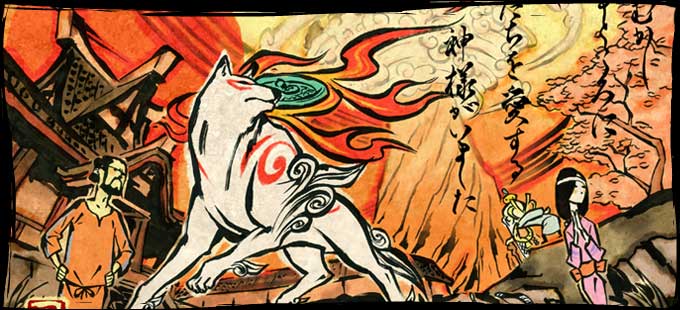
 My creature is a dog, so I found appropriate reference. The top image is of two ornamental Chinese dogs. They're typical in Chinese design, especially within the face. The two other images are based around Japanese culture. The character on the left is called Aku and comes from the animated hit TV series, Samurai Jack. He acquires some Chinese features facially, like the dogs above. The image on the right depicts a shot from the video game, Okami. It's a new design, but the designers have made it look like a typical Japanese tapestry with the type towards the right side. All the images acquire similarities in colour scheme and movement.

Monday 24 September 2012

David Hughes and 3D Models

http://4.bp.blogspot.com/_4MUf6T4VzPw/Sy_TP8JPp0I/AAAAAAAANBc/ZoU7-FWGpSI/s320/clink-klank-robot-papercraft.jpg

http://1.bp.blogspot.com/_4MUf6T4VzPw/SrZXKq0CtPI/AAAAAAAAL3k/zEd_ix4qPwY/s320/flight-conchords-papercraft.jpg
 The project requires at least one 3D model of our chosen creature. When it comes to 3D, it's not a strong point of mine, so I've decided to choose a flat pack layout technique. I've come across this many times before and the logic behind it is fairly straight forward in my eyes.

 The images above depict various models made from card and paper. The two bottom ones represent more what I'm describing. They've encouraged me to start creating one myself, or even a few (depending how long they take to manufacture).
 The two top ones are slightly different. They were created by another influence of mine, David Hughes. They're made up of a variation of different coloured and textured cards. They stand up with the use of the small slots. I've started creating the layout using Illustrator.

Thursday 20 September 2012

Other Artists


 The artists labelled here, from left to right, are: Alex Pardee, Matt Furie, Allyson Mellberg, Jeffrey Brown and Karen Runge. They all have their differences, but they all relate to my work.

 Alex Pardee's piece represents something grotesque and unnerving. The head and body look detached from one another and give a sense of an 'experiment gone wrong'. His use of paint too attracts my attention as it is minimalistic.
 Matt Furie's piece again depicts something grotesque, but this time gives it an innocent environment. The use of colour is very detailed. My drawings are very similar to these two pieces.
 Allyson Mellberg's piece emits surreality. I have myself experimented drawing lines and creating odd shapes which in turn can look like some sort of animal. The paper she has drawn this onto is complimentary due to the line's softness.
 Jeffrey Brown's is very like me. As a child I drew almost every day and came up with little characters such as these. His simple use of line and texture give the characters a bold presence. The deformities which some of them possess also add dark humour.
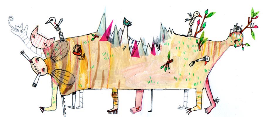
 Karen Runge's piece depicts an odd looking creature. Again it looks as though it's been hastily drawn by a child and the colours are eccentric. The creature could appear to have its own adaptation on its back, which is interesting due to our project requirements: to develop a creature and its environment.

Tuesday 18 September 2012

John Burningham


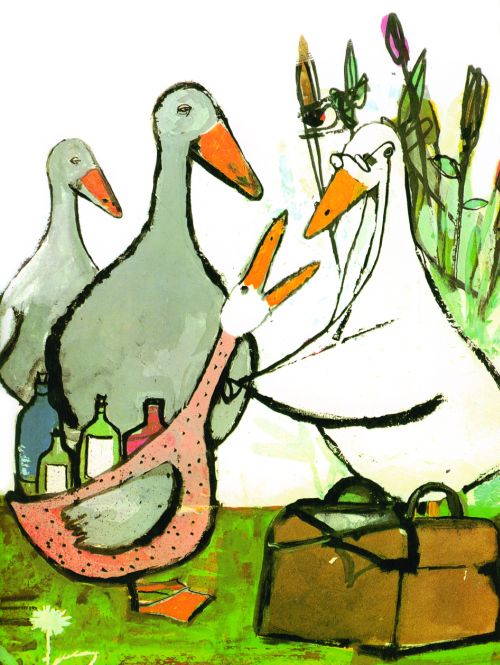
 John Burningham is another influence for me in this project. His use of colour creates a lovely humidity and it looks almost as though he allows the paint to overrun. The paint he uses is either watercolour or acrylic.

 The pieces above look as though they've come from a children's book. The colours are vibrant and the characters and scenery emit an innocent vibe that is suitable for young children. I aim to begin using colour this way in that it looks almost out of control and overwhelming.

Thursday 13 September 2012

Saul Steinberg


 Saul Steinberg is probably my main influence for this project. His simplistic yet lively drawings give him a distinct style that relates to mine. The pieces above emit imaginative characters and scenery. For colour it looks as though he uses pencil crayon.

 The map of America gives the states a bubbly/hilly feel that is so the opposite from reality, because the states are divided like squares almost. The piece representing rows of character's portraits look as though they've been drawn by a child. This deliberate style evokes political parody through Steinberg's work.