Illustration. It's a term that can perhaps leave you thinking for some time as to what it's all about. Obviously it corresponds alongside a description of something in a visual format and that's as old as everything, but certainly by today's standards it can be seen in many other ways. Imagery itself has evolved so much over the years, it seems as though everything is blending as one. The Mass Media is responsible for this because imagery is used over and over again in lots of new various contexts. A far-out example of this would be the Mint Royale remix of the classic song 'Singin' in the Rain' sang by Gene Kelly. The lyrics and chimes remain, but with a contemporary electronic beat. This is proof that boundaries can be broken and perhaps words can be too.
Some illustrators and people in other fields could be intimidated by this concept. Illustrators should definitely keep pushing boundaries and not fall to being halted by either they're own style or by clients. There are those illustrators who are traditional and prefer to remain all hand-rendered, and then there are the illustrators who apply themselves digitally (as well as maybe hand-rendered). The ones that work digitally appear to be a very common form of illustrator that are always high in demand by clients, whereas the ones who prefer the messy side of things are potentially seen as being backward, childish and not up with the times. Hand rendered illustration can however fall into categories, such as fine art, so that's proof all illustrators have a chance.
My own work is as of recently extremely hand-rendered and messy. I like working this way because I feel it truly expresses myself. Whenever digital application came into my work, I'd just feel my work had been drained of it's life and wasn't mine any more, but what the client wants. Heading into a new contemporary world evokes the mood that everything should be more clean-cut and higher defined than ever before. This is why perhaps so many illustrators end up working digitally: because the media says that's the only way to get a job in the new world. I originally studied graphics, so I attained a grasp of what their main strive was and it revolved mainly around money, business and professionalism. Illustration comes under this as well now because of the commercial digital field.
Will illustration survive? I believe it will because there are children's stories still being read in the world that obtain that innocent nature illustration naturally acquires. As long as stories continue to be told, illustration will live on.

Wednesday, 18 December 2013
Monday, 16 December 2013
Hopes, Fears and Opportunities
My hopes for the next semester and after include to achieve a grade that offers me the chance to be seen by professionals from various industries that collate with artistic integrity. People who have an eye for imagery and presentation are people I'll be in search for.
I hope to be considered and admired more than just an image maker and as a person who can communicate, other than just visually, such as into politics and within popular culture. What I mean by this is that I hope to acquire an articulate language which opens people's eyes and lets them correspond with me easily.
I hope to attain all the confidence I have gained being at college and to live a life where the way I express myself is heard and recognized by people that are not just close to me. I hope to be freely artistic in every sense.
My fears for the next semester and after are that I won't achieve the grade I desire because I'll stumble at the last hurdle. That's probably my biggest fear because having come so far with great achievement and understanding, to suddenly fall in a trap of becoming lazy would make me regret my actions for the rest of my life.
My fear also is that my work may lose it's capability of clearly communicating something. What I mean is that I fear I may lead into an area of work that will cause me to lose myself. I fear even that straying into the illustration industry will make me forget that my work is my own and not something to be made just for money. I feel this greatly because what we have learnt during our time at university, mainly during our contextual studies, is that becoming an illustrator seems to contradict everything about expressing your true self.
My potential opportunities for the next semester and beyond would include to create more abstract pieces based on the popularity of my developing portfolio and to pay a visit to the Northern Quarter in Manchester to hang them in bars and even hold mini exhibitions. This idea was offered to me by my past art foundation tutors who said I could potentially work onto canvases and so on.
Another good opportunity coming up for us all is the London trip. It will offer us the chance to witness the demand for art and design and what we're up against. It'll also be good because we'll be able to show our portfolios to professionals in a region of the country, far from our own.
An opportunity that's been handed to me before and may perhaps come again, is designing gig posters for a friend of mine who hosts bands to play at Kraak Gallery in Manchester. I designed a line-up poster for him last year and he greatly appreciated it. However I didn't receive any pay towards it because I forgot to ask. I'll know what to do next time.
Sunday, 15 December 2013
Portfolio Visits
As part of our assessment for the end of this module, we were told to go out and make contact with professionals of the industry to present our portfolios. I have collated work from both last year and this year to attain a good mixture of work from both development to final outcomes.
The first visit I had was from mentor Natalie Wood who is a Stockport College graduate. She is a designer and illustrator and she presented a fantastic range of work for me to look at in her portfolio. I recognised some of her work and made comment of it. Her work is very digital based and she says she mainly does editorials for magazines. She also showed me her work within motion graphics which really suited her style and also incorporated great use of typography.
We then went on to discuss my state of work so far, so I showed her what was potentially going to be in my portfolio because I unfortunately had misplaced it somewhere... She said she really liked my style and agreed we each had a very different approach to things. My work being so rough and in stages of development, I asked her how I should present this in my portfolio. She replied that I should keep my work ethic going and should keep playing within my sketchbook because the work in there seems more relevant to me than the desired outcome.
I found her advice to be very helpful and a great insight into what the industry demands. Seeing what she's achieved, the industry seems so vast and freelance jobs seem to be always available somewhere. This gave me greater confidence in myself and respect for my work. She gave me her business card and I surprisingly didn't make the mistake of thinking she was an actress...
My second portfolio visit was with Pat Carroll from the infamous Mancunian design company, Central Station Design. The group were responsible for livening up Manchester during the 'Madchester' era of the mid 80's to early 90's with their acidic-coloured record sleeve designs for the Happy Mondays. Pat tutored me back in my art foundation year when I was studying visual communication. It was certainly a privilege to be in his company, so I felt I should seek his advice once again on how to present my work.
I showed him my newly printed portfolio and his reaction was indeed positive. Pat's always admired my work for its use of negative space and raw hand rendering. He praised my work saying that it's evolved and is set on course for a new professional beginning. He also said that the work was giving off a fine art vibe, which was certainly a surprise for my ears! He said he could imagine my work being hung up in a bar or exhibition in the Northern Quarter of Manchester. This idea appealed to me more so than working as a freelance illustrator because it opens up a new world for me to enter.
A few things he said I could improve were make my whole portfolio portrait, keep my modules together and to display a small explanation/description of what work it is I'm showing. This newly delivered information has excited me more so than I felt before.
 |
| 'Create' by Natalie Wood |
The first visit I had was from mentor Natalie Wood who is a Stockport College graduate. She is a designer and illustrator and she presented a fantastic range of work for me to look at in her portfolio. I recognised some of her work and made comment of it. Her work is very digital based and she says she mainly does editorials for magazines. She also showed me her work within motion graphics which really suited her style and also incorporated great use of typography.
We then went on to discuss my state of work so far, so I showed her what was potentially going to be in my portfolio because I unfortunately had misplaced it somewhere... She said she really liked my style and agreed we each had a very different approach to things. My work being so rough and in stages of development, I asked her how I should present this in my portfolio. She replied that I should keep my work ethic going and should keep playing within my sketchbook because the work in there seems more relevant to me than the desired outcome.
I found her advice to be very helpful and a great insight into what the industry demands. Seeing what she's achieved, the industry seems so vast and freelance jobs seem to be always available somewhere. This gave me greater confidence in myself and respect for my work. She gave me her business card and I surprisingly didn't make the mistake of thinking she was an actress...
 |
| 'Bummed Portrait' by Central Station Design |
My second portfolio visit was with Pat Carroll from the infamous Mancunian design company, Central Station Design. The group were responsible for livening up Manchester during the 'Madchester' era of the mid 80's to early 90's with their acidic-coloured record sleeve designs for the Happy Mondays. Pat tutored me back in my art foundation year when I was studying visual communication. It was certainly a privilege to be in his company, so I felt I should seek his advice once again on how to present my work.
I showed him my newly printed portfolio and his reaction was indeed positive. Pat's always admired my work for its use of negative space and raw hand rendering. He praised my work saying that it's evolved and is set on course for a new professional beginning. He also said that the work was giving off a fine art vibe, which was certainly a surprise for my ears! He said he could imagine my work being hung up in a bar or exhibition in the Northern Quarter of Manchester. This idea appealed to me more so than working as a freelance illustrator because it opens up a new world for me to enter.
A few things he said I could improve were make my whole portfolio portrait, keep my modules together and to display a small explanation/description of what work it is I'm showing. This newly delivered information has excited me more so than I felt before.
Monday, 2 December 2013
'Thing' - It's Alive!
Apologies for the confusing title, but this post is showing the beginning stages of development for the new project: 'thing'. Yes I have managed to fill yet another sketchbook. This is an ability I didn't used to acquire, so I'm hoping the momentum of it all lasts!


I began development in my playful manner to attain a prolific nature:


The use of perspective, negative space and composition are all strong points within these images. The cube shapes alongside the scratchy figures proved to be a complimentary combination in the previous project, 'The Outsider'. There is also a lot more noticeable influence from artists I have been researching, such as Kim Hiorthøy's work with pencil lines.
Again I'm playing with the idea that these small figures contain each within them so much destruction and irrationality. Their mere presence on the page is somewhat of a discomfort. The cube shapes represent functioning absurdity whilst the negative space represents the unknown; the undiscovered; the truth. The figures act as the medium somewhat between both worlds within the page.
The simple use of colour with crayon has proved to be successful also in that they highlight an area to which the viewer looks upon first. Even the figures can be drawn using crayon, both dense or hollow. The colour also brings vibrancy to the page of black and white knowledge.
Also the use if type within some of the imagery expands the and explains in an informative manner the subject which is beheld. The fact they're newspaper cuts too enhances this quality.
Sunday, 24 November 2013
Beyond the Book
Now onto the second part...
After the mini exhibition where we had to display our work, we were given the next part of the module which was an extension of the previous project. After reading 'The Outsider' and having started writing about post-modernism and the human condition in my dissertation, I felt it appropriate to select another piece of text to relate to.
I eventually decided to go over my essay from last year discussing the keyword 'thing' because it too discusses similar themes. It contains sources that back up what I'm saying, so it's technically a reliable source. I analysed the text in search for themes to illustrate and I obtained a few.
Again I'm going to collect some more visual reference to put into a new sketchbook and then I shall respond from those images with the aid of my analytical notes from the essay.
Monday, 28 October 2013
Artist Research
As the module is taking progress, I decided to delve into some artist research to seek influence. After researching a good handful of artists for past modules, it's still very important to carry on looking to attain a hybrid mindset.
The first artist, Brad Holland, chooses to work using oil pastel. The image depicted presents a figure's face in sadness. What draws me to this image is that it's for starters figurative, and secondly because it has been drawn in such an expressionist manner. The outline of the profile is simple yet continuous, clearly representing an extremely rounded face. The line even flows into the mouth shape and displays squared-off teeth. The mouth depicts the grief and is followed by the closed eyelids. The eyelids acquire a subtle transparency which, if you look closer, the eye balls are visible. This engages another emotion that the face is expressing a maddening cry perhaps.
The second artist, Mark Manders, acquires the simple use of pencil line in this image. The image portrayed is of a figure dancing in the style of ballet perhaps. The shape is very abstract but the line is clear in allowing the viewer to understand what the figure is doing. The largest part of the shape appears almost like contracting biceps. The arch of the figure's back encourages this perspective. The shape underneath depicts the other leg in an ongoing motion of allegiance with the first leg. Without one, the actions would appear unclear.
Here are three artists which work similarly to my own practice:
 |
| Brad Holland |
The first artist, Brad Holland, chooses to work using oil pastel. The image depicted presents a figure's face in sadness. What draws me to this image is that it's for starters figurative, and secondly because it has been drawn in such an expressionist manner. The outline of the profile is simple yet continuous, clearly representing an extremely rounded face. The line even flows into the mouth shape and displays squared-off teeth. The mouth depicts the grief and is followed by the closed eyelids. The eyelids acquire a subtle transparency which, if you look closer, the eye balls are visible. This engages another emotion that the face is expressing a maddening cry perhaps.
The colour and texture within the image is vital in expressing the saddened face. The face appears rough textured due to the pastels and most of it acquires an ill complexion. The main focus of colour centres around the eyes and nose. Through the action of crying comes the sore redness from the tears and mucus. The texture is successful mostly around these areas because of the way they fade out and become speckled. The background colour emits the mood too due to its dark tone.
 |
| Mark Manders |
The second artist, Mark Manders, acquires the simple use of pencil line in this image. The image portrayed is of a figure dancing in the style of ballet perhaps. The shape is very abstract but the line is clear in allowing the viewer to understand what the figure is doing. The largest part of the shape appears almost like contracting biceps. The arch of the figure's back encourages this perspective. The shape underneath depicts the other leg in an ongoing motion of allegiance with the first leg. Without one, the actions would appear unclear.
What makes the figure most figurative is the gormless expression being pulled in the area where the face would be. It is positioned on its side in an almost curious glance at the viewer. The hair just next to the face appears just as angular as the rest of the body. It runs parallel with the shape below it and makes a turn into the direction of what appears to be a perspective point. It is successful also in presenting that the figure is dancing in such an excitable manner.
The perspective point helps the shape fold in onto itself and allows the viewer to understand how the figure's shape came about. The uplifted leg and the sweeping hair demonstrate the action being undertaken by the figure.
The final artist, Kim Hiorthøy, also attains the mood from this image by using simple media. The figure is clear and also satirical in that it's portraying a mock version of Batman. The frumpy caped crusader is drawn using pencil and it is applied in both the lines and the shading. The figure is deliberately drawn clumsily to illustrate that this is not Batman, but some slightly overweight and potentially drunk Halloween party-goer. The same style of line is used throughout the whole figure; changing in thickness every so often to emphasise certain areas, for example, the 'moobs' being thick.
 |
| Kim Hiorthøy |
The final artist, Kim Hiorthøy, also attains the mood from this image by using simple media. The figure is clear and also satirical in that it's portraying a mock version of Batman. The frumpy caped crusader is drawn using pencil and it is applied in both the lines and the shading. The figure is deliberately drawn clumsily to illustrate that this is not Batman, but some slightly overweight and potentially drunk Halloween party-goer. The same style of line is used throughout the whole figure; changing in thickness every so often to emphasise certain areas, for example, the 'moobs' being thick.
The figure's mask and cape are darkened out the most with the use of shading because obviously they need to be black to attain the Batman image. The figure's body and undergarments are the same colour as the paper used and are left out from shading. However a hand holding a cigarette creeps from underneath the cape and is shaded slightly to represent that it was perhaps previously hidden. The hand-written type at the top 'we must hide' implies this idea of secrecy.
The composition of the type above the figure plays with the idea that negative space is just as important as the space applied.
Sunday, 20 October 2013
The Outsider's First Stages of Development
I have gotten myself well under way with this module and can again congratulate myself for filling in another sketchbook. As I said in the previous post, I collected a range of imagery to fuel my development in which to respond from. My initial approach is to just play around in my sketchbook and begin to see things that I like and think are necessary for further development.
Here are a few images taken from my book:


I have managed to attain an interesting and complimentary range of media within these images. My combination of scratchy line and, either subtle or bold colours, undertakes an unsettled presentation. I have played with various types of media including: pencil, pencil crayons, nib and ink, oil pastels, graphite and marker pen to express a hybrid approach.
Each image attains a cartoon-like quality which is always very present in my work. The work is also figurative in that it centres around an almost-human-like quality. The figures as I said appear to be exaggerated in appearance, but they clearly express a human-likeness. I work in this way because I feel I can summon clearer expression in the figure's face.
The images appear abstract which is something fairly new to my way of working. They all seem to evoke a mood of isolation or an emotional weight of judgement from others. Some depict a search for identity and some even touch upon the belief in god. Mainly, they all possess questions to life and why we're here. This relates to what I intend to write about in my dissertation: post-modernism and the human condition.
Sunday, 13 October 2013
Bigger, Badder and Back-er
I'm back at uni!
Well... have been back.... for just over a month. I seem to have lost all momentum with this blog posting business. The summer holidays have perhaps numbed the mind somewhat, and now I intend to make my strongest ever effort!
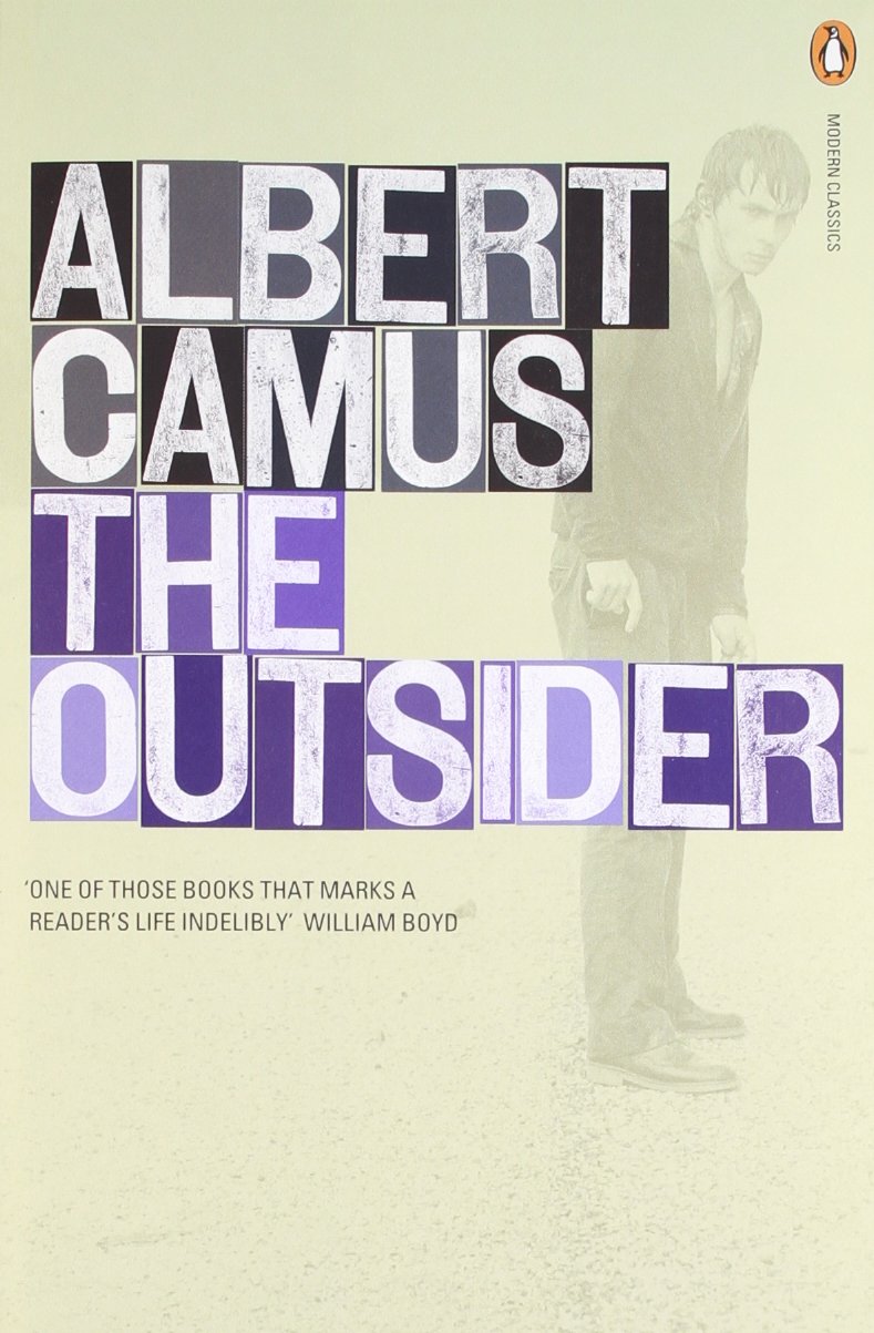
Over the summer, we were given the task to visually respond to one of four books. I chose the novel 'The Outsider' by Albert Camus. The story focuses on a man who is amoral and emotionally detached; thus considered an outcast from society. He doesn't cry at his mother's funeral, he doesn't believe in god and kills a man with no remorse. Camus discusses the theme of absurdity which deals with humanity's never-ending search for rationality in the universe. The protagonist, Meursault, expresses no reasons for his actions, so does not possess what is considered rational.
I felt a natural attachment to this because I too experience similar feelings of misinterpretation when encountering others. My style of work expresses this attitude of non-conforming with its raw edge and disregard for aesthetic clarity.
I read it over the summer and found it a fascinating read. Viewing it in depth encouraged me to begin interpreting it into one of my sketchbooks. I decided to first collect some original imagery to aid the response process. I used the same development technique last year with 'The Big Sleep' module.
I'll show my development in the next post.
Well... have been back.... for just over a month. I seem to have lost all momentum with this blog posting business. The summer holidays have perhaps numbed the mind somewhat, and now I intend to make my strongest ever effort!
Over the summer, we were given the task to visually respond to one of four books. I chose the novel 'The Outsider' by Albert Camus. The story focuses on a man who is amoral and emotionally detached; thus considered an outcast from society. He doesn't cry at his mother's funeral, he doesn't believe in god and kills a man with no remorse. Camus discusses the theme of absurdity which deals with humanity's never-ending search for rationality in the universe. The protagonist, Meursault, expresses no reasons for his actions, so does not possess what is considered rational.
I felt a natural attachment to this because I too experience similar feelings of misinterpretation when encountering others. My style of work expresses this attitude of non-conforming with its raw edge and disregard for aesthetic clarity.
I read it over the summer and found it a fascinating read. Viewing it in depth encouraged me to begin interpreting it into one of my sketchbooks. I decided to first collect some original imagery to aid the response process. I used the same development technique last year with 'The Big Sleep' module.
I'll show my development in the next post.
Thursday, 2 May 2013
The Discussion Forums
1) 'Digital vs Print'
Nathaniel and I presented our chosen discussion forum to the rest of the students. We talked about the negative effect digital media is having on print sales and how this will effect us as illustrators in a faster-progressing world.
I believe the reason to why digital media is causing this is because of people's lack of motivation. The internet has proven to be a quicker way to gain information than to visit a library and read a book. People nowadays take the quickest route to all sources.
We went on to discuss the advantage digital media has over hand-rendered work when it comes to moving an image. A way in which illustrators can embark on traditionalist methods in moving an image is through, for example, pop-up books. This is a limited field of course, but it requires no digital involvement and can obtain a far more charming interaction with the reader, as opposed to a .gif on a computer screen.
Digital has the upper-hand naturally with the use of digital recording equipment. The traditionalist way to make something move on screen would obviously have to be the medium of film. Digital media has caused these methods to be almost non-existent on the current market.
We do indeed live in a digital world but maybe it isn't such a difficult thing to incorporate the two together to gain more variety.
2) 'Where is the content? Where is the comment?'
The students who presented this discussion had read an article by Lawrence Zeegen who criticized the state of illustration today for excelling in aesthetics, but lacking in meaning.
He backs up this argument with David Shrigley's 'Fight the Nothingness' poster that was hung up outside Hayward Gallery in London. It is a protest by Shrigley to influence other illustrators to apply meaning in their work rather than put all the time and effort into just the draughtsmanship.
Zeegan claims that illustration has lost its way from discussing social topics into just becoming just a vacuous streamline. I agree with what the article is stating. Indeed this is happening, especially in the digital purist realm of illustration, and the market for 'pretty pictures' so to speak is becoming a hazard to what people perceive as 'good' art and 'bad' art.
In the eyes of a conventionalist, the works of Shrigley would be automatically considered 'bad' art (if there is such a thing) and only 'good' art would come from the likes of fine artists due to they're aesthetic taste.
3) 'Taste'
The students leading this discussion forum had answered the questions provided relating to a quote from a blog named 'Key Ideas' by Daryl Clifton. It discusses the role of taste and how it alters our lives.
It raises the question that as students learning about the art industry, are we working to how we want to work or are we just making other people happy? My answer to that would be that I take a little bit from column A and a little bit from column B. An example of the way I like to work would have been in The Big Sleep project with the sketchbook development I conjured. Column B applies because I felt my final outcome was trying to be stylized somewhat in order to be successful in the competition.
The likes of other people judging for themselves what is tasteful and what isn't is all a trend. It happens in fashion all the time. Last week it was 90's grunge, now this week it's 80's disco. Nobody truly has authority over that decision.
In the case of fashion, taste is hard to come by, especially if you're some way influenced by what is considered tasteful. Taste derives from within and I feel that some people are too afraid to express their true taste due to trends and such. If your work suddenly appears original and it is published, your work will no doubt become unoriginal in a week's time.
Creative Review
1) Paper Tigers, Peter Lyle

After making a presentation based around this Varoom article for context early this 2nd year, I feel it made an impression on my work. Lyle discusses how Le Gun (an underground illustration zine) is rebelling against the commercial influence in illustrative production. They also state that digital mediums should only be used as a tool because it is currently replacing our natural art heritage of hand-rendered work.
This theme has come up a few times during the course of the year: within context, the discussion forums and the advice people have given me about my working methods. I feel that illustration and art aren't what they once were, such as the great movements of the late 19th and early 20th Centuries. That period in time posed as modernism, and I believe that what this article is proposing is that we are living in a post-modern world where commercialism has devoured everything that was once underground and has simply plastered it all onto t-shirts. The article has made me more cynical I think, but it's at least raised my awareness.
2) Ways of Seeing, John Berger

I read this book to gain knowledge on how to better my critical writing skills. As well as that, it opened my eyes a lot more than they once were. Each of the essays within it increased my perception of things around me, such as: how we view art and where we view it (it's location being in various contexts). The essay that caught my attention most of all was the role that women play in society.
Berger discusses that women are the surveyed gender in society and that they are not only surveyed by men, but by themselves. I studied English Literature and History at A Level and both subjects included and delved into this social factor. Men have objectified women for centuries! The way I read it from those two subjects and from Berger's discussion, is that women are almost sometimes considered to be a sub-gender (even in today's world, both in Western and Eastern culture). Being a man, I perceive women just as equally as I do other men. It saddens me to think this has been happening for so long and it still continues today as though it's a social norm.
The reason why Berger exclaims that women survey themselves just as much as men do onto them, is because of the pressure placed upon them by the long-reigning patriarchal society. It also makes me wonder as to why women must suffer monthly periods and child birth too.
3) Manic (film)
I watched this film recently with my girlfriend and I really enjoyed it. It's about a teenager named Lyle (played by Joseph Gordon-Levitt) who gets admitted to a juvenile psychiatric ward because he beats someone up with a baseball bat. He has anger issues relating to his abusive relationship with his father.
The reason I like this film is because of the confined relationships he is forced to create with people in the ward. He befriends two people, Kenny and Chad, who both have similar social problems, and has a sexual relationship with a girl named Tracy (played by Zooey Deschanel) who has reoccurring nightmares of herself being raped. His relationship with Chad turns out the strongest due to their similar interests in music and their desire to escape the place to go to Amsterdam.
A connection and symbol within the film relating to the study of art is the scene where Sara and Chad are debating over what van Gogh's painting Wheat Field with Crows means. Sara says, "freedom" and Chad cynically responds that it is about, "depression and confinement because of the borders."
The main reason I enjoyed this film is because it brings back a sense of nostalgia of the 1990's. This is evident in my work because I particularly loved American cartoons and the music from that era. There is a scene in the film that evokes a great sensation in me. It's the scene when Chad puts the song Headup by Deftones on the stereo and everyone starts moshing out together. The sense of community I feel whenever I'm in a full-on moshpit at a gig is one of the best feelings ever...
Best scene ever.
'The birth of Radio' Animation
I have finally finished the animation for the brief and have uploaded it onto YouTube. Here it is:
There was a lot of editing to be made in After Effects which made me panic slightly due to the massive workload that also needed to be in. When I got to uni, I photographed each frame using a vertical stand for my camera so it would remain in the exact same spot as it took each picture. I then imported all the images into After Effects and began adjusting the time sequence so that each morphed image would run parallel with the sound of the broadcast. I made the reversals too by swapping round the frames in correspondence to the next subject being discussed by the broadcast. When I finished that, I moved onto adjusting the constant horizontal line. I realised it was too central within the frame and it was causing the tops of some of the images to be cut off. I went into the filter section and increased the contrast and levels which made the white background and black lines a flat colour. I then added another flat white background to fill in the entire space behind the frames. This allowed me to be able to drag the sequence down a third without there being a different shade above. I re-scanned some of the frames that had this problem and replaced the originals with them. Also what I could do is rub out some of the smudges that appear too often due to the background being a solid white colour. I could probably edit this tomorrow and render it again.
There was a lot of editing to be made in After Effects which made me panic slightly due to the massive workload that also needed to be in. When I got to uni, I photographed each frame using a vertical stand for my camera so it would remain in the exact same spot as it took each picture. I then imported all the images into After Effects and began adjusting the time sequence so that each morphed image would run parallel with the sound of the broadcast. I made the reversals too by swapping round the frames in correspondence to the next subject being discussed by the broadcast. When I finished that, I moved onto adjusting the constant horizontal line. I realised it was too central within the frame and it was causing the tops of some of the images to be cut off. I went into the filter section and increased the contrast and levels which made the white background and black lines a flat colour. I then added another flat white background to fill in the entire space behind the frames. This allowed me to be able to drag the sequence down a third without there being a different shade above. I re-scanned some of the frames that had this problem and replaced the originals with them. Also what I could do is rub out some of the smudges that appear too often due to the background being a solid white colour. I could probably edit this tomorrow and render it again.
I believe I have responded to the brief well with this piece. My reasoning for the constant line and the morphing forms was because it connoted with how radio signals are read. The flickering line almost represents both the speaker's voices as though they are speaking to the listener through radio communication. It also illustrates the historical information they speak of by morphing into what they are describing. Animation and sound together make very effective composition with one another. The two compliment one another through expressionism.
I can't believe it's the end of 2nd year! I hope I do well in this project and the other two.
1, 2, 3 Best Pieces of Advice
1. "David Shrigley, Paul Davis and Bragg - soon started to establish a school of drawing chic that prized emotional honesty over visual spectacle and charm over draughtsmanship, and saw crossings-out and wayward grammar as more forgiveable than vacuous sterile polish." Peter Lyle
This quote was taken from the Varoom article, Paper Tigers. This is not necessarily advice due to it being a quote, but rather more a source of influence. I feel that in my work that the more raw the image is, the better! Once I place an image into Photoshop to clean up, it loses its soul. The process of scanning something in and then, for example, adjusting it's contrast levels just seems to lose all respect for the hand-rendered stages. I feel that I don't want to work in Photoshop for this reason, but when a brief arises that requires some digital element, I feel that I HAVE to. This ruins the sense of enjoyment, and in turn, ruins the piece of work as I feel I am only working digitally for the needs of others.
2. "Concentrate on your drawing. Just keep playing." Ben Jones
This is an actual piece of advice that I received in person from Ben Jones when we were discussing what to put into my portfolio. Those probably weren't his words, but he delivered the same advice. He said that my drawings are evidently the main driving force within my work and that I should keep it as raw as possible. This I respect highly considering he has worked and been successful in the professional industry. He advised drawing on various surfaces and textures too, which I will take into consideration because my work always seems to be against a standard white background. And he also criticised my Big Sleep book cover due to it being clean and not messy enough. This makes perfect sense because my lead-up to the final outcome consisted of my best work and it was all purely hand-rendered. Therefore I shall keep playing with imagery within my sketchbooks.
3. "I get a kick out of being an outsider constantly. It allows me to be creative." Bill Hicks
Bill Hicks was a controversial comedian from America who performed stand-up during the 70's, 80's and early 90's. I had heard of him due to the legacy after his death, but only began watching him properly about two years ago. He satirised topics of society, politics, music and religion which is what I find humorous and can sometimes be evident in my work. This quote again isn't direct advice obviously, but it describes how I feel a lot. It may sound arrogant, but when I feel like I'm an 'outsider' I feel the need to rebel and this in turn makes my work a lot more creative and original. I think a shock factor is something I crave when I show people my work, which is what Bill Hicks always accomplished to his audiences.
Here's one of my favourite videos of him doing stand-up. He talks about musicians who 'sell out' and don't sing 'from the heart'. This further encourages my work ethic of doing what I want to do, rather than what someone else may want.
Sunday, 28 April 2013
Development on the Animation (and a few sneak previews)!
I have got down to getting this animation done! It's been a tough week with the PDP and context presentations, so now is the final push.
I have drawn each frame using pen and ink onto A5 horizontal sheets. It's a timely process, but it's a method I know works effectively from having done it before. Here are some photographs of my method:


This is my light box and it's the special ingredient within this whole process. It shines light through underneath with a standard light bulb. The cardboard right-angle corner on the light box keeps the frames in equal position. With out these the animation would be very messy and ill-composed.
I first drew the straight line on two separate sheets to attain the flickering effect. I did this by drawing one, then put the next sheet on top whilst on the light box. I deliberately hit and miss the previous line so the flicker is emphasized. I carry on this method throughout the whole of the animation, slightly moving the lines each time. A problem I faced at the beginning was that the ink wasn't drying quickly enough. I grew impatient and kept the process going, but the wet ink from the previous drawing would inevitably make a dark patch under the sheet was drawing onto. I began using my laptop as a heater which proved successful and convenient.
As I was drawing historical figures, places and machines, I had to research some reference in order to portray them properly, otherwise they'd just be random shapes. Putting in detail, such as one of the individual's facial expressions, proved difficult a couple of times because the ink may have ran slightly more than I wanted; thus making the face appear less like them.
Now for a few previews of my frames that I have drawn to show evidence of my reference:
Now comes the process of editing it all into After Effects. Wish me luck!
I have drawn each frame using pen and ink onto A5 horizontal sheets. It's a timely process, but it's a method I know works effectively from having done it before. Here are some photographs of my method:


This is my light box and it's the special ingredient within this whole process. It shines light through underneath with a standard light bulb. The cardboard right-angle corner on the light box keeps the frames in equal position. With out these the animation would be very messy and ill-composed.
I first drew the straight line on two separate sheets to attain the flickering effect. I did this by drawing one, then put the next sheet on top whilst on the light box. I deliberately hit and miss the previous line so the flicker is emphasized. I carry on this method throughout the whole of the animation, slightly moving the lines each time. A problem I faced at the beginning was that the ink wasn't drying quickly enough. I grew impatient and kept the process going, but the wet ink from the previous drawing would inevitably make a dark patch under the sheet was drawing onto. I began using my laptop as a heater which proved successful and convenient.
As I was drawing historical figures, places and machines, I had to research some reference in order to portray them properly, otherwise they'd just be random shapes. Putting in detail, such as one of the individual's facial expressions, proved difficult a couple of times because the ink may have ran slightly more than I wanted; thus making the face appear less like them.
Now for a few previews of my frames that I have drawn to show evidence of my reference:
 |
| Telegraph and Telephone |
 |
| Thomas Hardy |
 |
| 19th Century Generation |
 |
| Thomas Edison |
 |
| Lyon |
 |
| Sean Street |
Now comes the process of editing it all into After Effects. Wish me luck!
Monday, 22 April 2013
My Idea and Storyboard
Now to properly begin focusing on the animation! I have listened to the radio broadcast a few times now and I have written down the times for whenever a different subject is listed. Here is my storyboard:


This is a rough version of how my animation will play out. I hadn't collected my image references by the time I did this, so forgive me if the images look a little off. The way I want my animation to run is to have a horizontal line constantly going across the the frame. This line will be 'shake-y' like my creature animation, as in that I'll draw two or three frames for each lingering image. By this I'll be using a light box, but I won't explain that process yet. I'll show my development with it in one of the next blog posts.
As the line lingers and the duration of the broadcast plays, images will morph themselves from the line upwards. Each image will appear whenever their name is mentioned, such as the telegraph and telephone. These images will also linger for some time too, so I will apply the same method as with the straight line. The gradual morphing drawings will consist of about 5 or 6 frames. These will then reverse back into the line again when the next subject arises. Here is a test example of what I am explaining:
 |
| Test Storyboard |
See how the globe moulds out of the line and then sinks back into it? That's how the animation will appear. When the image lingers, I will add something to make parts of it flash as it goes from frame to frame. Now I just need to use my image reference to begin drawing out what I want the images to look like.
I Wish I'd Done This
 |
| David Hughes |
Firstly its style consists of a scratchy black line technique, which is done no doubt by using a nib/pen and a pot of ink. His method displays various depths in each of the drawn lines. The lines that appear thin acquire the ability to swerve in and out of the figure's faces, in turn creating facial features such as wrinkles and muscles. These details appear mostly around the figure's eyes: the brows and the bags underneath. What the thin line does most importantly is create each of the cast's outlines. Their raw and aggressive nature is a definite influenetial quality seen within my own work.
The other type of line seen within the image are the thick ones, which are used to create the image's constructive border. They appear less, compared to the thin ones, because they are possibly deliberate mistakes made by Hughes and his penwork. The flicks of ink too can be seen scattered throughout the composition. These are also more qualities I find within my own work, which adds to the rawness. The ink too has been possibly used to fill in areas, such as the boots of the figure on the left and the bombs dropping from the sky.
Going back to the detail element within each of the figure's faces, I notice that another method has been used to create shading. I imagine pencil has been used for this. It is subtle and compliments the scratchy lines in that it looks as though Hughes has gone to the effort of making the ink lines miniscule!
As well as the use of line within this image, colour has been used to make the image more aesthetically appealing. The colour template conists mainly of various shades of murky yellow. The paper Hughes has used to present this image on plays as the catalyst for other uses of colour. It's beige tone plays as the background, whilst the colours layered on top are darker creating a sense of depth. The other shades of yellow/mustard emphasise various shapes that Hughes has featured, including the hammer and sickle and hats. Other colours are used also, such as white, kharki green and an orange/pink blend. The most noticeable colour used is the striking red in the top left-hand corner of the image. Its colour relates to the image's context in that it colours a Nazi swastika flag.
Furthermore, the image's composition consists of six casts: The bull faced figure on the left, the bull faced figure on the right, the camera headed figure stood on a box, the falling bombs, the windmill and the Nazi flag. They are all enveloped inside a basic sqaure-shaped border which sets a narrative or scene. Also there is a sense of hierarchy from how I listed each of the casts. The bull faced figure of the right appears most prominient as its head is the largest. The other bull faced figure comes either second or third due to the strking colour of the Nazi flag. The other three casts are presented within the background and prove they're lower down in hierarchy.
Another potential cast would be the mustard coloured sky at the top of the composition. Its role develops the narrative of the image into having a sense of place and environment. The sky hints that the area in which the other casts are placed is some sort of flat plain. This reminds me of my animation for the mythological creature project. The use of a single horizontal line sets a basic but effective landscape in that it can behold infinite possibilities in size and scale. It plays with the idea of perspective and distance too. I have used this quality in the past a lot to create my narratives, i.e. when I was a child. The other use of lines towards the bottom of the image create the sense that the cast members are on some sort of stage. This relates to the context of the image which I will be discussing next.
Finally the context of the image presents many ideas and themes that I take general interest in. The first quality to be noticed is the swastika. This immidiately brings to the attention of what context this image is in. The context is obviously not pro-Nazism: it is historical. The larger bull faced figure on the left is holding the flag and appears to be in the attire of someone from the SS. This cast member represents a Nazi. The smaller bull faced figure on the right is holding a hammer and sickle and is dressed in workmen's dungarees. This cast member represents a communist (most likely Soviet). In historical context, these two extreme political powers were against each other during the course of WWII. The figures both stare at one another with mean intensity which represents their conflict.
The reason why the communist figure is smaller is due possibly to the spears going into its back; otherwise, it's unclear. This could however bring in another historical context: the Spanish Civil War. The bull is a prominent symbol of Spain and is involved within their national sport of bull fighting. The bull fighter, if the chance is given, stabs the bull in the back with his sword of lance. This is possibly what is represented here, in that the communist rebels of Spain were depleated by the fascist state (in which the Nazis also helped fight against). Perhaps even that the so-called 'Nazi bull' is instead a fascist and is luring the communist into the its fatal trap with the red flag (as they do in the performance of the sport). Also what is noticeable is the direction in which the bombs are descending. A curved dotted line hints that the bombs are swaying towards the flag, implying even more destruction. This brings to the table that the context represented is perhaps a mixture of things which have occured in the past between the two political sides instead of it just being about WWII. However another element of the piece informs connotation with European culture; this being the windmill in the background.
The final element to be discussed is the figure in the background with what appears to be a camera for a head. The figure's attire connotes that of a film director. The figure is also holding a megaphone, as though he is about to direct what is happening in the foreground bewteen the two bull faced figures. This also brings up the idea again that the bull faced figures are stood on what appears to be a stage platform, due to the lines drawn underneath them. Does this evoke that the battle between these two sides of politics is almost like a drama? Or even that the battleground is somewhat like a theatre?
Thursday, 11 April 2013
Animation Research
Now that I am going to create a new animation, I wish to use the same method as I did with the mythological creature project. First off, here are some animators I have taken influence from for this project and previous ones:
David Shrigley
An illustrator I've used as research before, Shrigley always achieves my approval. This animation expresses his random sense of humour and deliberate imperfections with his use of line. The animation, along with his others, create narratives that seem like something that would happen in everyday life, but then become twisted somehow. It's performed in an innocent childish way too which expands his abilities in allowing random things to occur.
Peter Millard
When playing this, have the volume turned down. Kept making me jump with the random silences and then the sudden outbursts of noise! I stumbled across Millard recently and realized he's doing exactly the same method as me, only with far more frames I imagine. The childish-like crude behaviour in this animation makes me laugh. I also noticed he applies colour in his animations; something I could possibly begin doing myself.
Willis Earl Beal
This animation was made using graphite. It's a very useful medium because it does all the things a pencil does, but better! The various shadings and lines used throughout this animation evoked a very sombre atmosphere along side the song which I believe Beal scored himself as well. The string instrument (probably acoustic guitar) being played alongside the quiet melodic singing sounds as though it was recorded through something very old - the sort of quality you hear with old blues music. This emphasized character's moody nature as he went about his day with a glum expression. Each of the frames had a grainy, scratchy effect like an old film roll. This could potentially work within my animation since it discusses in context with the late 19th and early 20th Centuries.
Tuesday, 9 April 2013
RA D IO_4
I hope the title is legible! I based it on the In Rainbows album cover type style by Radiohead. Anyway, onto the next and final brief of 2nd year!
Again the rest of the students and myself were given the choice of three briefs to choose from. I chose to take on another animation project. The task is to create at least a minute long animation to go alongside a BBC Radio 4 broadcast. There were four to choose from and I chose the one titled 'The birth of Radio'.
I listened to all four but this one appealed to me the most because it spoke of social historical changes, which I always find fascinating. It goes over and brings into context: the Industrial Revolution, the British Empire, the first of radio technology, Victorian England, Thomas Hardy and even the French Revolution! Its main topic point is to do with 'wireless telegraphy' and its inventor, Guglielmo Marconi.
Here is the radio broadcast and some background knowledge to do with 'wireless telegraphy', Guglielmo Marconi and other elements related:
http://www.bbc.co.uk/programmes/p010qnhc
'Wireless Telegraphy', sourced from Wikipedia
Wireless telegraphy is a historical term used today to apply to early radio telegraph communications techniques and practices, particularly those used during the first three decades of radio (1887 to 1920) before the term radio came into use.
Wireless telegraphy originated as a term to describe electrical signalling without the electric wires to connect the end points. The intent was to distinguish it from the conventional electric telegraph signalling of the day that required wire connection between the end points. The term was initially applied to a variety of competing technologies to communicate messages encoded as symbols, without wires, around the turn of the 20th century, but radio emerged as the most significant.
Wireless telegraphy rapidly came to mean Morse code transmitted with Hertzian waves (electromagnetic waves) decades before it came to be associated with the term radio. Radio-telephony by 1920's began to displace radio telegraphy for many applications and was the basis of public broadcasting. Radio-telegraphy continued to be used for point-to-point business, governmental, and military communication, and evolved into radioteletype networks. Wireless telegraphy is still used widely today by amateur radio hobbyists where it is commonly referred to as radiotelegraphy, continuous wave, or just CW.
Guglielmo Marconi, sourced from Wikipedia
Guglielmo Marconi (25 April 1874 – 20 July 1937) was an Italian inventor, known for his pioneering work on long distance radio transmission and for his development of Marconi's law and a radio telegraph system. Marconi is often credited as the inventor of radio, and he shared the 1909 Nobel Prize in Physics with Karl Ferdinand Braun "in recognition of their contributions to the development of wireless telegraphy". As an entrepreneur, businessman, and founder of the The Wireless Telegraph & Signal Company in Britain in 1897, Marconi succeeded in making a commercial success of radio by innovating and building on the work of previous experimenters and physicists. In 1924, he was ennobled as a Marchese.
By 1897, Guglielmo Marconi conducted a series of demonstrations with a radio system for signalling for communications over long distances. Marconi is said to have read, while on vacation in 1894, about the experiments that Hertz did in the 1880's. Marconi also read about Tesla's work. It was at this time that Marconi began to understand that radio waves could be used for wireless communications. Marconi's early apparatus was a development of Hertz’s laboratory apparatus into a system designed for communications purposes. At first, Marconi used a transmitter to ring a bell in a receiver in his attic laboratory. He then moved his experiments out-of-doors on the family estate near Bologna, Italy, to communicate farther. He replaced Hertz’s vertical dipole with a vertical wire topped by a metal sheet, with an opposing terminal connected to the ground. On the receiver side, Marconi replaced the spark gap with a metal powder coherer, a detector developed by Edouard Branly and other experimenters. Marconi transmitted radio signals for about a mile at the end of 1895.
Industrial Revolution, sourced from Wikipedia
The Industrial Revolution was the transition to new manufacturing processes that occurred in the period from about 1760 to some time between 1820 and 1840. This transition included going from hand production methods to machines, new chemical manufacturing and iron production processes, improved efficiency of water power, the increasing use of steam power and development of machine tools. The transition also included the change from wood and other bio-fuels to coal. The Industrial revolution began in Britain and within a few decades spread to Western Europe and the United States.
The Industrial Revolution marks a major turning point in history; almost every aspect of daily life was influenced in some way. Most notably, average income and population began to exhibit unprecedented sustained growth. In the words of Nobel Prize winner Robert E. Lucas, Jr., "For the first time in history, the living standards of the masses of ordinary people have begun to undergo sustained growth ... Nothing remotely like this economic behaviour is mentioned by the classical economists, even as a theoretical possibility."
British Empire, sourced from Wikipedia
The British Empire comprised the dominions, colonies, protectorates, mandates and other territories ruled or administered by the United Kingdom. It originated with the overseas possessions and trading posts established by England between the late 16th and early 18th centuries. At its height, it was the largest empire in history and, for over a century, was the foremost global power. By 1922 the British Empire held sway over about 458 million people, one-fifth of the world's population at the time. The empire covered more than 33,700,000 km2(13,012,000 sq mi), almost a quarter of the Earth's total land area. As a result, its political, legal, linguistic and cultural legacy is widespread. At the peak of its power, the phrase "the empire on which the sun never sets" was often used to describe the British Empire, because its expanse across the globe meant that the sun was always shining on at least one of its territories.
Telegraph, sourced from Wikipedia
An electrical telegraph is a telegraph that uses electrical signals, usually conveyed via telecommunication lines or radio. The electromagnetic telegraph is a device for human-to-human transmission of coded text messages.
The electrical telegraph, or more commonly just 'telegraph', superseded optical semaphore telegraph systems, such as those designed by Claude Chappe for the French military, and Friedrich Clemens Gerke for the Prussian military, thus becoming the first form of electrical telecommunications. In a matter of decades after their creation, electrical telegraph networks permitted people and commerce to almost instantly transmit messages across both continents and oceans, with widespread social and economic impacts.
Phonograph, sourced from Wikipedia
The phonograph, record player, or gramophone (from the Greek: γράμμα, gramma, "letter" and φωνή, phōnē, "voice"), is a device introduced in 1877 for the recording and reproduction of sound recordings. The recordings played on such a device generally consist of wavy lines that are either scratched, engraved, or grooved onto a rotating cylinder or disc. As the cylinder or disc rotates, a stylus or needle traces the wavy lines and vibrates to reproduce the recorded sound waves.
The phonograph was invented in 1877 by Thomas Edison. While other inventors had produced devices that could record sounds, Edison's phonograph was the first to be able to reproduce the recorded sound. His phonograph originally recorded sound onto a tinfoil sheet phonograph cylinder, and could both record and reproduce sounds.
Subscribe to:
Posts (Atom)