Wednesday 30 January 2013

Gathered Cultural Reference for The Big Sleep

 From reading and analysing the themes, motifs and symbols witnessed in the novel, I have begun gathering reference to use and take influence from as I start to develop my work for the brief. Here are a few images I have collected:

Mad Men
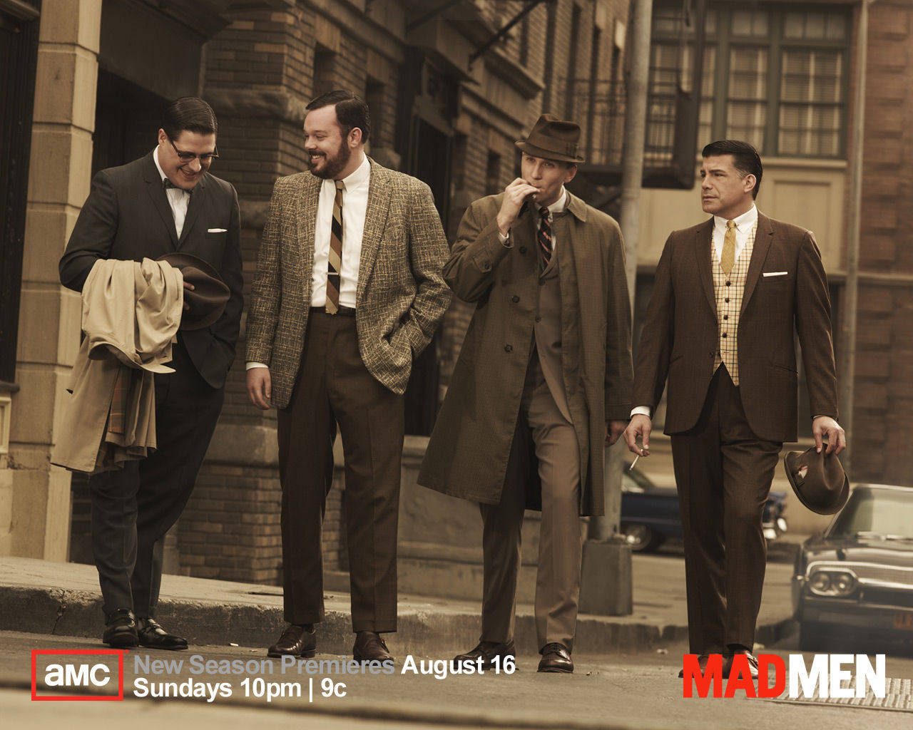
 Mad Men. Although set in the 50's and 60's, the attention to detail they craft within the show must be taken credit for. The corporate lifestyle these four characters have connotes to the lives of the characters within The Big Sleep: the fashion, the cigarettes, the alcohol, the offices, etc.

L.A. Noire
 I saw this video game advertised and it certainly connotes with the what the brief is asking for. Unfortunately I have not had the chance to play this game, but its imagery illustrates what's in store. Even the title shows that this game is potentially influenced from The Big Sleep. Then again, the novel was the first of its kind and no doubt had a huge input towards the many crime stories that came after; thus making this game not necessarily a direct influence. This game also beholds a 'film noir' vibe which was a genre of crime drama created during the 40's and 50's. The Big Sleep possesses this aspect too.

'Film Noir'
 This genre of film is widely known and is always generally connoted with detective stories. The use of light and shadow are the key elements within this. They emit complete symbolism and make characters appear more so mysterious and shady. They're highlighted further with the use of monochrome, due to the period in which they were shot. The images that came from these films create the typical scenario of what an American detective must endure. These techniques can be effectively played with in making an image.

The Big Sleep (film adaptation)
 The book itself was adapted into a film. I unfortunately only got chance to see half of it, but as I've read the book, I think I'll be fine. It acquires the same 'film noir' qualities of that era and the poster itself emits the time it was made. The bold typography, the sex appeal (the female figure) and the action scenes photographed display an obvious film genre of scandal and corruption. In order to keep as authentic as possible to the period when designing the book cover, perhaps this use of composition could be very effective in visually delivering the context. It's a charming poster more than anything, as were most film posters in those days.

Tuesday 29 January 2013

Saul Steinberg (again)

 Saul Steinberg, what would I do with out you? The works of this individual have yet again come to great use. His style especially relates to that of my own due to it being simplistic and cartoon-y. He mainly depicts people's foibles within society, all with the simple use of line. As well as that, the era in which he depicts relates heavily around the same era as The Big Sleep. His drawings of American society with its architecture, busy streets and geography all connote with this book in my eyes. Here are some examples that show evidence of this:

Graph Paper Architecture
Wyoming
'LA'
Papers
'Fingerprints'
Miland via Pascoli

Penguin Artist Research

 I have gathered a few images from artists that are helping build my sense of place. The time and location within The Big Sleep are key for achieving authenticity. Here they are:

Nuno DaCosta
Miminne
 Thinking in context of the era of how things looked, I immediately thought of fashion. As in all stories, people are described from the way they look at first glance. The fashion within the era is extremely recognizable, so that's definitely something to play on. These two artists illustrate fashion in a style similar to my own, with the pen and ink drawings I conjure.

Ceri Amphlett
 This image caught my attention with its raw style and context. From reading the book so far, characters are disappearing mysteriously or either getting themselves killed; maybe even both! This image looks as though the figure is submerged in water. As in a lot of murder cases, bodies can be found in water. In the story they find the chauffeur's car in a lake.

Marisol Escobar
 Again, the fashion aspect applies with this artist too. Male attire in those days was a lot more formal than it is now. This again connotes the time and place: detectives, gangsters, businessmen, etc. Such an interesting and slick time...

Benoit Jacques
 I found this image and it immediately took me to LA. The coastline and palm trees are both connotations. The style too is also what I find influential.

The Penguin Book Cover

 After the jolly season that was Christmas, we were back in uni and a new brief was set. There were a choice of four briefs, each being a competition. I chose the Penguin/Puffin book cover design one because I really enjoy reading and the chance of my design being on a classic novel is a dream!

 The brief offered two books: The Wind in the Willows and The Big Sleep. I chose the latter due to it being unfamiliar to me and from reading up on it I prefer the subject. So as always, I began researching and creating a 'sense of place' where I collect imagery together to gain connotations and references. I also began reading the book and found it's story to be a first of its kind. It's a crime novel set in 1930's LA and acquires what we see today as typical plot twists. In its day however this sort of story writing must have been very revolutionary. Whilst reading it I notice that it seems almost like watching a film. The culture and time its set in is sure to be rich of imagery.

 Here is an analysis of the story: http://www.sparknotes.com/lit/bigsleep/themes.html

Saturday 12 January 2013

The Final, Final Outcome!

 After my assessment, the tutors made their criticisms about my final piece. They advised I should edit two elements of the image: the figure and the jars. Here it is below:


 I wanted to make the jars appear a lot more structured and taller, so I traced a photograph of a sweet jar that I had previously used as reference and put it into Photoshop. For the reflections on the glass I rotated the scan and used the edges from the opposite side. I erased parts of the lines out slightly giving each jar variation and made them white. I applied the same technique for the underneath perspective view of the lid, except I kept the lines black. For the red colour of the lid I simply used the bucket tool and made the underneath part a shaded tone version. I added thin, vertical, black lines onto the lids for an authentic texture.
 The figure I drew out by hand, as I did with the jar, and I based his stance from the 1950's youth subculture of 'greasers'/rockers. My previous figures remained generic, so I wanted something with more character and attitude; something with a very noticeable presence. A greaser seemed perfect, since they came about the era of Joyce's youth. I put the figure into Photoshop also and increased the levels to make him a silhouette.
 For the rest of the elements of the image, I used the previous techniques because I was already happy with them. I increased the contrast of the photographed sweets and made use of the perspective from the jars by putting an underneath surface to the shelves. I increased the levels to each wood surface giving the image more depth and tonal variation. The image is also a lot more cropped compared to the last one because I wanted the figure of Richard to stand out more.

Wednesday 9 January 2013

Joyce's Sweet Shop Unveiled!

 I now knew where I was heading. I redrew the jar shape using marker pen to heighten the boldness of the basic shape. I even redrew the shadowy figure of Joyce's husband, this time possessing a 60s/70s haircut which would have probably been the time she met him.

 I scanned the images into Photoshop and increased the contrast and line thickness to emphasise the shapes. For the sweets, I took a photograph of one of each to create a good mixed variety for the outcome. I inserted them into Photoshop also and increased their edge thickness to go alongside the jars. I rotated and flipped each of the duplicated sweet photos to represent how piled up they are within the jars.
 I made three shelves visible within the image with sweet jars all stacked alongside one another and placed each of the sweets around from the centre. The centre displays Richard's figure and shadow, which is deliberate because he wouldn't be as obvious. I placed him along the edge of the jar to emphasise his visible yet small presence, in turn representing Joyce's only memory of him: a figure in the background.

 Here is my first draft of the final outcome:


 It proves more effective than just the single jar! However, the wood texture I used doesn't seem very evident. Also the jars could do with some sort of reflection to make them appear more like glass.

 Here's my final outcome:


 Much better. The wood texture is a lot more defined and I simply used the paint tool in Photoshop to put in those small reflections on the sides of the jars.

Joyce and the Sweet Shop!

 After my conversation with Joyce and a group discussion back at college, I realised that the history of her and the sweet shop in which she lived in was perfect in displaying her memories. The memory of her husband, Richard, was a prominent factor also because of the way she described her lost memories of him.

 I began researching images of old sweet shops in the heritage section at Stockport Library. I gathered a lot of imagery and started developing from there. I even went to Stockport Market to buy some classic old English sweets, such as: Black Jacks, acid drops, pear drops, rhubarb and custard and liquorice torpedoes.
 My initial idea for the image was it to be inside the sweet shop concentrating on the jars of sweets stacked along the shelves. Joyce's memories could be displayed in each jar, but I'm not sure I have enough strong memories to put in them. Perhaps just her husband, Richard, and the rest just filled with sweets to give the image more autheticity of an old sweet shop.
 I had a one-to-one with another student, each of us expressing our thoughts on one another's ideas. The other student applauded my idea, but wondered whether I could reduce the jar-stacked shelves and just have the one jar taking up all the space on the page. If I did this then Joyce's husband would most probably be within this single jar. The problem though was how to make the jar appear like a genuine sweet jar without any sweets in it.

 I tried the single jar idea and it came out like this below. It was rushed slightly because I still wavered upon the idea:


 Seeing as it's at rough development stage, I can sympathise with it. The lines used I believe should be bold and better shaped. The sweets should be detailed, individually displaying each sweet. The male figure appears generic also, so perhaps I should make further research into how men dressed in the era Joyce met her husband. Regardless, I believe more sweets and jars would prove more effective. The jar style I drew is how they appeared in the Stockport sweetshops when they sold the Squirrel brand of sweets, so that design will remain.

Age UK: Buildings

 For this project, the Age UK association gave us the task to record and illustrate people's memories of Stockport for a book they were investing in. The topic choices given were wartime and buildings. I decided to choose buildings because I felt I knew too much about the war time period, so a challenge was nice.

 The people's memories, which we would be gathering, were from people who suffered from dementia. at first this made me cautious as it is a delicate subject. It drove me however because it was such a good cause. Our group were to meet at the Day Care Centre in Reddish on the following Tuesday.

 We arrived on the day and were briefed what would happen. It was a rather relaxed atmosphere when we arrived, but I still remained anxious. We walked into the room in which the people we would be talking to were comfortably sat having morning coffee or tea. I was casually put with a woman named Joyce and so we began to chat. Here is my anecdote of our conversation:


“He’s a figure in the background...”Joyce

 On Tuesday, 11 December, I had the lovely encounter of a woman by the name of Joyce at the Day Care Centre in Reddish. Joyce unfortunately suffers from dementia, so the task I was given was to seek knowledge from her background through asking a series of questions.

 Well firstly she wasn't originally from Stockport, but from Leigh in Lancashire. She attended Leigh Grammar school for girls when she was younger and remembered having a talent for maths! She lived in a sweet shop with her family during the Second World War. She confessed sweetshops were a rarity and that living in one made her feel lucky due to the food rations. She also confessed stealing sweets from time to time. She mentioned that when the bombs fell she would hide under the stair case. The explosions never came close fortunately. She mentioned at this point that I remind her of a relative, but she could not remember who sadly.

 When Joyce became an adult she joined the civil service and became a short-hand typist for the building firm, Taylor Woodrow. I found it highly ironic that she was involved in buildings, due to the context of my questions. It was in this part of her life that she met her husband, Richard Howard. Not catching Joyce’s surname, I assumed the same as her husband’s. I asked what he was like and why she fell for him, but she sadly couldn't remember him. “He died too young”, she said simply, thus making Joyce a widow. Her quote that stood out was when she described Richard as ‘a figure in the background’. I found this incredibly poetic, moving and inspirational.

Tuesday 8 January 2013

The Collaboration Log (Continued 5)


Wednesday, 21/11/12

  • We decided to distribute them around places in Manchester where our audience (students, young adults) would most likely see them, for example, Northern Quarter, Fallowfield.
  •  Tinashe began distributing his and Mat’s that day as Mat was preparing to illustrate the responses.
  •  Joe and Natalie had work, so were unable to do it for this day.


Thursday, 22/11/12

  • Joe and Natalie began distributing during the day, but had the unfortunate encounter of heavy rain and gale force winds, so planned to venture out again the next day.


            Friday, 23/11/12

  • Joe and Natalie ventured out again and posted them around Fallowfield and Stockport; documenting with the camera in the process.


The following days no responses came in and it was Tuesday, 27/11/12 in which we pitched our idea to the groups.

Answers of the People Facebook Page

One of my four posters


The Collaboration Log (Continued 4)

Tuesday, 20/11/12

  • Mat, Joe and Tinashe met in room 4.106 again to begin informing each other of what they had gained over the weekend.
  • Natalie was ill so wasn’t in.
  • Joe had expressed himself through drawings in his sketchbook of people in distorted formations. He even represented his idea for the gig poster if it would come to that.
  •  Joe had looked through the dictionary to link random words together, following the influences previously thought of on Friday. They were: Boot Boy, Column Commoner, Fluorescent Food and Parsnip Pastel.
  • Mat suggested the idea of making a poster related to the protest group ‘Anonymous’ due to its nature of having no leader and no official members.
  • He also suggested the idea of parodying the 2012 Mayan prediction claiming it to be illogical.
  • He suggested things of a morbid nature but Joe spoke on Natalie’s behalf and said the group should keep things neutral.
  • Tinashe told Joe and Mat of his idea relating to ‘Nightmare on Elm St.’ suggesting we make a social event of some kind and inviting people to experience what happens in the film.
  • Joe then suggested the idea of getting people to interact with us via text. We would ask them a question and they would answer.
  •  This spurred on Mat and Tinashe and started suggesting questions like: ‘How was your day?’, ‘Plans for the weekend?’ and ‘How are you?’
  •  Joe then suggested making it more eccentric and took influence from the Monty Python question: ‘What is the average air speed velocity of an unladed swallow?’
  • Then Joe and Mat suggested basing it around typical ‘Manc’ sayings like: ‘Cold, innit?’ and ‘They don’t make ‘em like they used to.’
  •  Mat then suggested making the question surreal and philosophical, such as: ‘I’m thinking red. Discuss.’, ‘Should I?’ and ‘Any questions?’
  • This left us deciding for a while whether we wanted the question to be vague or eccentric.
  • We had an initial idea set out which was: the poster with a logo, a question and a number to respond to on it.
  • We then had the tutorial with the tutors and Natalie had just arrived.
  •  Mat, Joe and Tinashe presented the various ideas we had before going onto the concept of a phone.
  • The tutors seemed happy and told us to hastily make the posters as the process of making them was less irrelevant as compared to people’s responses.
  •  Natalie then introduced her ideas to the table which were to do with old phrases and sayings, such as, ‘A taste of your own medicine.’
  •  The tutors also applauded her ideas and told us to incorporate the old sayings within the questions which would be asked within the posters.
  • After the tutorial we all began discussing how we would process this.
  •  Natalie suggested each of us having an old phrase/saying and with it makes four surreal or vague questions to give the phrases a much more varied response by appealing to people differently.
  •  Tinashe now disregarded the logo idea due to our time schedule and suggested the phrase/saying should be designed and should stand out.
  • Tinashe also said he had an old phone at home with a SIM card, so that was one problem sorted.
  • Joe then suggested making a Facebook page in which we could put our illustrations of the responses we would get, in order to make the viewer seem more interested in texting.
  • Natalie vowed to send us all various phrases to choose from and to give examples to fully explain her concept.
  • After a lengthy discussion, we all agreed the format should consist of: our own individual style (to make introduce more range) of an A4 portrait poster with a typographical phrase in visual connotation at the top, one of the four questions underneath, the number in which to respond to underneath that and the Facebook page at the bottom which Joe would create.
  • We vowed to all login on Facebook tonight to send each other information and to begin the overrall process.
  • Tinashe sent us all the phone number and Joe sent the link to the Facebook page to put on the posters.
  • Natalie researched and sent the various old sayings and phrases all beginning with the letter ‘a’ to give the posters more unity and explained the format of making four questions out of one of them. She even made a visual example out of scrap.
  •  Tinashe chose ‘A leopard cannot change its spots.’ And his question was ‘Can we break from the conceptual?’
  • Joe chose ‘A house divided against it self cannot stand.’ And his four questions were: ‘Straw, sticks or bricks?’, ‘What makes a home?’, ‘How do you get a full house?’ and ‘What’s the result of a divided house?’
  •  Natalie chose ‘A stitch in time saves nine.’ And her four questions were: ‘What does your mind fester on?’, ‘What leads you to procrastinate?’, ‘If you had an infinite amount of time, would you value your mandatory work?’ and ‘Do you feel the value of craft has been lost?’
  •  Mat chose ‘Absolute power corrupts absolutely.’ And his question was, ‘Can absolute power ever be a force of good?’
  • Tinashe then suggested distributing them by Wednesday evening.

Chav


The Pope's Preaches

Gig Poster

Manc

Take a walk...

Screaming

Regret

The Collaboration Log (Continued 3)

Friday, 16/11/12

  • We all came in for 10 and met in room 4.106 to begin discussing ideas.
  • Mat’s first point of research was the infamous ‘OBEY’ poster, which spurred on the idea of our outcome being somewhat political.
  • Natalie disregarded this political theme, so we dismissed anything related to it.
  • We decided to move to the Mac suite to gain more visual research.
  •  Natalie presented her ideas to Mat and Tinashe from Wednesday which kept us more open-minded.
  •  Joe began bouncing off more of Natalie’s ideas and began researching image techniques. He suggested the band Melvins album cover ‘Houdini’ because it displayed an innocence but had subtly contained deformity. We all agreed it was an interesting concept.
  •  Had the initial idea of having a phrase, so began researching and imagining words.
  •  Joe looked at previous text messages of his to gain ideas and suggested the phrases ‘Where are you?’ and ‘Empty Subject’ which spurred on the ideas of vagueness and philosophy.
  • Mat bounced off the idea and gave a load more including: ‘Everything’s gone blank’ and ‘There’s nothing there’.
  • Mat also suggested ‘Traveling Insomnias’ which in turn spurred Joe on to suggest a dictionary as a good source for putting random words together. David Bowie’s lyrics and Muse’s song title ‘Muscle Museum’ were good examples of this.
  •  As well as ideas for phrases, we all began thinking of how we would display our message/information to the public. Mat suggested the use of stickers due to them being easily distributed without any danger of prosecution.
  • We researched how much stickers would cost and found it to be too expensive, so started thinking of posters.
  • Tinashe daringly suggested we could make them at least A3 in size to alert the public more.
  •  Going back off the idea of the Melvins album cover, Joe suggested a fake gig poster: something that appeared not as it seems.
  • He also suggested an American 50s style poster relating to a post-apocalyptic context, based upon the video game Fallout 3.
  • Mat, Tinashe and Joe all had the initial idea of having a potential logo for the posters.
  •  Mat suggested a face of some kind, like the V mask.
  • Joe suggested a quick paint stroke or two to represent something universal (something anyone could participate in) also spurring on the idea of a movement.
  • Tinashe showed us his previous work on logos due to his experience in graphic design.
  •  Tinashe also showed us logos from a website he refers to named ‘fromupnorth’ which spurred on the idea of basing something to do with Manchester’s culture and its public.
  • We had discussed various ideas but still hadn’t fully fixed our motives for what our idea properly would consist of, which was a good thing because it kept us open minded.
  • We vowed to carry on development from today and to keep on researching.

http://obeygiant.com/store/images/P/offsetobey.jpg
http://www.themelvins.net/wiki/images/7/7a/Melvins-houdini.jpg
http://www.thatvideogameblog.com/wp-content/uploads/2008/04/vault-boy2.jpg
http://takemydough.com/wp-content/uploads/2012/03/v-for-vendetta-mask.jpg

The Collaboration Log (Continued 2)

Thursday, 15/11/12

  • Natalie made further notes such as visual representations of the surreal that we see everyday; one in the form of a cartoon (for a DJ advertisement) of strange animals out of context, using quirky strap lines when sat at a restaurant, “There’s a bass line in my soup.”
  •  She also suggested incorporating a positive protest. The group questioned whether this could be done as most of the ones we encounter are of a political nature, for example it was suggested that the fable idea could be applied to modern day to express how much things have developed how lucky we are to live in this day and age, by applying modern day reflection of life within the context of folktale quaint imagery to work in harmony in suggesting how lovely things are now.
  • She also suggested research on Ricky Gervais’ ideology on Atheism, but we discussed this wouldn’t be wise as it would offend a percentage of our audience.


The Collaboration Log (Continued 1)


Wednesday, 14/11/12

  •  Joe and Natalie came in to college independently to discuss ideas.
  • Natalie brought up the idea of surrealist humour and research sources included: Monty Python/Terry Gilliam, Noel Fielding’s Luxury Comedy and Salad Fingers/Take this Pill by Doki66 (YouTube channel). This spurred the idea of a performance of a bizarre occurrence (themed event) with the use of costumes and masks.
  •  Natalie also suggested surreal music videos from artists including: Lady Gaga, The Horrors (Sheena is a Parasite) and Aphex Twin.
  • Natalie referred to also how we could incorporate the surreal into language and suggested the source ‘The Man Who Mistook His Wife for a Hat’ by Oliver Sacks.
  •  She also suggested surrealist photography like the work of Stephen Gill who played with the elements of combining one meaning within the image with the use of relief objects upon the image once retaken would adapt this meaning changing the way the audiences perceive it; thus adapting the reality of the subject matter.
  •  Natalie was intrigued by the idea of the eccentric and creative language.
  •  She even suggested producing an invented code, some sort of cryptic language with references such as hieroglyphics and Nadsat taken from Anthony Burgess’ Clockwork Orange (a Russian influenced English slang).
http://elastico.net/archives/horrors1.jpg
https://blogger.googleusercontent.com/img/b/R29vZ2xl/AVvXsEgNk1JwwJUcouXupkStH3nwTTXU30PmKh2LyG-J87_mPoHg6stzm8Hxq5GGzblKw_-cyq4jbl6upA4hFnmak6S0tFe_kES7h8qkTykEHP-v0UtvNQRXP3lvyyOeDzxSPsdD5NlSrtFU5AG5/s1600/A+Clockwork+Orange+4.jpg
http://www.photoforager.com/wp-content/uploads/2012/07/stephen-gill-outside-in-2.jpg
http://www.youdopia.com/wp-content/uploads/2010/05/come-to-daddy-aphex-twin-craziest-shit-ever-music-richard-d-james.jpg
http://sarcasmandtwosugars.files.wordpress.com/2012/02/blog-photos2-1.jpg
http://2.bp.blogspot.com/-rUTx-5jewR0/Ty43mNKRwZI/AAAAAAAAANo/YVpZE1Q1J1c/s1600/gilliam3.jpg
http://i45.photobucket.com/albums/f96/looloo071791/a9a0a2b6.jpg

The Collaboration Project

 For the next project, we were each given three choices of topic to collaborate with people on. I chose the last one which was named 'Fiction and Reality'. It was a conceptual brief with a vague outcome. The idea of it was to get a message to the public but to do it in an unexpected way, so anything was possible for this project. I chose to be with three other people: Mat Coffey and Natalie Bell who were illustration students like me, and Tinashe Muzengi who was a graphic design student.


Tuesday, 13/11/12
  • The four of us chose the ‘Fiction or Reality’ project and introduced ourselves to one another.
  • We made a manifesto which ruled:

  1. Be in on the scheduled days.
  2. Agree on a concept by the end of the week.
  3. Deliberate equally.
  4. Stick to plans and keep informed.
  5. Explore and don’t stop (stay motivated!)


  • We showed past work to each other to get a grasp of our styles and interests.
  • We each dispersed our phone numbers and vowed to begin researching ideas from home to bring in for Friday.