Saturday, 5 April 2014

Hariton Pushwagner

Soft City

 I found this artist in a book and 'dystopia' just came flying at me. The stale and repetitive nature displays a function so familiar in dystopian writing. The use of perspective in this image creates an inescapable environment where there is symbolically only one direction to go in: where everyone else is. This plays into the theme of identity and how it can be lost within the sea of conventional society. The countless figures and vehicles on the ground represent the flow of how a majority of people just want to fit in and not be left out. Even the simple line work used encourages this laziness we all acquire inside of us, just so life can be easier and we don't have to worry about too much. There is text seen in the image which reads, 'Where is the mind when the body is here?' This again comes into play with identity, stating that amongst the mass that is society, individuality can be lost and become part of the flow: 'the body'.

 This style of work is similar to my own with its minimalist approach and visual response to subject matter, as opposed to something literal and with a narrative.

Monday, 24 March 2014

Our Dystopia

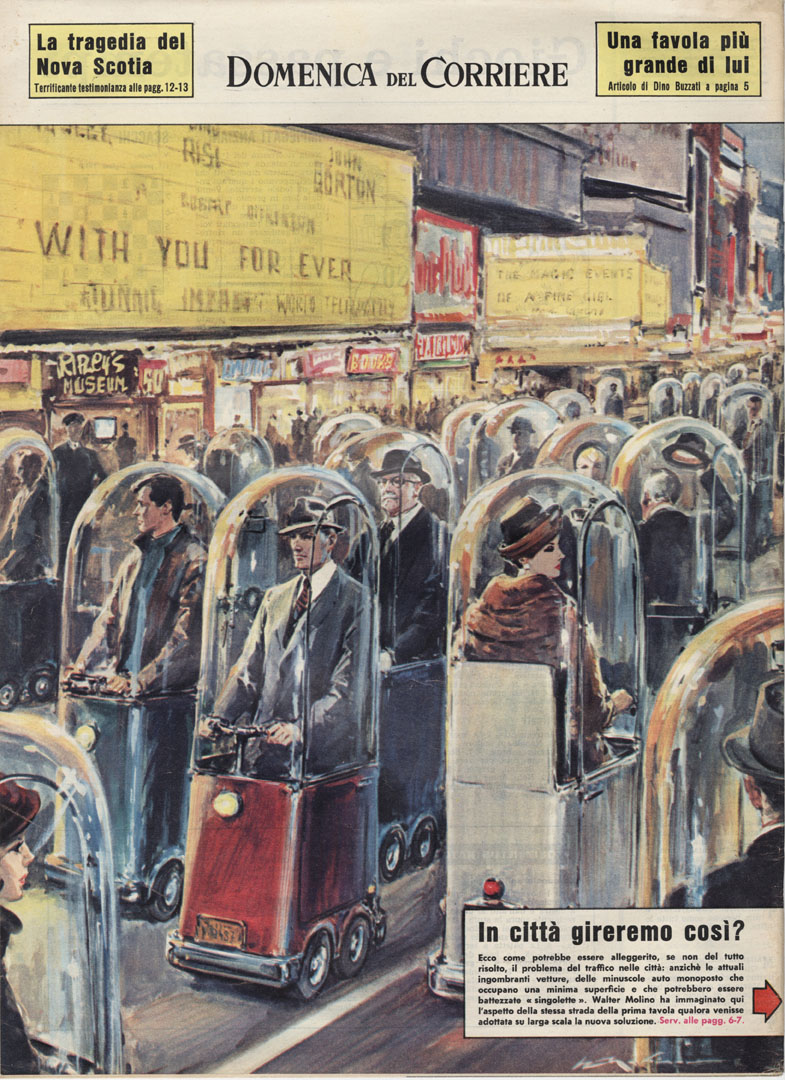
 The term 'dystopia' has been an interest of mine since I witnessed films, from the likes of Ridley Scott's, Blade Runner and Steven Spielberg's, Minority Report. It highlights a particular genre in fiction which portrays a highly corrupt society in comparison to current times. Usually dystopian fiction develops a satirical stance highlighting everything that's wrong within the current period; for example in Margaret Atwood's, The Handmaid's Tale, the role of women has drastically changed and they are mere tools for sex. This however still attains relation to their role in society now, in the likes of media where they are objectified in advertising for example.

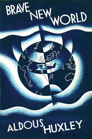
 This is the my main motive for the project: to discuss how dystopian fiction could be perhaps a real entity within in our contemporary setting. I believe Huxley's cynical outlook in the writings of Brave New World, and even in his essays, The Doors of Perception and Heaven and Hell, develop to my objective the most.

 The themes and motifs which are: over consumption, dependence on technology, denial of truth, happiness, humanity, sex, loss of dignity, morals, values and emotions in BNW display impressive hindsight, since it was first published in 1931! Today it seems that these aspects seem more evident than ever, which is rather disturbing to think about.

Walter Molino, 1962

Sunday, 23 March 2014

The Finale to End all Finales

 Yes it's that time again, but for the last time! My mind is racing with various levels of anticipation, both good and bad. The course has enlightened my life very much indeed and I will miss it dearly when it soon ends. Let the final major project commence!

 After some thought over the Christmas holidays, I decided to pick a novel to visually respond from; as it has previously played to my advantage in the way I work. As I fascinate over reading dystopian fiction, I thought it fit to choose within this category. It was a novel I had begun reading the previous year, but had become side-tracked for some reason, so I wanted to give it another chance as it seemed very relevant to my current state of mind in observation of society. I decided to work with and create visual responses from Aldous Huxley's classic, Brave New World.


 Using this novel as a guide towards my outcome, I want to demonstrate how Brave New World is happening right now. Written in 1931, it tells of a future, very much similar to the current state of our contemporary world, where people are cloned and passion towards life has diminished; instead being overshadowed by seamless, superficial activities. Truth ceases to exist in the majority, and the majority ignore it without consciousness.

 I want to make a series of visual responses in accordance to this novel, and perhaps others, to gain a better understanding of my own personal observations: my 'brave new world'.

Wednesday, 18 December 2013

What Does Illustration Mean?

 Illustration. It's a term that can perhaps leave you thinking for some time as to what it's all about. Obviously it corresponds alongside a description of something in a visual format and that's as old as everything, but certainly by today's standards it can be seen in many other ways. Imagery itself has evolved so much over the years, it seems as though everything is blending as one. The Mass Media is responsible for this because imagery is used over and over again in lots of new various contexts. A far-out example of this would be the Mint Royale remix of the classic song 'Singin' in the Rain' sang by Gene Kelly. The lyrics and chimes remain, but with a contemporary electronic beat. This is proof that boundaries can be broken and perhaps words can be too.

 Some illustrators and people in other fields could be intimidated by this concept. Illustrators should definitely keep pushing boundaries and not fall to being halted by either they're own style or by clients. There are those illustrators who are traditional and prefer to remain all hand-rendered, and then there are the illustrators who apply themselves digitally (as well as maybe hand-rendered). The ones that work digitally appear to be a very common form of illustrator that are always high in demand by clients, whereas the ones who prefer the messy side of things are potentially seen as being backward, childish and not up with the times. Hand rendered illustration can however fall into categories, such as fine art, so that's proof all illustrators have a chance.

 My own work is as of recently extremely hand-rendered and messy. I like working this way because I feel it truly expresses myself. Whenever digital application came into my work, I'd just feel my work had been drained of it's life and wasn't mine any more,  but what the client wants. Heading into a new contemporary world evokes the mood that everything should be more clean-cut and higher defined than ever before. This is why perhaps so many illustrators end up working digitally: because the media says that's the only way to get a job in the new world. I originally studied graphics, so I attained a grasp of what their main strive was and it revolved mainly around money, business and professionalism. Illustration comes under this as well now because of the commercial digital field.

 Will illustration survive? I believe it will because there are children's stories still being read in the world that obtain that innocent nature illustration naturally acquires. As long as stories continue to be told, illustration will live on.

Monday, 16 December 2013

Hopes, Fears and Opportunities

 My hopes for the next semester and after include to achieve a grade that offers me the chance to be seen by professionals from various industries that collate with artistic integrity. People who have an eye for imagery and presentation are people I'll be in search for.
 I hope to be considered and admired more than just an image maker and as a person who can communicate, other than just visually, such as into politics and within popular culture. What I mean by this is that I hope to acquire an articulate language which opens people's eyes and lets them correspond with me easily.
 I hope to attain all the confidence I have gained being at college and to live a life where the way I express myself is heard and recognized by people that are not just close to me. I hope to be freely artistic in every sense.

 My fears for the next semester and after are that I won't achieve the grade I desire because I'll stumble at the last hurdle. That's probably my biggest fear because having come so far with great achievement and understanding, to suddenly fall in a trap of becoming lazy would make me regret my actions for the rest of my life.
 My fear also is that my work may lose it's capability of clearly communicating something. What I mean is that I fear I may lead into an area of work that will cause me to lose myself. I fear even that straying into the illustration industry will make me forget that my work is my own and not something to be made just for money. I feel this greatly because what we have learnt during our time at university, mainly during our contextual studies, is that becoming an illustrator seems to contradict everything about expressing your true self.

 My potential opportunities for the next semester and beyond would include to create more abstract pieces based on the popularity of my developing portfolio and to pay a visit to the Northern Quarter in Manchester to hang them in bars and even hold mini exhibitions. This idea was offered to me by my past art foundation tutors who said I could potentially work onto canvases and so on.
 Another good opportunity coming up for us all is the London trip. It will offer us the chance to witness the demand for art and design and what we're up against. It'll also be good because we'll be able to show our portfolios to professionals in a region of the country, far from our own.
 An opportunity that's been handed to me before and may perhaps come again, is designing gig posters for a friend of mine who hosts bands to play at Kraak Gallery in Manchester. I designed a line-up poster for him last year and he greatly appreciated it. However I didn't receive any pay towards it because I forgot to ask. I'll know what to do next time.

Sunday, 15 December 2013

Portfolio Visits

 As part of our assessment for the end of this module, we were told to go out and make contact with professionals of the industry to present our portfolios. I have collated work from both last year and this year to attain a good mixture of work from both development to final outcomes.

'Create' by Natalie Wood

 The first visit I had was from mentor Natalie Wood who is a Stockport College graduate. She is a designer and illustrator and she presented a fantastic range of work for me to look at in her portfolio. I recognised some of her work and made comment of it. Her work is very digital based and she says she mainly does editorials for magazines. She also showed me her work within motion graphics which really suited her style and also incorporated great use of typography.

 We then went on to discuss my state of work so far, so I showed her what was potentially going to be in my portfolio because I unfortunately had misplaced it somewhere... She said she really liked my style and agreed we each had a very different approach to things. My work being so rough and in stages of development, I asked her how I should present this in my portfolio. She replied that I should keep my work ethic going and should keep playing within my sketchbook because the work in there seems more relevant to me than the desired outcome.

 I found her advice to be very helpful and a great insight into what the industry demands. Seeing what she's achieved, the industry seems so vast and freelance jobs seem to be always available somewhere. This gave me greater confidence in myself and respect for my work. She gave me her business card and I surprisingly didn't make the mistake of thinking she was an actress...

'Bummed Portrait' by Central Station Design

 My second portfolio visit was with Pat Carroll from the infamous Mancunian design company, Central Station Design. The group were responsible for livening up Manchester during the 'Madchester' era of the mid 80's to early 90's with their acidic-coloured record sleeve designs for the Happy Mondays. Pat tutored me back in my art foundation year when I was studying visual communication. It was certainly a privilege to be in his company, so I felt I should seek his advice once again on how to present my work.

 I showed him my newly printed portfolio and his reaction was indeed positive. Pat's always admired my work for its use of negative space and raw hand rendering. He praised my work saying that it's evolved and is set on course for a new professional beginning. He also said that the work was giving off a fine art vibe, which was certainly a surprise for my ears! He said he could imagine my work being hung up in a bar or exhibition in the Northern Quarter of Manchester. This idea appealed to me more so than working as a freelance illustrator because it opens up a new world for me to enter.

 A few things he said I could improve were make my whole portfolio portrait, keep my modules together and to display a small explanation/description of what work it is I'm showing. This newly delivered information has excited me more so than I felt before.

Monday, 2 December 2013

'Thing' - It's Alive!

 Apologies for the confusing title, but this post is showing the beginning stages of development for the new project: 'thing'. Yes I have managed to fill yet another sketchbook. This is an ability I didn't used to acquire, so I'm hoping the momentum of it all lasts!

I began development in my playful manner to attain a prolific nature:


 The use of perspective, negative space and composition are all strong points within these images. The cube shapes alongside the scratchy figures proved to be a complimentary combination in the previous project, 'The Outsider'. There is also a lot more noticeable influence from artists I have been researching, such as Kim Hiorthøy's work with pencil lines.
 Again I'm playing with the idea that these small figures contain each within them so much destruction and irrationality. Their mere presence on the page is somewhat of a discomfort. The cube shapes represent functioning absurdity whilst the negative space represents the unknown; the undiscovered; the truth. The figures act as the medium somewhat between both worlds within the page.
 The simple use of colour with crayon has proved to be successful also in that they highlight an area to which the viewer looks upon first. Even the figures can be drawn using crayon, both dense or hollow. The colour also brings vibrancy to the page of black and white knowledge.
 Also the use if type within some of the imagery expands the and explains in an informative manner the subject which is beheld. The fact they're newspaper cuts too enhances this quality.