Showing posts with label Competition. Show all posts

Monday, 8 April 2013

Final Final Book Cover (phew)!

 After some criticism about my final design, I now had the chance to edit the piece before the Penguin competition deadline, which is tomorrow! Here is my original draft again and the edited version below:

First Draft

Edited Version

 The main element that needed adjusting the most were the composition of the types. On the front where the title 'The Big Sleep' is composed, I decided to make it a stronger design by making an alignment down the middle of each word. I did this by connecting the 'h' with the 'i' and then so on to the 'l' underneath. I had to adjust the sizes of each word too in order for this to work. It's improved because I believe the last one looked slightly messy and unconsidered. The connection down the middle as well emphasises the rain by making it look as though the type is running.
 As well as the title, I adjusted the author's name 'Raymond Chandler' by aligning both the 'R' and the 'C' with the back of the knight piece. This helped to form a frame around the composition. The same was applied to the type 'A Philip Marlowe Mystery' also. On the back, the only aspect that needed aligning were the critic's reviews underneath the blurb. I simply just boxed them together as they appeared widened last time  As well as the composition of the typography, I decided to lighten up the grey type on the front. It looked a little too dark in the first draft due to the background already being a solid black. The lightened type also composes more effectively with the rain because they appear almost the same shade.
 The image of the nude woman within the knight piece required some editing too. Her body is fine, but her hair in the previous draft was touching the edge of the knight piece. I simply just erased the parts that were touching and added a few more flicks at the end with the brush tool in Photoshop. The feet I believed needed a touch-up too because she looked as though she was on her tiptoes. I again applied the same method of erasing parts of the lines and used the brush tool to create a more realistic perspective.
 A final element that appears probably most noticeable is the dark rain within the spine. Seeing as rain was continuing from the front to the back in a diagonal motion, it seemed only suiting to connect the sides by placing the rain in the middle too. I coloured them with the same colour used on the original grey type. I experimented with black, but the mid-tone of the grey delivered better composition with the rest of the cover. It makes an effective contrast between the dark and light shades.

 And that's it for this piece so far. All I have to do is send it off to Penguin and hope for the best. I think I've done very well in this project. It has certainly increased my workflow.

Monday, 18 February 2013

The Book Cover!

 I have started finishing my final outcome for the cover. Here are the elements I made to put into practice:


 The figure of the nude woman took me several attempts to achieve the right proportions. I knew what posture to place her in, but the outline of the knight piece kept being restrictive of space as I was drawing within. The rain and the knight outline were fairly standard in comparison; with a few simple scratch lines of pen and ink and a bold outline. With these and the letraset typography I have made an alphabet from, I have designed my first draft of the intended outcome. Behold!


 As you can see, I have kept an ongoing theme throughout each side of the cover (including the spine) with the element of the knight piece's bold shape. Being such a prominent symbol within the story, I thought it appropriate to repeat it like this. In the front and back, it is presented almost like a window for the woman and the blurb against the rain. On the spine it looks like a logo. The black background on the front and back emphasise the knight's clear white shape. The same applies to the spine except with the reversed effect.
 The fragmented Helvetica letraset proved to be successful in channelling across the context; that the novel involves crime and a detective inevitably trying to place back the pieces of the puzzle. The rain adds to this effect also because it symbolizes the corruption within the book and also makes the typography look weathered. The rest of the typography used (the quote, blurb etc.) were typed within Photoshop and were chosen for their aesthetic purposes, but mainly because they are far more legible as opposed to the original letraset type.
 The composition on the front runs accordingly as the type circulates around the edge of the knight piece. The same applies on the back but within the shape. The blurb displays careful attention in keeping an equal distance from both sides of the knight shape. It runs along with the shape and even magnetizes towards it when the shape outline expands again (as you read it downwards).
 The main focus within the cover is obviously the woman within the knight piece on the front side. As I expressed, I desired for her back to be on show and her face to potentially peak over the shoulder to show her coy nature. This displays innocence, but at the same time she displays sex appeal, due to her being nude. This then leads onto where her arms are positioned. She reaches for the mouth of the knight piece, which is a symbol of Philip Marlowe (the detective) as though she wishes to control it. That is my main source of context: the power the women victor over the men. The woman within the knight piece could also symbolize that she is playing a game with Marlowe.

 I think I have achieved my intentions well here. My development lead me to something that seemed correct throughout all the progress.

Sunday, 10 February 2013

Lead-up to the Final Outcome

 As I kept on developing I eventually stopped and concentrated on a particular design. It originated from one of my designs within the templates I had been given:


 Here's how I responded:


 Obviously they are rough drafts, but I had this image in my head of a female form perched within the knight piece. Her arms reach out to the snout of the horse as though she is controlling its actions. Her innocent, yet sexual, posture as well adds to the coy, psychotic nature of the character I am basing her on.
 I have composed it that the figure is central within the entirety of the image, but this creates difficulty in placing the typography. I manipulated the type according to her position.
 I also applied the idea that a chess board was circulating the image of her and the knight piece. It creates a sort of hypnotic approach, which is emphasised more so by the monochrome.
 All three acquire pros and cons and I am unsure as where to go from here... I will redraw the female figure and will make a tracing of an original photo of a knight chess piece. The raw and bold effect together may prevail effective, as proven within the photocopies I did. Here are some quick sketches of my idea:


Front and Spine
Back

 As you can see, I have adjusted the image of the figure and the knight to appear along the left-hand side as opposed to the middle. This gives room for the typography which can circulate around the chess piece outline. I have placed the knight piece outline on the spine and back cover too to enrich the theme.

Friday, 8 February 2013

Life Drawings

 As I have been drawing lots of women for this project, I realised I should probably make a few life drawings. Since my work consists a lot in expressionism as opposed to fine detail, I found this session difficult. I underwent life drawing classes back in my Foundation year and so carried out the same techniques I learnt from that, such as: drawing with my eyes closed, drawing with my left hand and using various types of media.
 It was a private session with a girl I know who I shall keep anonymous (but I don't think she'd mind anyway)! Here are my attempts:


A bit too much nose...


 From doing this session, I realised that my main interest was in her back. There is a particular drawing that I made for one of the book cover ideas and it displays a bed with a woman sat on the edge of it with her back to the viewer. I've carried it on into two of the images above. I believe the back is a good example of what differentiates a man's body to a woman's. The body type of an average weight female is almost vase-like. It defines what is conventionally perceived as beautiful and feminine. This is what I wish to capture in my drawings, with the context alongside of her face peaking over the shoulder with a coy expression (potentially).

Book Cover Templates and Designs

 We were given the templates to work on to encourage our understanding of what the book cover needed. Obviously cover consists of a front, back and spine. My initial thought was to keep a recurring theme throughout the whole cover. Here's what I ended up with:


 I stuck closely with the photocopying idea of blending things together. I played with pretty much every symbol and image within the story including: the chessboard, cigarette smoke, guns, shadows, American culture, the knight, the rain and most importantly, the female form.
 In all honesty, at this point I felt very lost and disorientated due to the prolific amount of work I've conjured. I believe I've responded very well to the brief so far, but I just hope that I can fully deliver my skills into the final outcome.

Thursday, 7 February 2013

Experimenting with Type

 The stages of development are now gradually turning into what could be the final outcome. What is also necessary for the book cover is the typography. Having experienced basic graphic design in my first year, I understand some of the capabilities that typography can possess. Type can just be as part of the illustration as the image can be; even more potentially. I began a new sketchbook a started applying typography within imagery:


 In all honesty, I felt worn out after those previous sketchbook developments. I think the types I've explored here are good, but I believe the type needs a bolder edge.
 So I decided to go to buy some letraset. I have used this method before (also in graphics) when I collaborated with another student to design a poster advertising the tragic play, Miss Julie. I bought it in standard Helvetica font and scratched an alphabet into my sketchbook. It's an element that worked well previously and I believe holds a place on the book cover. Its fragmented style symbolizes the broken society in which the protagonist must put back together; to justify.


Playing with the Photocopier!

 As promised, I photocopied my development pieces and began layering them over one another. Some were disasters, but others stood out and made an impression. I would very much like to work similarly to this in the future. You never know what you're going to end up with. My main source of influence in this field would be the Polish posters because of their raw and graphic nature. Here's what I got:


 As I did this process, I realised my raw images put together with something structured and already existing made an effective contrast.

Pin-ups

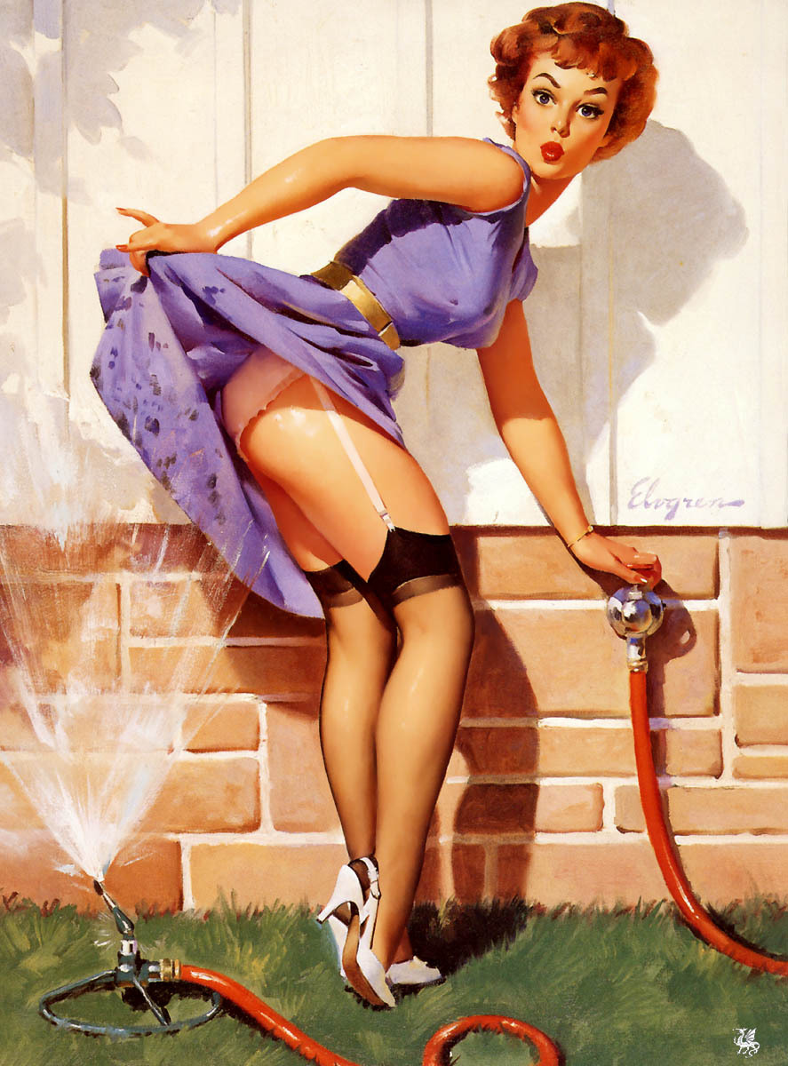
 Some more research and reference material that seems appropriate to the subject matter of women and The Big Sleep. 'Pin-ups' are either photographs or paintings of female models posing in suggestive positions. The images emit complete sexual appeal, but in ways that can be glamorous or even humorous. Here are some examples:

'Pin-up 1'
'Pin-up 2'
 I am unsure as to what era these images belong, but the second one looks very 50's. Regardless of the era, they emit sex appeal and most of all, the female form. These images are deemed as sexist and examples of objectification of women. I agree with this and understand that the time was different due to the mass patriarchal dominance. This can be still seen today however in magazines and other sorts of media.

Tuesday, 5 February 2013

Further Development in Sketchbook

 I have made some further development in my progress towards the final outcome: the Penguin book cover! Like I said previously I wanted to concentrate on the role of the female characters in the story, so I decided to draw lots of women in various styles. There are other elements of progress too, such as the male characters and the orchids. Here they are:


 This evidence of development has really excited me! I noticed as I gradually went through the book my line drawing technique improved. I believe this to be some of my best work as it is also purely hand-rendered. This is certainly a promising lead up to the final outcome.