Fig Taylor
The first visit I had with the new contents of my portfolio was from Fig Taylor, a portfolio consultant who previously gave the class a presentation with advice about how to be successful in self-promotion. We sat round as a group and she looked through each of our portfolios to give us feedback and to tell us where our territory of work would lie in the industry. She got to mine and had a glance through. She mentioned that my work acquired minimalistic elements and that she wasn't too sure where to categorize it in illustration. I found this both disheartening and positive, because my work clearly has potential in other fields of the industry. It was critical feedback, so I'll use it to my advantage.
Day Job
When we had our London trip, we visited an illustrator collective called Day Job. They're 10 postgraduates who make work in a empty mill-type environment, and produce zines together for promotional value. I enjoyed the experience of being there and hope to eventually work in a similar space. After we had a group discussion, we each showed them our portfolios one by one to receive feedback. I introduced myself to two of the girls by the names of Grace and Victoria and let them have a look through my portfolio. I gave a brief insight into what most of my work is about, saying that I like to create visual responses from themes within narratives. I told them of my worries too with my work not appearing to obtain a particular context and just being a random assortment of images. Also that the abstraction in my work leads it away from being considered illustration. They responded positively stating that it's always up to the artist who produces the work, and it's all down to personal interpretation. They were both complimentary of what I showed them too saying that it's interesting to see something abstracted for once. This left me feeling a lot more confident about my work because I had previous doubts of whether I should even attempt going into the illustration industry. I told them it was the best feedback I'd received.
Ben Jones
The most recent review of my portfolio came from Ben Jones, who graduated at Stockport. He helped out in first year and reviewed my work at the end of second. He encouraged me to work more hand-rendered as opposed to using the computer, and it's proven very successful as you can see in The Outsider project. I sent him an email asking if he could give me some feedback on my updated portfolio. He said yes and gave good criticism. He said the technique I picked up from The Outsider project has proven successful in both style and context. He admires my raw perspective and said I should perhaps start to work on canvas on a big scale. This is similar feedback I've had before two other people who said my work could be seen as fine art.

Showing posts with label PDP. Show all posts
Showing posts with label PDP. Show all posts
Monday, 21 April 2014

Sunday, 20 April 2014
Hopes, Fears and Opportunities Part 2
Hopes
After being at university, my hopes for me are to find and discover myself even further after everything I've learnt so far. I hope that my work remains consistent the way it has been since The Outsider project, and that it progresses into something that I'll be proud of for the rest of my life. Being at university has further extended my horizons towards succeeding in creating work that everyone can see and collaborate opinions towards. I hope for my work to develop connections with people, in both style and context, because it's positive to be surrounded by those who understand what your direction is.
Most of all, I hope that I become an artist; successful or not. It's a lifestyle that encourages so many opportunities and dreams to become physical. The simplest of things can influence ideas which become so very relevant in understanding who you are. I'm very grateful for attaining such a visual-based perspective of the world.
Fears
My fears for the future are understandable, as I'm sure a lot of other students facing the same situation feel. I fear the hastened approach towards not being in education any more. I've thought about perhaps studying something else, like philosophy, but at the moment I can only see myself struggling for money, which puts that out of the window. Money of course is a central fear, just mainly because of sustaining a decent enough livelihood for myself. My intentions outside of education are to remain in my current job, which is part-time at Morrisons, or to perhaps discover something more related to my desired practice, like working in an art cafe for a crude example. This would hopefully override my fear and keep me in a comfortable place.
My main fear is that my work will become repetitive and non-consistent. Throughout this major project I have been feeling this way because of the lack of direct context. My work is substantial, but just needs that push into something that binds it all together. It's certainly a weakness I carry in finalising my work because I become so confused with what I want.
Opportunities
Something that I've mentioned previously is that technology and the internet have expanded upon the almost endless amount of opportunities. The connections made with other illustrators/image makers and potential clients are a positive aspect, in having your work known and promoted. This is something to take advantage of. Another opportunity has been discussed with me and two other students from my class, proposing that we should all share a studio space together. This was an influence from witnessing the environment in which the illustration collective, Day Job, worked in. This potential opportunity excites me the most because it allows and encourages a momentum in work flow. Being surrounded by all my work, materials and influences would certainly hasten my progress. Also being in the midst of other people with the same motive would help too, because we'd all be very supportive of one another. It's an environment fine artists choose to work in and somehow I feel more comfortable with that, seeing as my work consists of similar elements.
What I've learnt from my time at university is that opportunities await in many areas - not just illustration. As mentioned previously, my work contains fine art elements and this has been commented on by some peers, saying they could imagine the work being hung up in a bar, or perhaps exhibited. This I found encouraging because it displays a sense of hybridity which can hopefully work to an advantage of mine.
Friday, 18 April 2014
Website!
Yes I now have a website and it's hosted by cargocollective.com. It took me a while to get the hang of it, but eventually I figured out how to adapt to the layout I was looking for.
Here's a link: joehuish.co.uk
And below are a couple of screenshots:


Here's a link: joehuish.co.uk
And below are a couple of screenshots:
The minimal design allows the viewer to easily stream through the website without having to wade through any clutter. On the home page I have my original typeface signature at the top, in correspondence with the business card design, and below a group of thumbnails displaying previews of my project work. I've deliberately zoomed in on the faces fro my work for these snippets because it immediately tells the story of what to expect - almost like a visual blurb. I've allowed the viewer to see both my outcomes and development within these allocated projects because it creates an aesthetic contrast. Alongside the images as well I've given a brief description of the context, my expression towards it, and the methods I used. Seeing as my work can appear abstract, this offers the viewer more insight.
Monday, 14 April 2014
Landan Trip
There's a hole in the world like a great black pit
and the vermin of the world inhabit it
and its morals aren't worth what a pig could spit
and it goes by the name of London
Sweeney Todd
Luckily we didn't experience the nature of Victorian London, however fascinating that would've been, but we still visited the infamous capital for a glimpse of its illustration industry... and its rum...
After an exceedingly expensive train journey that was pretty relaxing, I arrived in London at 11:10 am on Tuesday morning and made rendezvous with the rest of the class. We traversed out of Euston and headed straight to our first destination: adam&eveDDB. They are a communications company and are responsible for advertising brands. We entered a very stylish office building through a small rotating door and were welcomed by a smart and clean looking man in skinny jeans and loafers. He then escorted us into a glass-walled office with a huge flat screen television inside. As there were so many of us, I ended up sat on the floor which I wasn't too bothered about. He gave us an introduction as to what the company does and showed a series of adverts that they had published. They work with image makers of all varieties and establish the connection between them and the advertising client (sort of like an agency). He then gave us some feedback on a few questions about how to promote ourselves, which I found very valuable. After and hour or so, we said thank you and headed out for the tube to our next point of interest.
We arrived at Elephant and Castle station and started walking. We walked for at least 30 minutes or so until we were in a very residential looking part of town. We were lost for a little while, but managed to spot one of the people waving at us from across the street. She was called Grace and she showed us into a large empty mill-type building. She was part of a collective of post-graduate illustration students, called Day Job. We crowded up a lift and went upwards to a studio of spaces filled with art work. I felt right at home and we gathered round in a circle on some chairs and cushions - I was on the floor again! There were 5 girls and they gave us some insight into what they do and what it's like after university. With the work they made, they made zines together so they could promote their work. I loved the environment and I'm hoping to have a space of my own in the near future; potentially with others from the class! They then had a look through our portfolios, but I'll leave that for another post. We made our way out down the lift and headed back to the station, so we could finally get to our hostel which was all the way over at King's Cross.
After a quick rest back at the hostel, myself and two other fellow students conversed to Camden for a night of various antics, including me dancing like a puppet... Anyway, the next day 6 of us made an extraordinary visit to a lady's house. A very lovely and hospitable lady indeed, she's called Naomi Games and is the daughter of the famous graphic designer, Abram Games! We entered into the house and introduced ourselves to Naomi at the top of the stairs with a hand shake. She wore nice clothes that emitted the colours pink and purple, mainly in the scarf she was wearing. We then entered the kitchen which was full of artwork and all sorts of cool antiques and furniture. We sat round the table and eagerly anticipating what she would show us. She first asked if we all wanted a hot drink and most of us answered yes. She revealed a crazy, bong-like coffee maker which happened to be an invention created by her father. She was going to show us his archive of development work. We all drank our coffees and she opened up countless amounts of folders containing this goldmine of work. Everyone was most fascinated by his stamp designs because of how small he made them. A tool he used, an airbrush, was passed round with delicacy. Ian, our tutor, couldn't contain his excitement. It was all very fascinating and she even told us a story about how Paul Rand and Saul Bass came round for tea! Apparently I was sat where Rand was. Starstruck much?! After a lengthy presentation of the vast amount of work, we made our goodbyes with another classic handshake, and left for London town for some final free time in this amazing city.
 |
| Grow Your Own Food, Abram Games |
Got back to ol' Mancunia by 11:10 pm after another relaxing train journey, and headed back home to continue writing the last part of my dissertation. It was a long night...
Sunday, 6 April 2014
The Business Cards, mmm
Yes, the real world is fast approaching and as students, we are in preparation to promote ourselves and our work. We have been asked to create a website, build a portfolio and handle some business cards. At this stage, it all feels quite daunting because I've never been outside of education my entire life! And now we've all grown up and are expected to know what to do next, which quite frankly I'm not even sure.

In this revolutionary age of technology, particularly with the influence of the internet, self-promotion seems a much easier process. With our websites, anyone in the world can see them just by clicking a button. An amazing prospect indeed, and a sign that opportunities are absolutely everywhere. This raises my hopes in the midst of all the stress that inevitably comes with acquiring a skilled occupation.
So here is my card:
For the front of the card I created my own type, that being the letters spelling my name in large. I used my trademark pen and ink and made smooth but jagged lines. The style of a signature springs to mind with this, like a quick scrawl from a fountain pen. I duplicated two of the letterheads in Photoshop to ensure a professional standard. In composition with the rest of the text, I aligned the right-hand side in correspondence to tip of the last 'h' letterhead from my name. The link to my website is visible in the contact details: joehuish.co.uk
For the staple image on the back, I decided to choose the large, gaping mouth which I produced in The Outsider project: indeed one of my strongest. It's composition on the page is what propels it to being suitable for the card: shocking, bold and identifiable. It sums up my style of working too, with its method and context.
Wednesday, 18 December 2013
What Does Illustration Mean?
Illustration. It's a term that can perhaps leave you thinking for some time as to what it's all about. Obviously it corresponds alongside a description of something in a visual format and that's as old as everything, but certainly by today's standards it can be seen in many other ways. Imagery itself has evolved so much over the years, it seems as though everything is blending as one. The Mass Media is responsible for this because imagery is used over and over again in lots of new various contexts. A far-out example of this would be the Mint Royale remix of the classic song 'Singin' in the Rain' sang by Gene Kelly. The lyrics and chimes remain, but with a contemporary electronic beat. This is proof that boundaries can be broken and perhaps words can be too.
Some illustrators and people in other fields could be intimidated by this concept. Illustrators should definitely keep pushing boundaries and not fall to being halted by either they're own style or by clients. There are those illustrators who are traditional and prefer to remain all hand-rendered, and then there are the illustrators who apply themselves digitally (as well as maybe hand-rendered). The ones that work digitally appear to be a very common form of illustrator that are always high in demand by clients, whereas the ones who prefer the messy side of things are potentially seen as being backward, childish and not up with the times. Hand rendered illustration can however fall into categories, such as fine art, so that's proof all illustrators have a chance.
My own work is as of recently extremely hand-rendered and messy. I like working this way because I feel it truly expresses myself. Whenever digital application came into my work, I'd just feel my work had been drained of it's life and wasn't mine any more, but what the client wants. Heading into a new contemporary world evokes the mood that everything should be more clean-cut and higher defined than ever before. This is why perhaps so many illustrators end up working digitally: because the media says that's the only way to get a job in the new world. I originally studied graphics, so I attained a grasp of what their main strive was and it revolved mainly around money, business and professionalism. Illustration comes under this as well now because of the commercial digital field.
Will illustration survive? I believe it will because there are children's stories still being read in the world that obtain that innocent nature illustration naturally acquires. As long as stories continue to be told, illustration will live on.
Monday, 16 December 2013
Hopes, Fears and Opportunities
My hopes for the next semester and after include to achieve a grade that offers me the chance to be seen by professionals from various industries that collate with artistic integrity. People who have an eye for imagery and presentation are people I'll be in search for.
I hope to be considered and admired more than just an image maker and as a person who can communicate, other than just visually, such as into politics and within popular culture. What I mean by this is that I hope to acquire an articulate language which opens people's eyes and lets them correspond with me easily.
I hope to attain all the confidence I have gained being at college and to live a life where the way I express myself is heard and recognized by people that are not just close to me. I hope to be freely artistic in every sense.
My fears for the next semester and after are that I won't achieve the grade I desire because I'll stumble at the last hurdle. That's probably my biggest fear because having come so far with great achievement and understanding, to suddenly fall in a trap of becoming lazy would make me regret my actions for the rest of my life.
My fear also is that my work may lose it's capability of clearly communicating something. What I mean is that I fear I may lead into an area of work that will cause me to lose myself. I fear even that straying into the illustration industry will make me forget that my work is my own and not something to be made just for money. I feel this greatly because what we have learnt during our time at university, mainly during our contextual studies, is that becoming an illustrator seems to contradict everything about expressing your true self.
My potential opportunities for the next semester and beyond would include to create more abstract pieces based on the popularity of my developing portfolio and to pay a visit to the Northern Quarter in Manchester to hang them in bars and even hold mini exhibitions. This idea was offered to me by my past art foundation tutors who said I could potentially work onto canvases and so on.
Another good opportunity coming up for us all is the London trip. It will offer us the chance to witness the demand for art and design and what we're up against. It'll also be good because we'll be able to show our portfolios to professionals in a region of the country, far from our own.
An opportunity that's been handed to me before and may perhaps come again, is designing gig posters for a friend of mine who hosts bands to play at Kraak Gallery in Manchester. I designed a line-up poster for him last year and he greatly appreciated it. However I didn't receive any pay towards it because I forgot to ask. I'll know what to do next time.
Sunday, 15 December 2013
Portfolio Visits
As part of our assessment for the end of this module, we were told to go out and make contact with professionals of the industry to present our portfolios. I have collated work from both last year and this year to attain a good mixture of work from both development to final outcomes.
The first visit I had was from mentor Natalie Wood who is a Stockport College graduate. She is a designer and illustrator and she presented a fantastic range of work for me to look at in her portfolio. I recognised some of her work and made comment of it. Her work is very digital based and she says she mainly does editorials for magazines. She also showed me her work within motion graphics which really suited her style and also incorporated great use of typography.
We then went on to discuss my state of work so far, so I showed her what was potentially going to be in my portfolio because I unfortunately had misplaced it somewhere... She said she really liked my style and agreed we each had a very different approach to things. My work being so rough and in stages of development, I asked her how I should present this in my portfolio. She replied that I should keep my work ethic going and should keep playing within my sketchbook because the work in there seems more relevant to me than the desired outcome.
I found her advice to be very helpful and a great insight into what the industry demands. Seeing what she's achieved, the industry seems so vast and freelance jobs seem to be always available somewhere. This gave me greater confidence in myself and respect for my work. She gave me her business card and I surprisingly didn't make the mistake of thinking she was an actress...
My second portfolio visit was with Pat Carroll from the infamous Mancunian design company, Central Station Design. The group were responsible for livening up Manchester during the 'Madchester' era of the mid 80's to early 90's with their acidic-coloured record sleeve designs for the Happy Mondays. Pat tutored me back in my art foundation year when I was studying visual communication. It was certainly a privilege to be in his company, so I felt I should seek his advice once again on how to present my work.
I showed him my newly printed portfolio and his reaction was indeed positive. Pat's always admired my work for its use of negative space and raw hand rendering. He praised my work saying that it's evolved and is set on course for a new professional beginning. He also said that the work was giving off a fine art vibe, which was certainly a surprise for my ears! He said he could imagine my work being hung up in a bar or exhibition in the Northern Quarter of Manchester. This idea appealed to me more so than working as a freelance illustrator because it opens up a new world for me to enter.
A few things he said I could improve were make my whole portfolio portrait, keep my modules together and to display a small explanation/description of what work it is I'm showing. This newly delivered information has excited me more so than I felt before.
 |
| 'Create' by Natalie Wood |
The first visit I had was from mentor Natalie Wood who is a Stockport College graduate. She is a designer and illustrator and she presented a fantastic range of work for me to look at in her portfolio. I recognised some of her work and made comment of it. Her work is very digital based and she says she mainly does editorials for magazines. She also showed me her work within motion graphics which really suited her style and also incorporated great use of typography.
We then went on to discuss my state of work so far, so I showed her what was potentially going to be in my portfolio because I unfortunately had misplaced it somewhere... She said she really liked my style and agreed we each had a very different approach to things. My work being so rough and in stages of development, I asked her how I should present this in my portfolio. She replied that I should keep my work ethic going and should keep playing within my sketchbook because the work in there seems more relevant to me than the desired outcome.
I found her advice to be very helpful and a great insight into what the industry demands. Seeing what she's achieved, the industry seems so vast and freelance jobs seem to be always available somewhere. This gave me greater confidence in myself and respect for my work. She gave me her business card and I surprisingly didn't make the mistake of thinking she was an actress...
 |
| 'Bummed Portrait' by Central Station Design |
My second portfolio visit was with Pat Carroll from the infamous Mancunian design company, Central Station Design. The group were responsible for livening up Manchester during the 'Madchester' era of the mid 80's to early 90's with their acidic-coloured record sleeve designs for the Happy Mondays. Pat tutored me back in my art foundation year when I was studying visual communication. It was certainly a privilege to be in his company, so I felt I should seek his advice once again on how to present my work.
I showed him my newly printed portfolio and his reaction was indeed positive. Pat's always admired my work for its use of negative space and raw hand rendering. He praised my work saying that it's evolved and is set on course for a new professional beginning. He also said that the work was giving off a fine art vibe, which was certainly a surprise for my ears! He said he could imagine my work being hung up in a bar or exhibition in the Northern Quarter of Manchester. This idea appealed to me more so than working as a freelance illustrator because it opens up a new world for me to enter.
A few things he said I could improve were make my whole portfolio portrait, keep my modules together and to display a small explanation/description of what work it is I'm showing. This newly delivered information has excited me more so than I felt before.
Thursday, 2 May 2013
The Discussion Forums
1) 'Digital vs Print'
Nathaniel and I presented our chosen discussion forum to the rest of the students. We talked about the negative effect digital media is having on print sales and how this will effect us as illustrators in a faster-progressing world.
I believe the reason to why digital media is causing this is because of people's lack of motivation. The internet has proven to be a quicker way to gain information than to visit a library and read a book. People nowadays take the quickest route to all sources.
We went on to discuss the advantage digital media has over hand-rendered work when it comes to moving an image. A way in which illustrators can embark on traditionalist methods in moving an image is through, for example, pop-up books. This is a limited field of course, but it requires no digital involvement and can obtain a far more charming interaction with the reader, as opposed to a .gif on a computer screen.
Digital has the upper-hand naturally with the use of digital recording equipment. The traditionalist way to make something move on screen would obviously have to be the medium of film. Digital media has caused these methods to be almost non-existent on the current market.
We do indeed live in a digital world but maybe it isn't such a difficult thing to incorporate the two together to gain more variety.
2) 'Where is the content? Where is the comment?'
The students who presented this discussion had read an article by Lawrence Zeegen who criticized the state of illustration today for excelling in aesthetics, but lacking in meaning.
He backs up this argument with David Shrigley's 'Fight the Nothingness' poster that was hung up outside Hayward Gallery in London. It is a protest by Shrigley to influence other illustrators to apply meaning in their work rather than put all the time and effort into just the draughtsmanship.
Zeegan claims that illustration has lost its way from discussing social topics into just becoming just a vacuous streamline. I agree with what the article is stating. Indeed this is happening, especially in the digital purist realm of illustration, and the market for 'pretty pictures' so to speak is becoming a hazard to what people perceive as 'good' art and 'bad' art.
In the eyes of a conventionalist, the works of Shrigley would be automatically considered 'bad' art (if there is such a thing) and only 'good' art would come from the likes of fine artists due to they're aesthetic taste.
3) 'Taste'
The students leading this discussion forum had answered the questions provided relating to a quote from a blog named 'Key Ideas' by Daryl Clifton. It discusses the role of taste and how it alters our lives.
It raises the question that as students learning about the art industry, are we working to how we want to work or are we just making other people happy? My answer to that would be that I take a little bit from column A and a little bit from column B. An example of the way I like to work would have been in The Big Sleep project with the sketchbook development I conjured. Column B applies because I felt my final outcome was trying to be stylized somewhat in order to be successful in the competition.
The likes of other people judging for themselves what is tasteful and what isn't is all a trend. It happens in fashion all the time. Last week it was 90's grunge, now this week it's 80's disco. Nobody truly has authority over that decision.
In the case of fashion, taste is hard to come by, especially if you're some way influenced by what is considered tasteful. Taste derives from within and I feel that some people are too afraid to express their true taste due to trends and such. If your work suddenly appears original and it is published, your work will no doubt become unoriginal in a week's time.
Creative Review
1) Paper Tigers, Peter Lyle

After making a presentation based around this Varoom article for context early this 2nd year, I feel it made an impression on my work. Lyle discusses how Le Gun (an underground illustration zine) is rebelling against the commercial influence in illustrative production. They also state that digital mediums should only be used as a tool because it is currently replacing our natural art heritage of hand-rendered work.
This theme has come up a few times during the course of the year: within context, the discussion forums and the advice people have given me about my working methods. I feel that illustration and art aren't what they once were, such as the great movements of the late 19th and early 20th Centuries. That period in time posed as modernism, and I believe that what this article is proposing is that we are living in a post-modern world where commercialism has devoured everything that was once underground and has simply plastered it all onto t-shirts. The article has made me more cynical I think, but it's at least raised my awareness.
2) Ways of Seeing, John Berger

I read this book to gain knowledge on how to better my critical writing skills. As well as that, it opened my eyes a lot more than they once were. Each of the essays within it increased my perception of things around me, such as: how we view art and where we view it (it's location being in various contexts). The essay that caught my attention most of all was the role that women play in society.
Berger discusses that women are the surveyed gender in society and that they are not only surveyed by men, but by themselves. I studied English Literature and History at A Level and both subjects included and delved into this social factor. Men have objectified women for centuries! The way I read it from those two subjects and from Berger's discussion, is that women are almost sometimes considered to be a sub-gender (even in today's world, both in Western and Eastern culture). Being a man, I perceive women just as equally as I do other men. It saddens me to think this has been happening for so long and it still continues today as though it's a social norm.
The reason why Berger exclaims that women survey themselves just as much as men do onto them, is because of the pressure placed upon them by the long-reigning patriarchal society. It also makes me wonder as to why women must suffer monthly periods and child birth too.
3) Manic (film)
I watched this film recently with my girlfriend and I really enjoyed it. It's about a teenager named Lyle (played by Joseph Gordon-Levitt) who gets admitted to a juvenile psychiatric ward because he beats someone up with a baseball bat. He has anger issues relating to his abusive relationship with his father.
The reason I like this film is because of the confined relationships he is forced to create with people in the ward. He befriends two people, Kenny and Chad, who both have similar social problems, and has a sexual relationship with a girl named Tracy (played by Zooey Deschanel) who has reoccurring nightmares of herself being raped. His relationship with Chad turns out the strongest due to their similar interests in music and their desire to escape the place to go to Amsterdam.
A connection and symbol within the film relating to the study of art is the scene where Sara and Chad are debating over what van Gogh's painting Wheat Field with Crows means. Sara says, "freedom" and Chad cynically responds that it is about, "depression and confinement because of the borders."
The main reason I enjoyed this film is because it brings back a sense of nostalgia of the 1990's. This is evident in my work because I particularly loved American cartoons and the music from that era. There is a scene in the film that evokes a great sensation in me. It's the scene when Chad puts the song Headup by Deftones on the stereo and everyone starts moshing out together. The sense of community I feel whenever I'm in a full-on moshpit at a gig is one of the best feelings ever...
Best scene ever.
1, 2, 3 Best Pieces of Advice
1. "David Shrigley, Paul Davis and Bragg - soon started to establish a school of drawing chic that prized emotional honesty over visual spectacle and charm over draughtsmanship, and saw crossings-out and wayward grammar as more forgiveable than vacuous sterile polish." Peter Lyle
This quote was taken from the Varoom article, Paper Tigers. This is not necessarily advice due to it being a quote, but rather more a source of influence. I feel that in my work that the more raw the image is, the better! Once I place an image into Photoshop to clean up, it loses its soul. The process of scanning something in and then, for example, adjusting it's contrast levels just seems to lose all respect for the hand-rendered stages. I feel that I don't want to work in Photoshop for this reason, but when a brief arises that requires some digital element, I feel that I HAVE to. This ruins the sense of enjoyment, and in turn, ruins the piece of work as I feel I am only working digitally for the needs of others.
2. "Concentrate on your drawing. Just keep playing." Ben Jones
This is an actual piece of advice that I received in person from Ben Jones when we were discussing what to put into my portfolio. Those probably weren't his words, but he delivered the same advice. He said that my drawings are evidently the main driving force within my work and that I should keep it as raw as possible. This I respect highly considering he has worked and been successful in the professional industry. He advised drawing on various surfaces and textures too, which I will take into consideration because my work always seems to be against a standard white background. And he also criticised my Big Sleep book cover due to it being clean and not messy enough. This makes perfect sense because my lead-up to the final outcome consisted of my best work and it was all purely hand-rendered. Therefore I shall keep playing with imagery within my sketchbooks.
3. "I get a kick out of being an outsider constantly. It allows me to be creative." Bill Hicks
Bill Hicks was a controversial comedian from America who performed stand-up during the 70's, 80's and early 90's. I had heard of him due to the legacy after his death, but only began watching him properly about two years ago. He satirised topics of society, politics, music and religion which is what I find humorous and can sometimes be evident in my work. This quote again isn't direct advice obviously, but it describes how I feel a lot. It may sound arrogant, but when I feel like I'm an 'outsider' I feel the need to rebel and this in turn makes my work a lot more creative and original. I think a shock factor is something I crave when I show people my work, which is what Bill Hicks always accomplished to his audiences.
Here's one of my favourite videos of him doing stand-up. He talks about musicians who 'sell out' and don't sing 'from the heart'. This further encourages my work ethic of doing what I want to do, rather than what someone else may want.
Monday, 22 April 2013
I Wish I'd Done This
 |
| David Hughes |

Firstly its style consists of a scratchy black line technique, which is done no doubt by using a nib/pen and a pot of ink. His method displays various depths in each of the drawn lines. The lines that appear thin acquire the ability to swerve in and out of the figure's faces, in turn creating facial features such as wrinkles and muscles. These details appear mostly around the figure's eyes: the brows and the bags underneath. What the thin line does most importantly is create each of the cast's outlines. Their raw and aggressive nature is a definite influenetial quality seen within my own work.
The other type of line seen within the image are the thick ones, which are used to create the image's constructive border. They appear less, compared to the thin ones, because they are possibly deliberate mistakes made by Hughes and his penwork. The flicks of ink too can be seen scattered throughout the composition. These are also more qualities I find within my own work, which adds to the rawness. The ink too has been possibly used to fill in areas, such as the boots of the figure on the left and the bombs dropping from the sky.
Going back to the detail element within each of the figure's faces, I notice that another method has been used to create shading. I imagine pencil has been used for this. It is subtle and compliments the scratchy lines in that it looks as though Hughes has gone to the effort of making the ink lines miniscule!
As well as the use of line within this image, colour has been used to make the image more aesthetically appealing. The colour template conists mainly of various shades of murky yellow. The paper Hughes has used to present this image on plays as the catalyst for other uses of colour. It's beige tone plays as the background, whilst the colours layered on top are darker creating a sense of depth. The other shades of yellow/mustard emphasise various shapes that Hughes has featured, including the hammer and sickle and hats. Other colours are used also, such as white, kharki green and an orange/pink blend. The most noticeable colour used is the striking red in the top left-hand corner of the image. Its colour relates to the image's context in that it colours a Nazi swastika flag.
Furthermore, the image's composition consists of six casts: The bull faced figure on the left, the bull faced figure on the right, the camera headed figure stood on a box, the falling bombs, the windmill and the Nazi flag. They are all enveloped inside a basic sqaure-shaped border which sets a narrative or scene. Also there is a sense of hierarchy from how I listed each of the casts. The bull faced figure of the right appears most prominient as its head is the largest. The other bull faced figure comes either second or third due to the strking colour of the Nazi flag. The other three casts are presented within the background and prove they're lower down in hierarchy.
Another potential cast would be the mustard coloured sky at the top of the composition. Its role develops the narrative of the image into having a sense of place and environment. The sky hints that the area in which the other casts are placed is some sort of flat plain. This reminds me of my animation for the mythological creature project. The use of a single horizontal line sets a basic but effective landscape in that it can behold infinite possibilities in size and scale. It plays with the idea of perspective and distance too. I have used this quality in the past a lot to create my narratives, i.e. when I was a child. The other use of lines towards the bottom of the image create the sense that the cast members are on some sort of stage. This relates to the context of the image which I will be discussing next.
Finally the context of the image presents many ideas and themes that I take general interest in. The first quality to be noticed is the swastika. This immidiately brings to the attention of what context this image is in. The context is obviously not pro-Nazism: it is historical. The larger bull faced figure on the left is holding the flag and appears to be in the attire of someone from the SS. This cast member represents a Nazi. The smaller bull faced figure on the right is holding a hammer and sickle and is dressed in workmen's dungarees. This cast member represents a communist (most likely Soviet). In historical context, these two extreme political powers were against each other during the course of WWII. The figures both stare at one another with mean intensity which represents their conflict.
The reason why the communist figure is smaller is due possibly to the spears going into its back; otherwise, it's unclear. This could however bring in another historical context: the Spanish Civil War. The bull is a prominent symbol of Spain and is involved within their national sport of bull fighting. The bull fighter, if the chance is given, stabs the bull in the back with his sword of lance. This is possibly what is represented here, in that the communist rebels of Spain were depleated by the fascist state (in which the Nazis also helped fight against). Perhaps even that the so-called 'Nazi bull' is instead a fascist and is luring the communist into the its fatal trap with the red flag (as they do in the performance of the sport). Also what is noticeable is the direction in which the bombs are descending. A curved dotted line hints that the bombs are swaying towards the flag, implying even more destruction. This brings to the table that the context represented is perhaps a mixture of things which have occured in the past between the two political sides instead of it just being about WWII. However another element of the piece informs connotation with European culture; this being the windmill in the background.
The final element to be discussed is the figure in the background with what appears to be a camera for a head. The figure's attire connotes that of a film director. The figure is also holding a megaphone, as though he is about to direct what is happening in the foreground bewteen the two bull faced figures. This also brings up the idea again that the bull faced figures are stood on what appears to be a stage platform, due to the lines drawn underneath them. Does this evoke that the battle between these two sides of politics is almost like a drama? Or even that the battleground is somewhat like a theatre?
Monday, 4 March 2013
Stephen Byram Interview
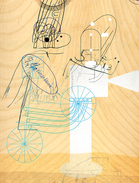
As part of my personal development, I was asked to seek out professionals within the industry to ask them questions to do with their work. My first chosen contact was Stephen Byram, who we met during our visit to New York last year. I remember admiring his work due to it being so prolific and similar to my own style. I've even used him as reference for the last project.
For the interview I emailed him five questions in which he very kindly corresponded. Here it is:
1) I remember you discussing your past to the group and that you played bass guitar. Would you consider music to be a main driving force in your style of work?
A) I think I said I aspired to play the bass, but found that I had no aptitude in that direction. I would say that
music was and is a primary inspiration for the content of my work. My style is something that developed
(and keeps developing) over many years of hacking away at things employing the stuff I was given to work
with. I like to think that my approach to art is musical, but since I’m not a musician I can’t say for sure.
2) Seeing your work first-hand, it stemmed in so many directions: from 3D sculptures to abstract painted
canvases. Have you always been experimental in your choice of media or has it developed over time?
A) Yeah, pretty much. I get a lot of satisfaction trying to put things together that may not obviously fit
together, so experimentation kind of comes with the territory. I also enjoy trying to figure out how to do
something unfamiliar, as long as I have plenty of time to wrestle with it. I like wandering around in the
woods and stumbling over something of potential value (in spite of the anxiety this behavior can produce
- or maybe because of it).
3) I remember you discussing digital interaction within some of your work. Would you say you prefer working digitally or more so hand-rendered?
A) I like both in equal measure, but you have to keep them in balance - too much of either is no good fer ya.
4) I find the compositions on your album covers very interesting and unique. Before composing an image, do you have an idea of what the outcome will look like or do you just play with the imagery to see what randomly unfolds?
Thank you!
I try to delay knowing the outcome as long as possible, the most important part of the process for me is
the surprise that comes from finding out something that I didn’t know before, or seeing the connection that
hadn’t occurred to me.
Yes, I love unfolding it randomly.
5) And lastly, your use of line is fantastic and emits total expressionism and punk rock – as well as its composition with the textured background. The lines appear very figurative. What draws you to the profile of the figure?
Again, thank you, that’s quite a compliment.
I basically consider myself a figurative artist in everything I make. I can’t really answer why other than to say
that I’m compelled to make figures.
I guess that’s where all the action is in life, trying to understand the other and yourself, or vice versa. I need
to see where I live. You need a good basic structure to riff on, figures be mine.
For the interview I emailed him five questions in which he very kindly corresponded. Here it is:
 |
| http://farm3.staticflickr.com/2213/2512897228_874a44ceef_z.jpg |
1) I remember you discussing your past to the group and that you played bass guitar. Would you consider music to be a main driving force in your style of work?
A) I think I said I aspired to play the bass, but found that I had no aptitude in that direction. I would say that
music was and is a primary inspiration for the content of my work. My style is something that developed
(and keeps developing) over many years of hacking away at things employing the stuff I was given to work
with. I like to think that my approach to art is musical, but since I’m not a musician I can’t say for sure.
2) Seeing your work first-hand, it stemmed in so many directions: from 3D sculptures to abstract painted
canvases. Have you always been experimental in your choice of media or has it developed over time?
A) Yeah, pretty much. I get a lot of satisfaction trying to put things together that may not obviously fit
together, so experimentation kind of comes with the territory. I also enjoy trying to figure out how to do
something unfamiliar, as long as I have plenty of time to wrestle with it. I like wandering around in the
woods and stumbling over something of potential value (in spite of the anxiety this behavior can produce
- or maybe because of it).
3) I remember you discussing digital interaction within some of your work. Would you say you prefer working digitally or more so hand-rendered?
A) I like both in equal measure, but you have to keep them in balance - too much of either is no good fer ya.
4) I find the compositions on your album covers very interesting and unique. Before composing an image, do you have an idea of what the outcome will look like or do you just play with the imagery to see what randomly unfolds?
Thank you!
I try to delay knowing the outcome as long as possible, the most important part of the process for me is
the surprise that comes from finding out something that I didn’t know before, or seeing the connection that
hadn’t occurred to me.
Yes, I love unfolding it randomly.
5) And lastly, your use of line is fantastic and emits total expressionism and punk rock – as well as its composition with the textured background. The lines appear very figurative. What draws you to the profile of the figure?
Again, thank you, that’s quite a compliment.
I basically consider myself a figurative artist in everything I make. I can’t really answer why other than to say
that I’m compelled to make figures.
I guess that’s where all the action is in life, trying to understand the other and yourself, or vice versa. I need
to see where I live. You need a good basic structure to riff on, figures be mine.
Subscribe to:
Posts (Atom)