Showing posts with label Research. Show all posts

Friday, 18 April 2014

GIFs

 'Graphics Interchange Format', or better known as 'GIFs', are an internet phenomena. They're image files that can be animated and are really easy to make (apparently). As I've never made one, I thought it appropriate to research a few to see what you can get from them. Some are really simple and others look more complex, almost like a video. They're everywhere and they bring potentially still images to life.

Here are a few examples:

Saskia Keultjes
Laurene Boglio
Miranda Pfeiffer

 As you can see there is certainly difference in style and quality, like with everything. The one at the top appeals to me more however, just because of its humour factor and that it's straight to the point. The last one is also very good but in a different way in that more drawings have gone into it. This is what I'm thinking about concerning my own version and take on them. I'm probably most likely going to work the way the top one plays out because of it's rawness, humour, and simple nature. It reflects my own work the most because of these familiarities.

Monday, 14 April 2014

Landan Trip


There's a hole in the world like a great black pit

and the vermin of the world inhabit it

and its morals aren't worth what a pig could spit

and it goes by the name of London


Sweeney Todd


 Luckily we didn't experience the nature of Victorian London, however fascinating that would've been, but we still visited the infamous capital for a glimpse of its illustration industry... and its rum...


 After an exceedingly expensive train journey that was pretty relaxing, I arrived in London at 11:10 am on Tuesday morning and made rendezvous with the rest of the class. We traversed out of Euston and headed straight to our first destination: adam&eveDDB. They are a communications company and are responsible for advertising brands. We entered a very stylish office building through a small rotating door and were welcomed by a smart and clean looking man in skinny jeans and loafers. He then escorted us into a glass-walled office with a huge flat screen television inside. As there were so many of us, I ended up sat on the floor which I wasn't too bothered about. He gave us an introduction as to what the company does and showed a series of adverts that they had published. They work with image makers of all varieties and establish the connection between them and the advertising client (sort of like an agency). He then gave us some feedback on a few questions about how to promote ourselves, which I found very valuable. After and hour or so, we said thank you and headed out for the tube to our next point of interest.

 We arrived at Elephant and Castle station and started walking. We walked for at least 30 minutes or so until we were in a very residential looking part of town. We were lost for a little while, but managed to spot one of the people waving at us from across the street. She was called Grace and she showed us into a large empty mill-type building. She was part of a collective of post-graduate illustration students, called Day Job. We crowded up a lift and went upwards to a studio of spaces filled with art work. I felt right at home and we gathered round in a circle on some chairs and cushions - I was on the floor again! There were 5 girls and they gave us some insight into what they do and what it's like after university. With the work they made, they made zines together so they could promote their work. I loved the environment and I'm hoping to have a space of my own in the near future; potentially with others from the class! They then had a look through our portfolios, but I'll leave that for another post. We made our way out down the lift and headed back to the station, so we could finally get to our hostel which was all the way over at King's Cross.

 After a quick rest back at the hostel, myself and two other fellow students conversed to Camden for a night of various antics, including me dancing like a puppet... Anyway, the next day 6 of us made an extraordinary visit to a lady's house. A very lovely and hospitable lady indeed, she's called Naomi Games and is the daughter of the famous graphic designer, Abram Games! We entered into the house and introduced ourselves to Naomi at the top of the stairs with a hand shake. She wore nice clothes that emitted the colours pink and purple, mainly in the scarf she was wearing. We then entered the kitchen which was full of artwork and all sorts of cool antiques and furniture. We sat round the table and eagerly anticipating what she would show us. She first asked if we all wanted a hot drink and most of us answered yes. She revealed a crazy, bong-like coffee maker which happened to be an invention created by her father. She was going to show us his archive of development work. We all drank our coffees and she opened up countless amounts of folders containing this goldmine of work. Everyone was most fascinated by his stamp designs because of how small he made them. A tool he used, an airbrush, was passed round with delicacy. Ian, our tutor, couldn't contain his excitement. It was all very fascinating and she even told us a story about how Paul Rand and Saul Bass came round for tea! Apparently I was sat where Rand was. Starstruck much?! After a lengthy presentation of the vast amount of work, we made our goodbyes with another classic handshake, and left for London town for some final free time in this amazing city.

Grow Your Own Food, Abram Games

 Got back to ol' Mancunia by 11:10 pm after another relaxing train journey, and headed back home to continue writing the last part of my dissertation. It was a long night...

Saturday, 5 April 2014

Hariton Pushwagner

Soft City

 I found this artist in a book and 'dystopia' just came flying at me. The stale and repetitive nature displays a function so familiar in dystopian writing. The use of perspective in this image creates an inescapable environment where there is symbolically only one direction to go in: where everyone else is. This plays into the theme of identity and how it can be lost within the sea of conventional society. The countless figures and vehicles on the ground represent the flow of how a majority of people just want to fit in and not be left out. Even the simple line work used encourages this laziness we all acquire inside of us, just so life can be easier and we don't have to worry about too much. There is text seen in the image which reads, 'Where is the mind when the body is here?' This again comes into play with identity, stating that amongst the mass that is society, individuality can be lost and become part of the flow: 'the body'.

 This style of work is similar to my own with its minimalist approach and visual response to subject matter, as opposed to something literal and with a narrative.

Monday, 24 March 2014

Our Dystopia

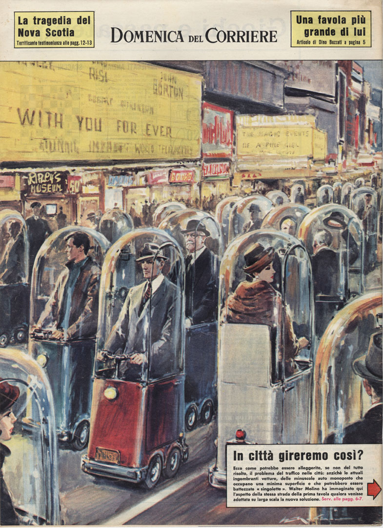
 The term 'dystopia' has been an interest of mine since I witnessed films, from the likes of Ridley Scott's, Blade Runner and Steven Spielberg's, Minority Report. It highlights a particular genre in fiction which portrays a highly corrupt society in comparison to current times. Usually dystopian fiction develops a satirical stance highlighting everything that's wrong within the current period; for example in Margaret Atwood's, The Handmaid's Tale, the role of women has drastically changed and they are mere tools for sex. This however still attains relation to their role in society now, in the likes of media where they are objectified in advertising for example.

 This is the my main motive for the project: to discuss how dystopian fiction could be perhaps a real entity within in our contemporary setting. I believe Huxley's cynical outlook in the writings of Brave New World, and even in his essays, The Doors of Perception and Heaven and Hell, develop to my objective the most.

 The themes and motifs which are: over consumption, dependence on technology, denial of truth, happiness, humanity, sex, loss of dignity, morals, values and emotions in BNW display impressive hindsight, since it was first published in 1931! Today it seems that these aspects seem more evident than ever, which is rather disturbing to think about.

Walter Molino, 1962

Sunday, 23 March 2014

The Finale to End all Finales

 Yes it's that time again, but for the last time! My mind is racing with various levels of anticipation, both good and bad. The course has enlightened my life very much indeed and I will miss it dearly when it soon ends. Let the final major project commence!

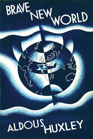
 After some thought over the Christmas holidays, I decided to pick a novel to visually respond from; as it has previously played to my advantage in the way I work. As I fascinate over reading dystopian fiction, I thought it fit to choose within this category. It was a novel I had begun reading the previous year, but had become side-tracked for some reason, so I wanted to give it another chance as it seemed very relevant to my current state of mind in observation of society. I decided to work with and create visual responses from Aldous Huxley's classic, Brave New World.


 Using this novel as a guide towards my outcome, I want to demonstrate how Brave New World is happening right now. Written in 1931, it tells of a future, very much similar to the current state of our contemporary world, where people are cloned and passion towards life has diminished; instead being overshadowed by seamless, superficial activities. Truth ceases to exist in the majority, and the majority ignore it without consciousness.

 I want to make a series of visual responses in accordance to this novel, and perhaps others, to gain a better understanding of my own personal observations: my 'brave new world'.

Monday, 28 October 2013

Artist Research

 As the module is taking progress, I decided to delve into some artist research to seek influence. After researching a good handful of artists for past modules, it's still very important to carry on looking to attain a hybrid mindset.

Here are three artists which work similarly to my own practice:

Brad Holland

 The first artist, Brad Holland, chooses to work using oil pastel. The image depicted presents a figure's face in sadness. What draws me to this image is that it's for starters figurative, and secondly because it has been drawn in such an expressionist manner. The outline of the profile is simple yet continuous, clearly representing an extremely rounded face. The line even flows into the mouth shape and displays squared-off teeth. The mouth depicts the grief and is followed by the closed eyelids. The eyelids acquire a subtle transparency which, if you look closer, the eye balls are visible. This engages another emotion that the face is expressing a maddening cry perhaps.
 The colour and texture within the image is vital in expressing the saddened face. The face appears rough textured due to the pastels and most of it acquires an ill complexion. The main focus of colour centres around the eyes and nose. Through the action of crying comes the sore redness from the tears and mucus. The texture is successful mostly around these areas because of the way they fade out and become speckled. The background colour emits the mood too due to its dark tone.

Mark Manders

 The second artist, Mark Manders, acquires the simple use of pencil line in this image. The image portrayed is of a figure dancing in the style of ballet perhaps. The shape is very abstract but the line is clear in allowing the viewer to understand what the figure is doing. The largest part of the shape appears almost like contracting biceps. The arch of the figure's back encourages this perspective. The shape underneath depicts the other leg in an ongoing motion of allegiance with the first leg. Without one, the actions would appear unclear.
 What makes the figure most figurative is the gormless expression being pulled in the area where the face would be. It is positioned on its side in an almost curious glance at the viewer. The hair just next to the face appears just as angular as the rest of the body. It runs parallel with the shape below it and makes a turn into the direction of what appears to be a perspective point. It is successful also in presenting that the figure is dancing in such an excitable manner.
 The perspective point helps the shape fold in onto itself and allows the viewer to understand how the figure's shape came about. The uplifted leg and the sweeping hair demonstrate the action being undertaken by the figure.
Kim Hiorthøy

 The final artist, Kim Hiorthøy, also attains the mood from this image by using simple media. The figure is clear and also satirical in that it's portraying a mock version of Batman. The frumpy caped crusader is drawn using pencil and it is applied in both the lines and the shading. The figure is deliberately drawn clumsily to illustrate that this is not Batman, but some slightly overweight and potentially drunk Halloween party-goer. The same style of line is used throughout the whole figure; changing in thickness every so often to emphasise certain areas, for example, the 'moobs' being thick.
 The figure's mask and cape are darkened out the most with the use of shading because obviously they need to be black to attain the Batman image. The figure's body and undergarments are the same colour as the paper used and are left out from shading. However a hand holding a cigarette creeps from underneath the cape and is shaded slightly to represent that it was perhaps previously hidden. The hand-written type at the top 'we must hide' implies this idea of secrecy.
 The composition of the type above the figure plays with the idea that negative space is just as important as the space applied.

Thursday, 2 May 2013

'The birth of Radio' Animation

 I have finally finished the animation for the brief and have uploaded it onto YouTube. Here it is:


 There was a lot of editing to be made in After Effects which made me panic slightly due to the massive workload that also needed to be in. When I got to uni, I photographed each frame using a vertical stand for my camera so it would remain in the exact same spot as it took each picture. I then imported all the images into After Effects and began adjusting the time sequence so that each morphed image would run parallel with the sound of the broadcast. I made the reversals too by swapping round the frames in correspondence to the next subject being discussed by the broadcast. When I finished that, I moved onto adjusting the constant horizontal line. I realised it was too central within the frame and it was causing the tops of some of the images to be cut off. I went into the filter section and increased the contrast and levels which made the white background and black lines a flat colour. I then added another flat white background to fill in the entire space behind the frames. This allowed me to be able to drag the sequence down a third without there being a different shade above. I re-scanned some of the frames that had this problem and replaced the originals with them. Also what I could do is rub out some of the smudges that appear too often due to the background being a solid white colour. I could probably edit this tomorrow and render it again.

 I believe I have responded to the brief well with this piece. My reasoning for the constant line and the morphing forms was because it connoted with how radio signals are read. The flickering line almost represents both the speaker's voices as though they are speaking to the listener through radio communication. It also illustrates the historical information they speak of by morphing into what they are describing. Animation and sound together make very effective composition with one another. The two compliment one another through expressionism.

 I can't believe it's the end of 2nd year! I hope I do well in this project and the other two.

Sunday, 28 April 2013

Development on the Animation (and a few sneak previews)!

 I have got down to getting this animation done! It's been a tough week with the PDP and context presentations, so now is the final push.

 I have drawn each frame using pen and ink onto A5 horizontal sheets. It's a timely process, but it's a method I know works effectively from having done it before. Here are some photographs of my method:


 This is my light box and it's the special ingredient within this whole process. It shines light through underneath with a standard light bulb. The cardboard right-angle corner on the light box keeps the frames in equal position. With out these the animation would be very messy and ill-composed.
 I first drew the straight line on two separate sheets to attain the flickering effect. I did this by drawing one, then put the next sheet on top whilst on the light box. I deliberately hit and miss the previous line so the flicker is emphasized. I carry on this method throughout the whole of the animation, slightly moving the lines each time. A problem I faced at the beginning was that the ink wasn't drying quickly enough. I grew impatient and kept the process going, but the wet ink from the previous drawing would inevitably make a dark patch under the sheet was drawing onto. I began using my laptop as a heater which proved successful and convenient.
 As I was drawing historical figures, places and machines, I had to research some reference in order to portray them properly, otherwise they'd just be random shapes. Putting in detail, such as one of the individual's facial expressions, proved difficult a couple of times because the ink may have ran slightly more than I wanted; thus making the face appear less like them.
 Now for a few previews of my frames that I have drawn to show evidence of my reference:

Telegraph and Telephone


Thomas Hardy

19th Century Generation

Thomas Edison

Lyon

Sean Street

 Now comes the process of editing it all into After Effects. Wish me luck!

Monday, 22 April 2013

My Idea and Storyboard

 Now to properly begin focusing on the animation! I have listened to the radio broadcast a few times now and I have written down the times for whenever a different subject is listed. Here is my storyboard:


 This is a rough version of how my animation will play out. I hadn't collected my image references by the time I did this, so forgive me if the images look a little off. The way I want my animation to run is to have a horizontal line constantly going across the the frame. This line will be 'shake-y' like my creature animation, as in that I'll draw two or three frames for each lingering image. By this I'll be using a light box, but I won't explain that process yet. I'll show my development with it in one of the next blog posts.
 As the line lingers and the duration of the broadcast plays, images will morph themselves from the line upwards. Each image will appear whenever their name is mentioned, such as the telegraph and telephone. These images will also linger for some time too, so I will apply the same method as with the straight line. The gradual morphing drawings will consist of about 5 or 6 frames. These will then reverse back into the line again when the next subject arises. Here is a test example of what I am explaining:

Test Storyboard
 See how the globe moulds out of the line and then sinks back into it? That's how the animation will appear. When the image lingers, I will add something to make parts of it flash as it goes from frame to frame. Now I just need to use my image reference to begin drawing out what I want the images to look like.

Thursday, 11 April 2013

Animation Research

 Now that I am going to create a new animation, I wish to use the same method as I did with the mythological creature project. First off, here are some animators I have taken influence from for this project and previous ones:

David Shrigley


 An illustrator I've used as research before, Shrigley always achieves my approval. This animation expresses his random sense of humour and deliberate imperfections with his use of line. The animation, along with his others, create narratives that seem like something that would happen in everyday life, but then become twisted somehow. It's performed in an innocent childish way too which expands his abilities in allowing random things to occur.

Peter Millard


 When playing this, have the volume turned down. Kept making me jump with the random silences and then the sudden outbursts of noise! I stumbled across Millard recently and realized he's doing exactly the same method as me, only with far more frames I imagine. The childish-like crude behaviour in this animation makes me laugh. I also noticed he applies colour in his animations; something I could possibly begin doing myself.

Willis Earl Beal


 This animation was made using graphite. It's a very useful medium because it does all the things a pencil does, but better! The various shadings and lines used throughout this animation evoked a very sombre atmosphere along side the song which I believe Beal scored himself as well. The string instrument (probably acoustic guitar) being played alongside the quiet melodic singing sounds as though it was recorded through something very old - the sort of quality you hear with old blues music. This emphasized character's moody nature as he went about his day with a glum expression. Each of the frames had a grainy, scratchy effect like an old film roll. This could potentially work within my animation since it discusses in context with the late 19th and early 20th Centuries.

Tuesday, 9 April 2013

RA D IO_4

 I hope the title is legible! I based it on the In Rainbows album cover type style by Radiohead. Anyway, onto the next and final brief of 2nd year!

 Again the rest of the students and myself were given the choice of three briefs to choose from. I chose to take on another animation project. The task is to create at least a minute long animation to go alongside a BBC Radio 4 broadcast. There were four to choose from and I chose the one titled 'The birth of Radio'.
 I listened to all four but this one appealed to me the most because it spoke of social historical changes, which I always find fascinating. It goes over and brings into context: the Industrial Revolution, the British Empire, the first of radio technology, Victorian England, Thomas Hardy and even the French Revolution! Its main topic point is to do with 'wireless telegraphy' and its inventor, Guglielmo Marconi.

 Here is the radio broadcast and some background knowledge to do with 'wireless telegraphy', Guglielmo Marconi and other elements related:


http://www.bbc.co.uk/programmes/p010qnhc


'Wireless Telegraphy', sourced from Wikipedia

Wireless telegraphy is a historical term used today to apply to early radio telegraph communications techniques and practices, particularly those used during the first three decades of radio (1887 to 1920) before the term radio came into use.
Wireless telegraphy originated as a term to describe electrical signalling without the electric wires to connect the end points. The intent was to distinguish it from the conventional electric telegraph signalling of the day that required wire connection between the end points. The term was initially applied to a variety of competing technologies to communicate messages encoded as symbols, without wires, around the turn of the 20th century, but radio emerged as the most significant.
Wireless telegraphy rapidly came to mean Morse code transmitted with Hertzian waves (electromagnetic waves) decades before it came to be associated with the term radioRadio-telephony by 1920's began to displace radio telegraphy for many applications and was the basis of public broadcasting. Radio-telegraphy continued to be used for point-to-point business, governmental, and military communication, and evolved into radioteletype networks. Wireless telegraphy is still used widely today by amateur radio hobbyists where it is commonly referred to as radiotelegraphy, continuous wave, or just CW.

Guglielmo Marconi, sourced from Wikipedia

Guglielmo Marconi (25 April 1874 – 20 July 1937) was an Italian inventor, known for his pioneering work on long distance radio transmission and for his development of Marconi's law and a radio telegraph system. Marconi is often credited as the inventor of radio, and he shared the 1909 Nobel Prize in Physics with Karl Ferdinand Braun "in recognition of their contributions to the development of wireless telegraphy". As an entrepreneur, businessman, and founder of the The Wireless Telegraph & Signal Company in Britain in 1897, Marconi succeeded in making a commercial success of radio by innovating and building on the work of previous experimenters and physicists. In 1924, he was ennobled as a Marchese.

By 1897, Guglielmo Marconi conducted a series of demonstrations with a radio system for signalling for communications over long distances. Marconi is said to have read, while on vacation in 1894, about the experiments that Hertz did in the 1880's. Marconi also read about Tesla's work. It was at this time that Marconi began to understand that radio waves could be used for wireless communications. Marconi's early apparatus was a development of Hertz’s laboratory apparatus into a system designed for communications purposes. At first, Marconi used a transmitter to ring a bell in a receiver in his attic laboratory. He then moved his experiments out-of-doors on the family estate near Bologna, Italy, to communicate farther. He replaced Hertz’s vertical dipole with a vertical wire topped by a metal sheet, with an opposing terminal connected to the ground. On the receiver side, Marconi replaced the spark gap with a metal powder coherer, a detector developed by Edouard Branly and other experimenters. Marconi transmitted radio signals for about a mile at the end of 1895.


Industrial Revolution, sourced from Wikipedia


The Industrial Revolution was the transition to new manufacturing processes that occurred in the period from about 1760 to some time between 1820 and 1840. This transition included going from hand production methods to machines, new chemical manufacturing and iron production processes, improved efficiency of water power, the increasing use of steam power and development of machine tools. The transition also included the change from wood and other bio-fuels to coal. The Industrial revolution began in Britain and within a few decades spread to Western Europe and the United States.
The Industrial Revolution marks a major turning point in history; almost every aspect of daily life was influenced in some way. Most notably, average income and population began to exhibit unprecedented sustained growth. In the words of Nobel Prize winner Robert E. Lucas, Jr., "For the first time in history, the living standards of the masses of ordinary people have begun to undergo sustained growth ... Nothing remotely like this economic behaviour is mentioned by the classical economists, even as a theoretical possibility."

British Empire, sourced from Wikipedia

The British Empire comprised the dominionscoloniesprotectoratesmandates and other territories ruled or administered by the United Kingdom. It originated with the overseas possessions and trading posts established by England between the late 16th and early 18th centuries. At its height, it was the largest empire in history and, for over a century, was the foremost global power. By 1922 the British Empire held sway over about 458 million people, one-fifth of the world's population at the time. The empire covered more than 33,700,000 km2(13,012,000 sq mi), almost a quarter of the Earth's total land area. As a result, its political, legallinguistic and cultural legacy is widespread. At the peak of its power, the phrase "the empire on which the sun never sets" was often used to describe the British Empire, because its expanse across the globe meant that the sun was always shining on at least one of its territories.

Telegraph, sourced from Wikipedia

An electrical telegraph is a telegraph that uses electrical signals, usually conveyed via telecommunication lines or radio. The electromagnetic telegraph is a device for human-to-human transmission of coded text messages.
The electrical telegraph, or more commonly just 'telegraph', superseded optical semaphore telegraph systems, such as those designed by Claude Chappe for the French military, and Friedrich Clemens Gerke for the Prussian military, thus becoming the first form of electrical telecommunications. In a matter of decades after their creation, electrical telegraph networks permitted people and commerce to almost instantly transmit messages across both continents and oceans, with widespread social and economic impacts.

Phonograph, sourced from Wikipedia

The phonograph, record player, or gramophone (from the Greek: γράμμα, gramma, "letter" and φωνή, phōnē, "voice"), is a device introduced in 1877 for the recording and reproduction of sound recordings. The recordings played on such a device generally consist of wavy lines that are either scratched, engraved, or grooved onto a rotating cylinder or disc. As the cylinder or disc rotates, a stylus or needle traces the wavy lines and vibrates to reproduce the recorded sound waves.
The phonograph was invented in 1877 by Thomas Edison. While other inventors had produced devices that could record sounds, Edison's phonograph was the first to be able to reproduce the recorded sound. His phonograph originally recorded sound onto a tinfoil sheet phonograph cylinder, and could both record and reproduce sounds.

Monday, 8 April 2013

Final Final Book Cover (phew)!

 After some criticism about my final design, I now had the chance to edit the piece before the Penguin competition deadline, which is tomorrow! Here is my original draft again and the edited version below:

First Draft

Edited Version

 The main element that needed adjusting the most were the composition of the types. On the front where the title 'The Big Sleep' is composed, I decided to make it a stronger design by making an alignment down the middle of each word. I did this by connecting the 'h' with the 'i' and then so on to the 'l' underneath. I had to adjust the sizes of each word too in order for this to work. It's improved because I believe the last one looked slightly messy and unconsidered. The connection down the middle as well emphasises the rain by making it look as though the type is running.
 As well as the title, I adjusted the author's name 'Raymond Chandler' by aligning both the 'R' and the 'C' with the back of the knight piece. This helped to form a frame around the composition. The same was applied to the type 'A Philip Marlowe Mystery' also. On the back, the only aspect that needed aligning were the critic's reviews underneath the blurb. I simply just boxed them together as they appeared widened last time  As well as the composition of the typography, I decided to lighten up the grey type on the front. It looked a little too dark in the first draft due to the background already being a solid black. The lightened type also composes more effectively with the rain because they appear almost the same shade.
 The image of the nude woman within the knight piece required some editing too. Her body is fine, but her hair in the previous draft was touching the edge of the knight piece. I simply just erased the parts that were touching and added a few more flicks at the end with the brush tool in Photoshop. The feet I believed needed a touch-up too because she looked as though she was on her tiptoes. I again applied the same method of erasing parts of the lines and used the brush tool to create a more realistic perspective.
 A final element that appears probably most noticeable is the dark rain within the spine. Seeing as rain was continuing from the front to the back in a diagonal motion, it seemed only suiting to connect the sides by placing the rain in the middle too. I coloured them with the same colour used on the original grey type. I experimented with black, but the mid-tone of the grey delivered better composition with the rest of the cover. It makes an effective contrast between the dark and light shades.

 And that's it for this piece so far. All I have to do is send it off to Penguin and hope for the best. I think I've done very well in this project. It has certainly increased my workflow.

Sunday, 7 April 2013

Joyce's Moving Sweet Shop

 I have finally uploaded it onto YouTube and this time had no trouble with any copyright problems. Ta-da!


 Everything about this works well. The motion of the camera looking at the sweet jars almost feels human. Even though our eyes scan images by flickering, the gradual pace of the movement doesn't feel robotic. It enhances character too I believe, as well as the sound that goes with it of children. The height and perspective of the shelves too creates this feeling that the viewer is looking through the eyes of a child. The animated figure of Richard makes its contribution by evoking curiosity in the child's thought process. The child moves their gaze back towards the jar and zooms in knowing for sure they had just seen something.
 The child is based on Joyce and the sweet jars represent where her memories are stored. Symbolically, her mind will skim over these jars hoping to find that memory she lost of her husband. It is deeply saddening to think that the memory of a loved one could be lost so easily. Every time I watch this and the other animations people produced, I feel both saddened and happy. Happy because memories are usually based on visual experience and what we are doing by creating these animations and images is reinventing those memories into a physical form again, so to speak. Memories are meant to be cherished for later life and it's hard comprehending that they could all be forgotten...

Assembling Joyce's Animation

 I have now planned the way the animation will proceed and have gained all the elements necessary. The essential part of this animation is the gradual motion of the child's sight looking upon the jars of sweets. I did this using After Effects by placing the entire shop image into frame and zooming in. I adjusted the direction, the flow and the speed using very complicated functions which I can't even remember how. It worked to the way I wanted it though and so that leads onto the next essential part: Richard's figure flicking his hair.
 As Joyce grew up as an adolescent either during the 40's or 50's, Richard in my mind most probably could have been a greaser/rocker-type. Obviously she cannot remember his exact appearance, hence why he appears as a silhouette in the image and animation. But it gives him character regardless and the ability to display animation. What I did to achieve this was redraw him within Photoshop several times. In each drawing, he gradually tilts his head backwards. I would then reverse these drawings back to his original state and then have his hair bounce slightly, just to make his hair feel more real. Here is a representation of what I drew:

 From left to right is the full animation of his head tilting back and forward. It appears subtle, but within the animation it looks better that way, because it's not meant to be completely obvious: more like something you see in the corner of your eye. This movement occurs just before the viewer veers off into the next row of sweets, and of course the double-take happens and instead in the jar are the liquorice sticks. The trick behind that is another After Effects tool that makes something appear in at a desired point within the the frame.
 Another required element which is key for most animations is sound. For this I wanted to get the atmospheric sound of a gathered bunch of excited children within a enclosed space. My original plan was to record children near a playground, but I feared this would be controversial as the only recording equipment I have is a camera. So instead I recorded (with the lid on!) two of my cousins playing together. Seeing as there were only two of them, I recorded a mixture of sounds they made and merged them all together into After Effects. It was a funny experience because they were confused and interested as to what I was doing!

Thursday, 21 March 2013

The Themed Patterns (developed and finished)!

 I have now made my two patterns. I first made two more illustrations into my sketchbook that form a segment of the repeated pattern. Here is the 'wartime' theme:

Wartime Theme
 As you can see I have applied shading into the design. Due to the context being about the blitz, I immediately made the connotation of soot and ash. The grainy texture made by a pencil on its side represents this perfectly. I applied this method and then used a wet brush to create a smudge effect. I deliberately made the shading around the destroyed area darker to emphasise that a bomb caused this destruction; so a burnt effect basically. I originally drew the outline in pencil just in case I made a mistake and then went over it in fine liner. Then to put it into the pattern I began duplicating the image, attaching them at each side. I repeated this a couple of times and gradually it built up within the A4 horizontal page. Here is the outcome:


 As I described before, I wanted it to appear as though the houses were ascending up a hill from the perspective of the viewer. The monochrome and the endless amount of roof tops and windows makes this piece look very dense. The destroyed areas of the terrace houses reveal a living room window on the street behind. This makes the pattern almost hypnotic and abstract. It forces the viewer to peer in closer.
 This pattern further represents the context due to the catastrophic nature of WWII. It serves almost like a memorial to the victims taken by the blitz because the image appears so vast and infinite; symbolizing the almost countless deaths. It also could symbolize society and what human nature is capable of; even worse in mainland Europe where innocents were murdered by gas according to their race. War is a terrible thing, and the events that happened during WWII must definitely never happen again.


 Now for the 'historic buildings' theme. As I had been working closely with the theme of Pear Mill, I thought it appropriate to incorporate it into this cover somehow. Due to the term given to work upon, 'buildings', I realised that the cover had to be something universal; something that applied with most standard buildings. When I think of a building, I imagine a giant rectangular block with windows. The windows I then thought were a great idea. When I found this idea, I immediately remembered the album cover Physical Graffiti, by Led Zeppelin:

Physical Graffiti, Led Zeppelin
 This influenced my idea of having the pattern just as windows. In accordance to Pear Mill, I decided to draw a segment of the windows into my sketchbook:

Buildings Theme
 I drew and kept the windows in the same style as my entire illustration of Pear Mill, with the pen and ink and watercolours. I then applied the same technique as I did with the 'wartime' theme and kept on duplicating them until they filled the A4 space. Here is my outcome:


 Yet again, compared with my 'wartime' pattern, it appears rather densely populated with the amount of windows there are. It appears almost like a 'super factory'! I believe it appears abstract as well as representational because of the same reason (the size). Its difference with the 'wartime' cover is that it has colour. Colour is more so necessary in this one because of the burgundy/redness that is associated with industrial architecture. The weathered red bricks that crafted these working spaces symbolize how huge the buildings were.
 I believe this relates to the context of the brief well because the buildings that were made during the industrial revolution still stand today and so keep the memory of what was. Their dominance in the landscape pushes across the message that everything has a history, and that these histories will never be altered or forgotten. Even if Joyce cannot remember, the building physically remains present.

Wednesday, 20 March 2013

Pear Mill Revealed!

 I have made my illustration of Pear Mill. I cleaned it up a little in Photoshop and increased the contrast to enhance the colours of the paint:


 Looking back on the previous designs, I decided to redraw my strongest one and add extra detail. It's essentially the same shape and perspective as that one, and the colours too are similar. Again, they were painted in watercolours and they helped let the ink run unpredictably. Also the windows have received a touch up with the extra lines going through them, which represent the panes. The most important aspect obviously is that it illustrates Pear Mill. It acquires a Quentin Blake style where the paint is running over the lines and the lines are hastily drawn. This gives it character and it displays a great example of how effective hand-rendered work can be.

Monday, 18 March 2013

Development of the Booklet Covers

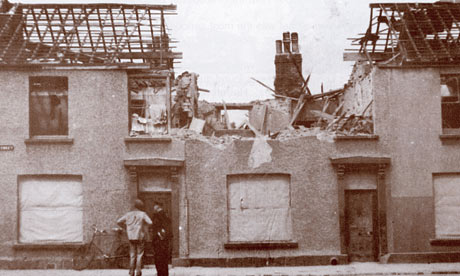
 As well as the Pear Mill illustration and the sweet shop animation, we ALSO have to design two pattern-based booklet covers! It seems to be a very busy project. The two covers are themed 'historic wartime' and historic buildings'. For the 'wartime' cover, I came across a photograph of a residential street in Manchester during World War II that had been blitzed:

Blitzed Street in Manchester

 The pattern appeared in my head and I knew what I wanted. The pattern will be a drawn version of this photograph and will be repeated as though a house has exploded every few yards down the endless street. The streets will overlap one another as though they are gradually going up a hill for example. I have started drawing this idea within my sketchbook:


 These are deliberately first drafts, so I'll make sure to put in adequate detail. I will keep the image monochrome to keep with the theme of the war period. Photography during WWII was predominately black and white, so I want it to bear that connotation. The pattern idea for this is well suited as well because terrace houses from above appear as rows and rows and rows of almost infinite (exaggerating) stretches of streets. It emphasises also the fact that the Germans could have dropped a bomb anywhere over the city without knowing where, and it will have destroyed at least something. It must have been such a scary time, especially for young Joyce who had to hide under the staircases in her sweet shop whilst the sirens blazed. I find WWII so fascinating. The fact it occurred during the Twentieth Century still astounds me.

Drawings of Pear Mill

 After visiting Pear Mill, I now began drawing the building into my sketchbook. The best development work I'd made so far had come from my sketchbooks, like in the Penguin book cover project, so I just started being playful with the use of media and what style I'd prefer it. Here they are:


 The lines I've drawn were made with the pen and ink technique. It seems this has become my favourite use of line. I enjoy how unpredictable it is, such as when it runs a little or flicks ink to the other side of the page. It works effectively with watercolours too because the water encourages the flow of the ink to spread. The second-to-last image is different to the rest because I applied brusho dye for the first time. I was unsure as how to use it, but I guess I learn from experience. It was more difficult to use than I'd previously thought because the grains sometimes don't run and you have to be careful of putting too much water on the surface, otherwise it'll run off the page! I enjoyed all these styles of drawing and I believe the last one to be the strongest, simply because slightly more detail has gone into it, i.e. the different shades appearing on each side of the building and the line textures. My final outcome will probably end up being similar to this one.

Sunday, 17 March 2013

The Stage is Set

 After almost a week's dedication to this image, I have finally completed it. It seemed simple to start with, but the layers from the original image were all locked together so I had to manoeuvre around them which took quite some time. There were so many layers by the end of it! Anyway, it is done and all I have to do now is put it into After Effects. Here it is:

Richard

 For the jars, I duplicated them adjusting their size depending how far down they were. I even added different types of reflection on each jar simply using the brush tool. For the shelf lines I extended them keeping in mind with the point-of-perspective, so they'd become narrower as they verge to the right-hand side of the image. For the sweets in the jars I again duplicated them and scattered them as randomly as possible. I adjusted their colours too to add variation in the types of sweets available.
 What also is required for the animation are the liquorice sticks. For this I photographed a small bunch of them and applied the same method of contrast levelling as I did with the other sweets. Here they are within the shop replacing Richard's figure:

Liquorice

 I find this a fun concept, but at the same time feel sad due to its context. Joyce's loss of memory is the crucial factor behind this brief.

Thursday, 7 March 2013

My Animation Environment

 For this animation I am going to create, I am simply going to expand the scene of the sweet jars from my original outcome of the last Age UK project. This will mean more sweet jars and more sweets! Luckily with the help of Photoshop, all I'll have to do is duplicate everything. Here is a rough sketch of my initial idea including lines and arrows directing the flow of the animation:

Sketch of Animation

 My idea is to pan across this expanse of sweet jars as though a child is looking at them all eagerly. Then the child's eyes will pass over the figure of Joyce's husband within the sweet jar. There would then be a double-take back towards the figure, but he would not be there. Instead he'd be replaced with a stack of liquorice sticks. This concept is playing with the quote Joyce used to describe the memory of her husband, "A figure in the background."