Monday, 8 April 2013

Final Final Book Cover (phew)!

 After some criticism about my final design, I now had the chance to edit the piece before the Penguin competition deadline, which is tomorrow! Here is my original draft again and the edited version below:

First Draft

Edited Version

 The main element that needed adjusting the most were the composition of the types. On the front where the title 'The Big Sleep' is composed, I decided to make it a stronger design by making an alignment down the middle of each word. I did this by connecting the 'h' with the 'i' and then so on to the 'l' underneath. I had to adjust the sizes of each word too in order for this to work. It's improved because I believe the last one looked slightly messy and unconsidered. The connection down the middle as well emphasises the rain by making it look as though the type is running.
 As well as the title, I adjusted the author's name 'Raymond Chandler' by aligning both the 'R' and the 'C' with the back of the knight piece. This helped to form a frame around the composition. The same was applied to the type 'A Philip Marlowe Mystery' also. On the back, the only aspect that needed aligning were the critic's reviews underneath the blurb. I simply just boxed them together as they appeared widened last time  As well as the composition of the typography, I decided to lighten up the grey type on the front. It looked a little too dark in the first draft due to the background already being a solid black. The lightened type also composes more effectively with the rain because they appear almost the same shade.
 The image of the nude woman within the knight piece required some editing too. Her body is fine, but her hair in the previous draft was touching the edge of the knight piece. I simply just erased the parts that were touching and added a few more flicks at the end with the brush tool in Photoshop. The feet I believed needed a touch-up too because she looked as though she was on her tiptoes. I again applied the same method of erasing parts of the lines and used the brush tool to create a more realistic perspective.
 A final element that appears probably most noticeable is the dark rain within the spine. Seeing as rain was continuing from the front to the back in a diagonal motion, it seemed only suiting to connect the sides by placing the rain in the middle too. I coloured them with the same colour used on the original grey type. I experimented with black, but the mid-tone of the grey delivered better composition with the rest of the cover. It makes an effective contrast between the dark and light shades.

 And that's it for this piece so far. All I have to do is send it off to Penguin and hope for the best. I think I've done very well in this project. It has certainly increased my workflow.

Sunday, 7 April 2013

Joyce's Moving Sweet Shop

 I have finally uploaded it onto YouTube and this time had no trouble with any copyright problems. Ta-da!


 Everything about this works well. The motion of the camera looking at the sweet jars almost feels human. Even though our eyes scan images by flickering, the gradual pace of the movement doesn't feel robotic. It enhances character too I believe, as well as the sound that goes with it of children. The height and perspective of the shelves too creates this feeling that the viewer is looking through the eyes of a child. The animated figure of Richard makes its contribution by evoking curiosity in the child's thought process. The child moves their gaze back towards the jar and zooms in knowing for sure they had just seen something.
 The child is based on Joyce and the sweet jars represent where her memories are stored. Symbolically, her mind will skim over these jars hoping to find that memory she lost of her husband. It is deeply saddening to think that the memory of a loved one could be lost so easily. Every time I watch this and the other animations people produced, I feel both saddened and happy. Happy because memories are usually based on visual experience and what we are doing by creating these animations and images is reinventing those memories into a physical form again, so to speak. Memories are meant to be cherished for later life and it's hard comprehending that they could all be forgotten...

Assembling Joyce's Animation

 I have now planned the way the animation will proceed and have gained all the elements necessary. The essential part of this animation is the gradual motion of the child's sight looking upon the jars of sweets. I did this using After Effects by placing the entire shop image into frame and zooming in. I adjusted the direction, the flow and the speed using very complicated functions which I can't even remember how. It worked to the way I wanted it though and so that leads onto the next essential part: Richard's figure flicking his hair.
 As Joyce grew up as an adolescent either during the 40's or 50's, Richard in my mind most probably could have been a greaser/rocker-type. Obviously she cannot remember his exact appearance, hence why he appears as a silhouette in the image and animation. But it gives him character regardless and the ability to display animation. What I did to achieve this was redraw him within Photoshop several times. In each drawing, he gradually tilts his head backwards. I would then reverse these drawings back to his original state and then have his hair bounce slightly, just to make his hair feel more real. Here is a representation of what I drew:

 From left to right is the full animation of his head tilting back and forward. It appears subtle, but within the animation it looks better that way, because it's not meant to be completely obvious: more like something you see in the corner of your eye. This movement occurs just before the viewer veers off into the next row of sweets, and of course the double-take happens and instead in the jar are the liquorice sticks. The trick behind that is another After Effects tool that makes something appear in at a desired point within the the frame.
 Another required element which is key for most animations is sound. For this I wanted to get the atmospheric sound of a gathered bunch of excited children within a enclosed space. My original plan was to record children near a playground, but I feared this would be controversial as the only recording equipment I have is a camera. So instead I recorded (with the lid on!) two of my cousins playing together. Seeing as there were only two of them, I recorded a mixture of sounds they made and merged them all together into After Effects. It was a funny experience because they were confused and interested as to what I was doing!

Thursday, 21 March 2013

The Themed Patterns (developed and finished)!

 I have now made my two patterns. I first made two more illustrations into my sketchbook that form a segment of the repeated pattern. Here is the 'wartime' theme:

Wartime Theme
 As you can see I have applied shading into the design. Due to the context being about the blitz, I immediately made the connotation of soot and ash. The grainy texture made by a pencil on its side represents this perfectly. I applied this method and then used a wet brush to create a smudge effect. I deliberately made the shading around the destroyed area darker to emphasise that a bomb caused this destruction; so a burnt effect basically. I originally drew the outline in pencil just in case I made a mistake and then went over it in fine liner. Then to put it into the pattern I began duplicating the image, attaching them at each side. I repeated this a couple of times and gradually it built up within the A4 horizontal page. Here is the outcome:


 As I described before, I wanted it to appear as though the houses were ascending up a hill from the perspective of the viewer. The monochrome and the endless amount of roof tops and windows makes this piece look very dense. The destroyed areas of the terrace houses reveal a living room window on the street behind. This makes the pattern almost hypnotic and abstract. It forces the viewer to peer in closer.
 This pattern further represents the context due to the catastrophic nature of WWII. It serves almost like a memorial to the victims taken by the blitz because the image appears so vast and infinite; symbolizing the almost countless deaths. It also could symbolize society and what human nature is capable of; even worse in mainland Europe where innocents were murdered by gas according to their race. War is a terrible thing, and the events that happened during WWII must definitely never happen again.


 Now for the 'historic buildings' theme. As I had been working closely with the theme of Pear Mill, I thought it appropriate to incorporate it into this cover somehow. Due to the term given to work upon, 'buildings', I realised that the cover had to be something universal; something that applied with most standard buildings. When I think of a building, I imagine a giant rectangular block with windows. The windows I then thought were a great idea. When I found this idea, I immediately remembered the album cover Physical Graffiti, by Led Zeppelin:

Physical Graffiti, Led Zeppelin
 This influenced my idea of having the pattern just as windows. In accordance to Pear Mill, I decided to draw a segment of the windows into my sketchbook:

Buildings Theme
 I drew and kept the windows in the same style as my entire illustration of Pear Mill, with the pen and ink and watercolours. I then applied the same technique as I did with the 'wartime' theme and kept on duplicating them until they filled the A4 space. Here is my outcome:


 Yet again, compared with my 'wartime' pattern, it appears rather densely populated with the amount of windows there are. It appears almost like a 'super factory'! I believe it appears abstract as well as representational because of the same reason (the size). Its difference with the 'wartime' cover is that it has colour. Colour is more so necessary in this one because of the burgundy/redness that is associated with industrial architecture. The weathered red bricks that crafted these working spaces symbolize how huge the buildings were.
 I believe this relates to the context of the brief well because the buildings that were made during the industrial revolution still stand today and so keep the memory of what was. Their dominance in the landscape pushes across the message that everything has a history, and that these histories will never be altered or forgotten. Even if Joyce cannot remember, the building physically remains present.

Wednesday, 20 March 2013

Pear Mill Revealed!

 I have made my illustration of Pear Mill. I cleaned it up a little in Photoshop and increased the contrast to enhance the colours of the paint:


 Looking back on the previous designs, I decided to redraw my strongest one and add extra detail. It's essentially the same shape and perspective as that one, and the colours too are similar. Again, they were painted in watercolours and they helped let the ink run unpredictably. Also the windows have received a touch up with the extra lines going through them, which represent the panes. The most important aspect obviously is that it illustrates Pear Mill. It acquires a Quentin Blake style where the paint is running over the lines and the lines are hastily drawn. This gives it character and it displays a great example of how effective hand-rendered work can be.

Monday, 18 March 2013

Development of the Booklet Covers

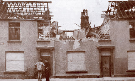
 As well as the Pear Mill illustration and the sweet shop animation, we ALSO have to design two pattern-based booklet covers! It seems to be a very busy project. The two covers are themed 'historic wartime' and historic buildings'. For the 'wartime' cover, I came across a photograph of a residential street in Manchester during World War II that had been blitzed:

Blitzed Street in Manchester

 The pattern appeared in my head and I knew what I wanted. The pattern will be a drawn version of this photograph and will be repeated as though a house has exploded every few yards down the endless street. The streets will overlap one another as though they are gradually going up a hill for example. I have started drawing this idea within my sketchbook:


 These are deliberately first drafts, so I'll make sure to put in adequate detail. I will keep the image monochrome to keep with the theme of the war period. Photography during WWII was predominately black and white, so I want it to bear that connotation. The pattern idea for this is well suited as well because terrace houses from above appear as rows and rows and rows of almost infinite (exaggerating) stretches of streets. It emphasises also the fact that the Germans could have dropped a bomb anywhere over the city without knowing where, and it will have destroyed at least something. It must have been such a scary time, especially for young Joyce who had to hide under the staircases in her sweet shop whilst the sirens blazed. I find WWII so fascinating. The fact it occurred during the Twentieth Century still astounds me.

Drawings of Pear Mill

 After visiting Pear Mill, I now began drawing the building into my sketchbook. The best development work I'd made so far had come from my sketchbooks, like in the Penguin book cover project, so I just started being playful with the use of media and what style I'd prefer it. Here they are:


 The lines I've drawn were made with the pen and ink technique. It seems this has become my favourite use of line. I enjoy how unpredictable it is, such as when it runs a little or flicks ink to the other side of the page. It works effectively with watercolours too because the water encourages the flow of the ink to spread. The second-to-last image is different to the rest because I applied brusho dye for the first time. I was unsure as how to use it, but I guess I learn from experience. It was more difficult to use than I'd previously thought because the grains sometimes don't run and you have to be careful of putting too much water on the surface, otherwise it'll run off the page! I enjoyed all these styles of drawing and I believe the last one to be the strongest, simply because slightly more detail has gone into it, i.e. the different shades appearing on each side of the building and the line textures. My final outcome will probably end up being similar to this one.