Tuesday, 15 April 2014

Photocopying and Editing

 After some initial development in two sketchbooks, I started to overlay the images onto backgrounds I had made with mount board. I used a photocopier to accomplish this outcome and it certainly demonstrated the act of chance:


 These ones were picked for being the strongest and I edited them slightly with the use of Photoshop. Some I kept the colour, some I didn't. Some I duplicated parts, some I didn't. This playful technique has developed well and I believe that I have become more accomplished with it. It's clear the ones that are most effective in this bunch acquire both a bold graphic look, with a fine art quality composed alongside: such as the scratchy lines and crease textures.

 I believe these images have come out well in a sense that this project is looking more hopeful in finding a direction and a context to work towards. I'm still unsure as to what it could be, but perhaps something along the lines as an anniversary for Huxley's work. I want the visual responses to be central, but perhaps something digital and even physical could be added to what needs to be shown. Gifs are something I'm hoping in trying out and the physical aspect could be a 3D piece of a figure...

Monday, 14 April 2014

Landan Trip


There's a hole in the world like a great black pit

and the vermin of the world inhabit it

and its morals aren't worth what a pig could spit

and it goes by the name of London


Sweeney Todd


 Luckily we didn't experience the nature of Victorian London, however fascinating that would've been, but we still visited the infamous capital for a glimpse of its illustration industry... and its rum...


 After an exceedingly expensive train journey that was pretty relaxing, I arrived in London at 11:10 am on Tuesday morning and made rendezvous with the rest of the class. We traversed out of Euston and headed straight to our first destination: adam&eveDDB. They are a communications company and are responsible for advertising brands. We entered a very stylish office building through a small rotating door and were welcomed by a smart and clean looking man in skinny jeans and loafers. He then escorted us into a glass-walled office with a huge flat screen television inside. As there were so many of us, I ended up sat on the floor which I wasn't too bothered about. He gave us an introduction as to what the company does and showed a series of adverts that they had published. They work with image makers of all varieties and establish the connection between them and the advertising client (sort of like an agency). He then gave us some feedback on a few questions about how to promote ourselves, which I found very valuable. After and hour or so, we said thank you and headed out for the tube to our next point of interest.

 We arrived at Elephant and Castle station and started walking. We walked for at least 30 minutes or so until we were in a very residential looking part of town. We were lost for a little while, but managed to spot one of the people waving at us from across the street. She was called Grace and she showed us into a large empty mill-type building. She was part of a collective of post-graduate illustration students, called Day Job. We crowded up a lift and went upwards to a studio of spaces filled with art work. I felt right at home and we gathered round in a circle on some chairs and cushions - I was on the floor again! There were 5 girls and they gave us some insight into what they do and what it's like after university. With the work they made, they made zines together so they could promote their work. I loved the environment and I'm hoping to have a space of my own in the near future; potentially with others from the class! They then had a look through our portfolios, but I'll leave that for another post. We made our way out down the lift and headed back to the station, so we could finally get to our hostel which was all the way over at King's Cross.

 After a quick rest back at the hostel, myself and two other fellow students conversed to Camden for a night of various antics, including me dancing like a puppet... Anyway, the next day 6 of us made an extraordinary visit to a lady's house. A very lovely and hospitable lady indeed, she's called Naomi Games and is the daughter of the famous graphic designer, Abram Games! We entered into the house and introduced ourselves to Naomi at the top of the stairs with a hand shake. She wore nice clothes that emitted the colours pink and purple, mainly in the scarf she was wearing. We then entered the kitchen which was full of artwork and all sorts of cool antiques and furniture. We sat round the table and eagerly anticipating what she would show us. She first asked if we all wanted a hot drink and most of us answered yes. She revealed a crazy, bong-like coffee maker which happened to be an invention created by her father. She was going to show us his archive of development work. We all drank our coffees and she opened up countless amounts of folders containing this goldmine of work. Everyone was most fascinated by his stamp designs because of how small he made them. A tool he used, an airbrush, was passed round with delicacy. Ian, our tutor, couldn't contain his excitement. It was all very fascinating and she even told us a story about how Paul Rand and Saul Bass came round for tea! Apparently I was sat where Rand was. Starstruck much?! After a lengthy presentation of the vast amount of work, we made our goodbyes with another classic handshake, and left for London town for some final free time in this amazing city.

Grow Your Own Food, Abram Games

 Got back to ol' Mancunia by 11:10 pm after another relaxing train journey, and headed back home to continue writing the last part of my dissertation. It was a long night...

Sunday, 6 April 2014

The Business Cards, mmm

 Yes, the real world is fast approaching and as students, we are in preparation to promote ourselves and our work. We have been asked to create a website, build a portfolio and handle some business cards. At this stage, it all feels quite daunting because I've never been outside of education my entire life! And now we've all grown up and are expected to know what to do next, which quite frankly I'm not even sure.

 In this revolutionary age of technology, particularly with the influence of the internet, self-promotion seems a much easier process. With our websites, anyone in the world can see them just by clicking a button. An amazing prospect indeed, and a sign that opportunities are absolutely everywhere. This raises my hopes in the midst of all the stress that inevitably comes with acquiring a skilled occupation.

 So here is my card:


 For the front of the card I created my own type, that being the letters spelling my name in large. I used my trademark pen and ink and made smooth but jagged lines. The style of a signature springs to mind with this, like a quick scrawl from a fountain pen. I duplicated two of the letterheads in Photoshop to ensure a professional standard. In composition with the rest of the text, I aligned the right-hand side in correspondence to tip of the last 'h' letterhead from my name. The link to my website is visible in the contact details: joehuish.co.uk

 For the staple image on the back, I decided to choose the large, gaping mouth which I produced in The Outsider project: indeed one of my strongest. It's composition on the page is what propels it to being suitable for the card: shocking, bold and identifiable. It sums up my style of working too, with its method and context.

The Ol' Sketchbook

 I began working into another sketchbook to develop on my ideas for what I want to communicate. My mind is working towards producing a contemporary re-envisioning of Brave New World.

 Here are some examples:


 At first I started off a bit side-tracked because I had no particular direction I wanted to go in. I was using quotes from authoritative sources to try and make some guidance. It worked, but it still didn't feel right. My style of work hinders me from narrowing things down, because it appears quite prolific. I decided to choose keywords that would enable some form of positive direction. I chose words that are relevant to Huxley's novel, and they are: isolation, sedation, self-delusion and propaganda. I then decided to add sub-keywords in order to gain more of a solid idea:

Isolation - Alone, sadness, frustration, closed off...
Sedation - Blind, control, daze, suppressed...
Self-delusion - Fear, denial, ignorance, weak...
Propaganda - Power, lies, corruption, exaggeration...

 The use of these words shaped the images above. Negative space is noticeable again (like in my previous work) and the figure too. Again I use a variety of media to allow differences in line technique and colouring, particularly oil pastels. The rawness gives off a coldness and a frustrated sense, which is what I wish to capture. I can't help but compare this work to that of what I produced for The Outsider project, and see it as almost a poor relation. The way I'm working here doesn't seem to be as stimulating as previously thought, and my drawing itself seems to lack quality. I believe I need to conjure up a context for this work soon to prevent disappointment.

Saturday, 5 April 2014

Hariton Pushwagner

Soft City

 I found this artist in a book and 'dystopia' just came flying at me. The stale and repetitive nature displays a function so familiar in dystopian writing. The use of perspective in this image creates an inescapable environment where there is symbolically only one direction to go in: where everyone else is. This plays into the theme of identity and how it can be lost within the sea of conventional society. The countless figures and vehicles on the ground represent the flow of how a majority of people just want to fit in and not be left out. Even the simple line work used encourages this laziness we all acquire inside of us, just so life can be easier and we don't have to worry about too much. There is text seen in the image which reads, 'Where is the mind when the body is here?' This again comes into play with identity, stating that amongst the mass that is society, individuality can be lost and become part of the flow: 'the body'.

 This style of work is similar to my own with its minimalist approach and visual response to subject matter, as opposed to something literal and with a narrative.

Monday, 24 March 2014

Our Dystopia

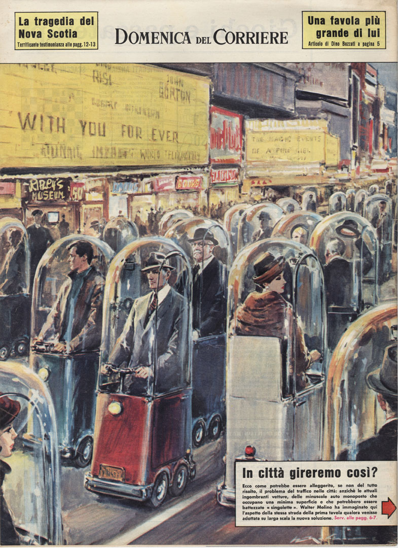
 The term 'dystopia' has been an interest of mine since I witnessed films, from the likes of Ridley Scott's, Blade Runner and Steven Spielberg's, Minority Report. It highlights a particular genre in fiction which portrays a highly corrupt society in comparison to current times. Usually dystopian fiction develops a satirical stance highlighting everything that's wrong within the current period; for example in Margaret Atwood's, The Handmaid's Tale, the role of women has drastically changed and they are mere tools for sex. This however still attains relation to their role in society now, in the likes of media where they are objectified in advertising for example.

 This is the my main motive for the project: to discuss how dystopian fiction could be perhaps a real entity within in our contemporary setting. I believe Huxley's cynical outlook in the writings of Brave New World, and even in his essays, The Doors of Perception and Heaven and Hell, develop to my objective the most.

 The themes and motifs which are: over consumption, dependence on technology, denial of truth, happiness, humanity, sex, loss of dignity, morals, values and emotions in BNW display impressive hindsight, since it was first published in 1931! Today it seems that these aspects seem more evident than ever, which is rather disturbing to think about.

Walter Molino, 1962

Sunday, 23 March 2014

The Finale to End all Finales

 Yes it's that time again, but for the last time! My mind is racing with various levels of anticipation, both good and bad. The course has enlightened my life very much indeed and I will miss it dearly when it soon ends. Let the final major project commence!

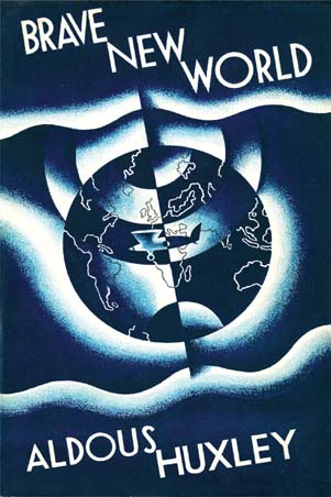
 After some thought over the Christmas holidays, I decided to pick a novel to visually respond from; as it has previously played to my advantage in the way I work. As I fascinate over reading dystopian fiction, I thought it fit to choose within this category. It was a novel I had begun reading the previous year, but had become side-tracked for some reason, so I wanted to give it another chance as it seemed very relevant to my current state of mind in observation of society. I decided to work with and create visual responses from Aldous Huxley's classic, Brave New World.


 Using this novel as a guide towards my outcome, I want to demonstrate how Brave New World is happening right now. Written in 1931, it tells of a future, very much similar to the current state of our contemporary world, where people are cloned and passion towards life has diminished; instead being overshadowed by seamless, superficial activities. Truth ceases to exist in the majority, and the majority ignore it without consciousness.

 I want to make a series of visual responses in accordance to this novel, and perhaps others, to gain a better understanding of my own personal observations: my 'brave new world'.